Hi everyone,
I'm working on a mobile-responsive UI project [GSOC] and could use some help resolving a persistent layout issue.
The Problem:
I created a separate module specifically for mobile, where I implemented a completely different layout—including mobile-optimized components like a hamburger menu that opens a popup panel with menu items and sub-items. These changes successfully appear when the screen width matches mobile dimensions.
However, despite these adjustments, the overall layout still looks like the desktop interface. When I shrink the browser window or simulate a mobile screen, the layout doesn’t adapt like you'd expect from a responsive or even unresponsive website—it continues to display elements side by side, just like the desktop view.
What I’ve Tried:
- I created and linked a
mobile/ode.ui.xmlfile with mobile-optimized components. - I applied custom styles in
mobile.csswhich, according to the setup, should override styles specifically for mobile without needing media queries.
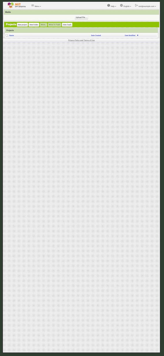
Observation Example:
If you reduce the screen width on a typical website, even unresponsive sites adjust in some way (e.g., shrinking elements or stacking them). But in my case, the entire UI looks identical to the desktop layout—just squished into a smaller screen. The footer(status Panel) also appears misplaced (like Privacy Policy and Terms of Use showing at the top instead of the bottom), which further breaks the experience.
Do I need to adjust each UI component’s dimensions (height, width, orientation) individually to make the layout truly mobile-friendly?
Any guidance on how to make the interface behave more naturally on mobile—especially with vertical stacking and better spacing—would be really appreciated. I’m open to CSS changes, layout tips, or even recommendations on how to adjust GWT/UiBinder logic if needed.
Thanks in advance!