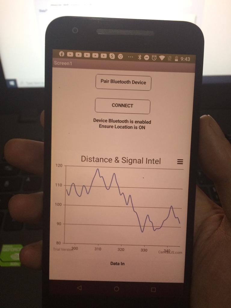
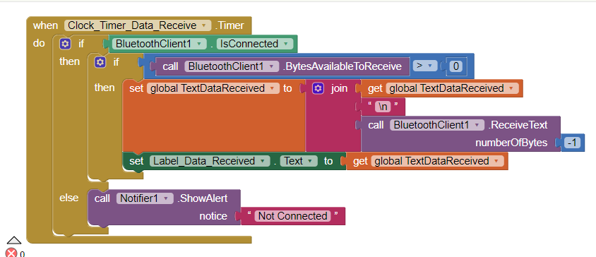
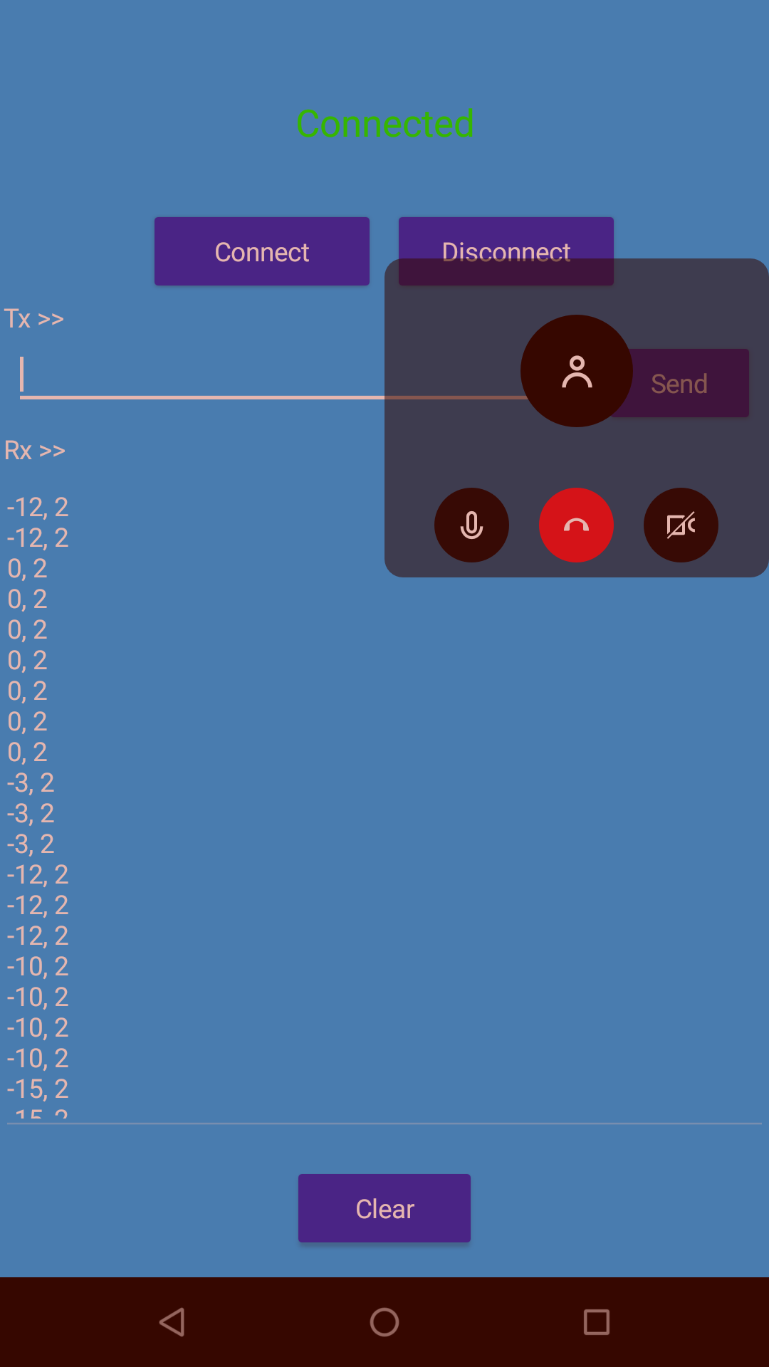
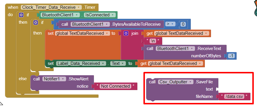
I programmed my Esp32 to output RSSI signal strength values to whatever Smartphone it's paired to and connected to through text output lines that update constantly based on what the esp32 is reading and that are sent to whatever App can read them through a Bluetooth Classic connection.
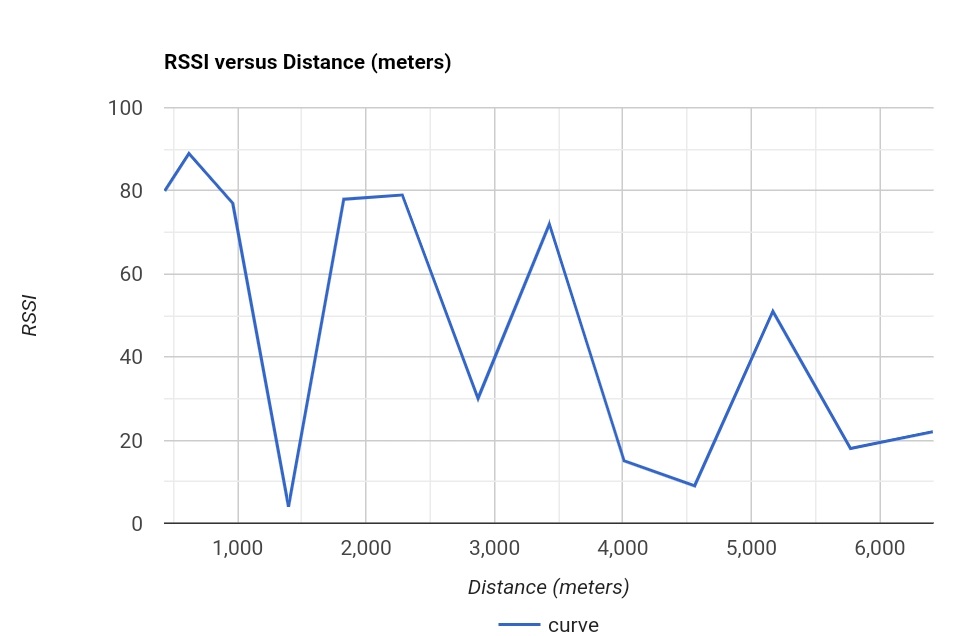
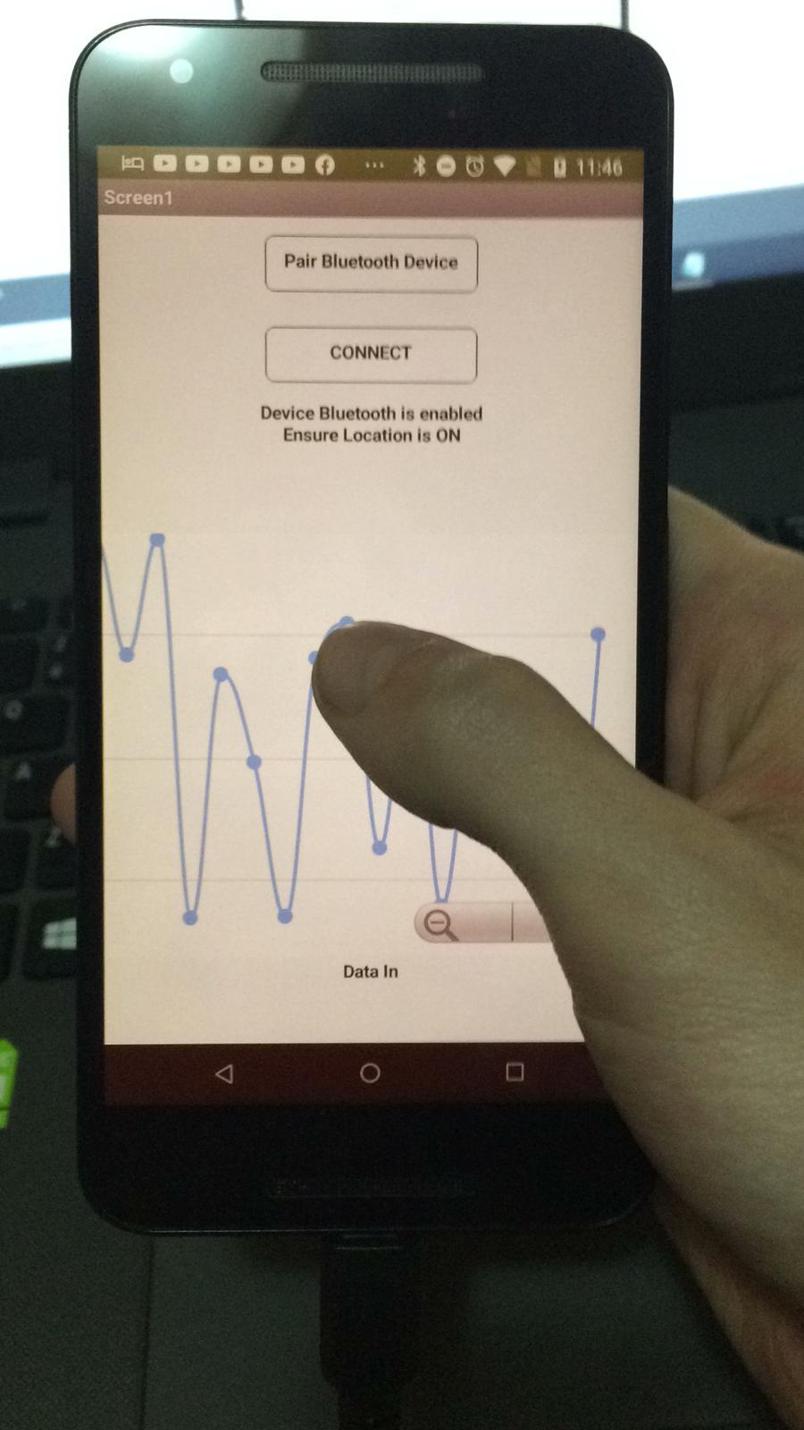
So I'd like to have a Dynamic Spline Chart with Live Data (just like the one bellow in the screenshot bellow) that updates live from either a JSON/Javascript(.js/.mini.js) file or from a CSV file that is constantly updated with the Rssi Signal Strength Values that my Esp32 is sending to my App every second.
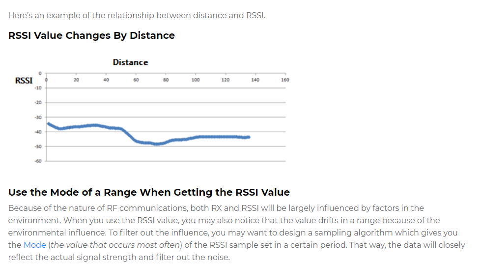
Note 1: In the graph screenshot above, it talks about a mode and also I know there is a noise filter named Kalman which can also be used to filter out the scan noise from the RSSI frequencies.
I'd like to know how I can also add these two features into my app and how to.
Resource: The link for that "mode" thing; there's alot of math which I don't understand how to implement: Mode (statistics) - Wikipedia
Note 2: I'd like the MIT App to calculate the distance at which the phone is detecting the esp32 to be at based on the RSSI output (signal values) that the esp32 is already programmed to send to the phone as text output.
My guess is that I'll have to use the clock for sure and some kind of ecuation that calculates the values and renders them in aproximate distance as I guess the accuray will be off by aprox. 2 meters, based on my tests.
This is a pretty advanced topic for me since I'm a newbie but I'd like to learn if everyone is willing to say what I need to do since I want the graph really bad (because it looks cool) and it's also very useful for my project (but mainly because it looks so cool).
If possible, please give as much details as you can about the graph creation hence I've never done something like this before but if I have the steps I think I can make it work.
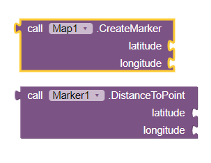
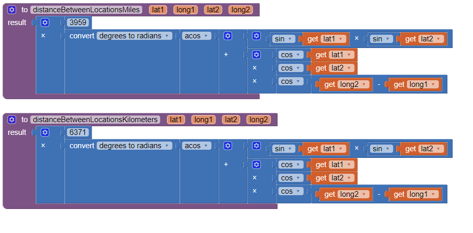
To calculate distance between a transmitter and a receiver, normally you need the coordinates of each. If you expect the Android to calculate the distance, you may need one of these two examples to determine distance between two geocoordinates using a point to point distance calculation. They depend on having access to the location coordinates.
use the Map component and a Marker you can use these two Blocks to calculate
The Blocks with 6371 provides a result in metric units, the Blocks using 3959 results in English units.
Your first step to plotting RSSI vs. Distance might be to create a Table of RSSI vs distance from the signal source; possibly a list of pairs or a csv to use with your graph, and use it to create a static graph display. There are also ways to graph in real time using various techniques. While you learn to construct a basic graph, ignore filtering, get the basic app to work. There are complex ways to possibly 'filter' your data you can 'add' later. The filter would probably something like Help on mathematics of filters - #4 by ABG
I guess this depends on how you test. If you use the LocationSensor and the device built in GPS receiver, the best you can ever achieve is 2 meter resolution and more often then not, your Accuracy will on the order of 10 meters (dependent on the number of satellite fixes that are obtained and the location of those satellites in the constellation. Read about 'Accuracy' in Using the Location Sensor
Hmm, thank you very much my dear but what about the graphical side of things? What do I need to use to create that graph and how do I animate it for MIT 2?
I can make all the required parts of it in Photoshop but I ain't sure if that's how it's done.
How exacly do you create the visuals for the graph and animate them?
I am confused a bit on the visual aspect of the problem, is the graph made entireley out of code or some kind of xml file or is it made in parts in software like gimp/photoshop etc. ?
See the resources in the above link.
Graphs can be made entirely out of code using the Canvas or using javascript or an extension. There are examples in the resources. See this too Charts and Graphs
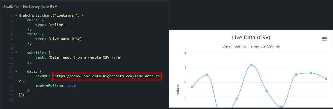
Does anyone having any experience with Highcharts?
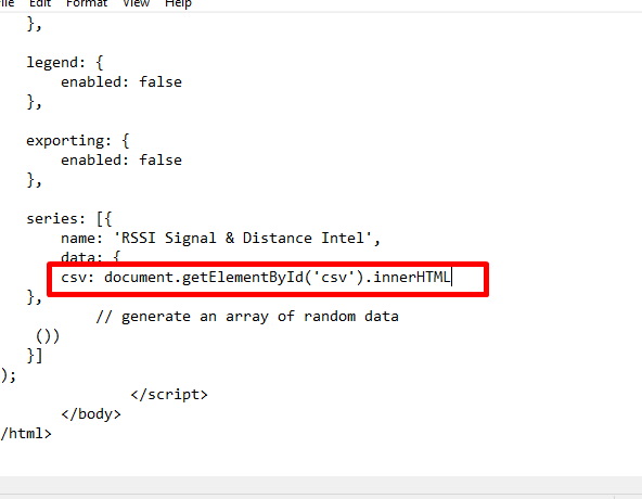
Can I take the Bluetooth RSSI values sent by my esp32 to the app and have the app to output a .js file that my highcharts constantly reads and updates the chart?
If then how to?
Is there an easier alternative to achieve the same outcome?
This is the graph that I currently use which is a default graph with no input added because I don't know how to make it do what I've said above, but it looks so cool and much more informative than simple lines of text with the signal values.
So please, if anyone can assist me I am waiting for some help because I've read alot of resources and I still don't understand what I am supposed to do to have my graph working.
To graph your data with ChartMaker, the data needs to be in the form of a List of Lists . The the first value is distance and the second is the RSSI value (for example 432 meters and an RSSI of 80).
You should be able to update the Chart with a Button or Clock event handler, depending on how you capture your data. This discussion might help you figure out what you want to do Chart Maker help please - #6 by Sirous_Nekooei
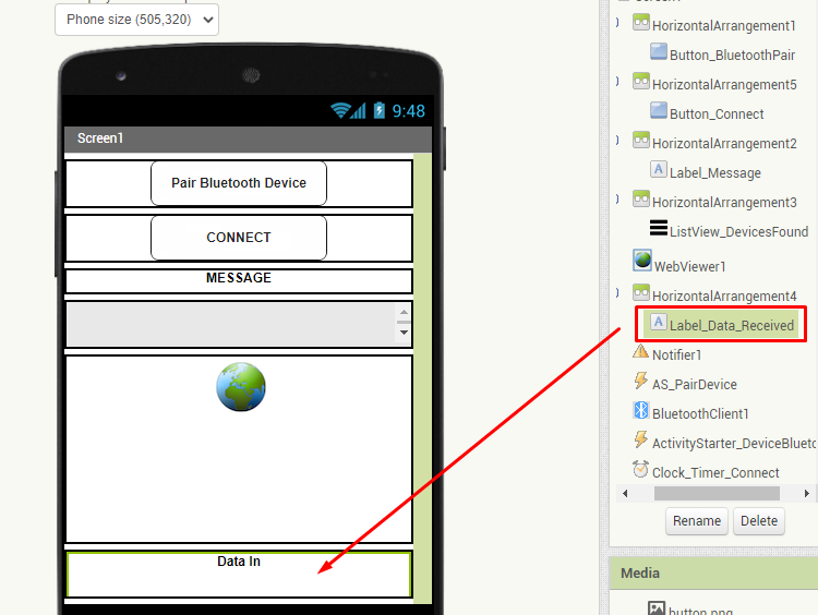
My first question is, for the start, how do I export this data that I currently have right now (the rssi value to a list of lists like you said)
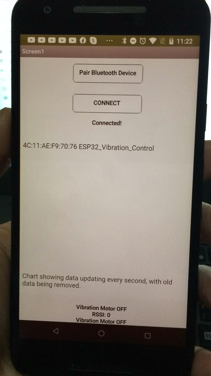
And also, let me know if I need to modify my esp to only give number values without the text "RSSI:" and "vibration motor on/off" or can I leave those in there?
I am asking that because I want to see if the chart that I implemented will respond and update accordingly to the RSSI Data received.
I do not use any GPS data my dear. Do those examples work with the RSSI signal value strength information that the app currently receives only?
Also I can't use the gps data hence the esp32 doesn't have a gps module and from what I know it is possible to approximate point to point precision through Bluetooth Signal Intel only.
If so, is there is anything else I need to setup in Arduino prior to using the example blocks please let me know.
Nevermind, sadly I just realised those examples use GPS coordinates data in order to calculate the aproximate location, which I don't use so I don't think that I can make use of the examples.
It seems that all their example use data input from the .js file series data set.
I am supposed to have it read whatever rssi data my app is sending to the chart and have it updating accordingly so I don't know how to make the app output those values into the series data set constantly so that the chart can read it.
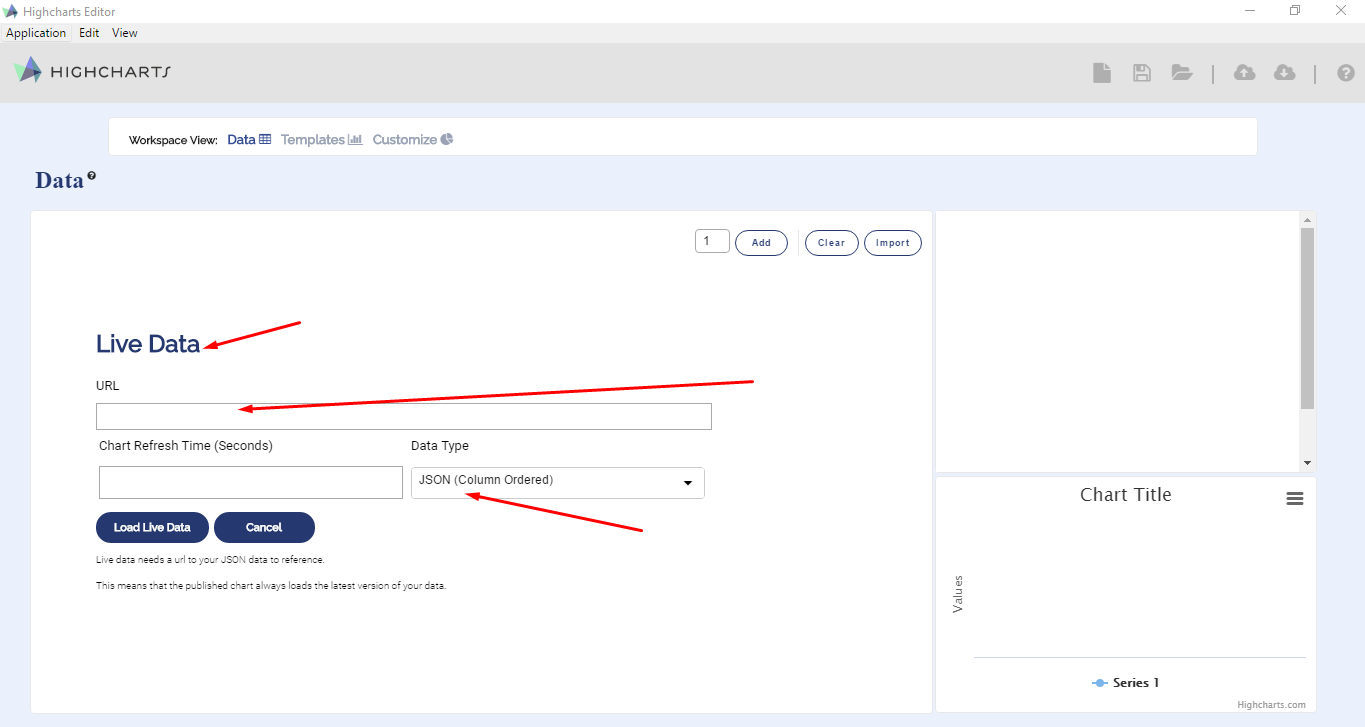
I've made some progress in terms of workflow, i've included the data.js module in order to be able to work with live data with the following supporting formats:
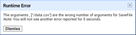
Made a huge progress managing to find a way to read data from a data.csv file from a url that I can specify, meaning that there is a huge chance I can program the app to constantly update the .csv file with whatever I need to.
Take you pick of method to capture the received signal level and calculate a distance. Include the 'distance' you calculate in a List of pairs along with your corresponding RSSI. How you include the derived 'distance' in the List of pairs is accomplished exactly the same way one would input a gps derived distance. Your challenge will be to create a List of pairs before you create your graph and actually do the complex distance determinations the above articles allude to.
Create a List of pairs on your Android of the RSSI/distance data.
Someone might be able to help you with Highcharts after you can download the RSSI values and calculate the 'distance'. They need to know how your data List is constructed and someone then might be able to help.