Jelly Toggle: Animated Toggle Button

An extension for animated toggle button with 15 different toggle animations.

LazyTrembleTailFatty LazyTrembleHeadFatty

Documentation

Of all the available blocks

event
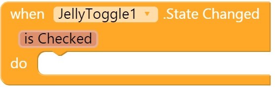
Event fired when the state of the toggle is changed

isChecked: Whether toggle is checked


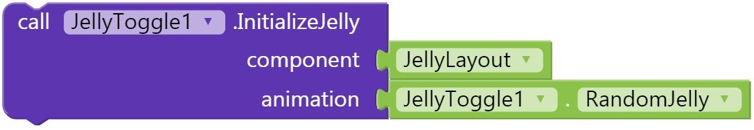
Initialize the toggle jelly in an arrangement

component: Horizontal / Vertical arrangement
animation: Animation of the toggle


change

Changes the toggle animation

animation: Animation of the toggle


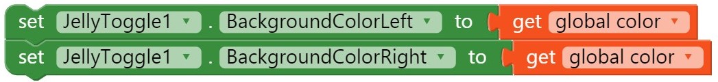
Changes the left and right background colour of the toggle


getbg

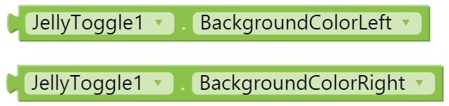
Returns the left and right background-colour


Whether the toggle should be checked


checkedG

Whether toggle is checked


Whether the toggle can be checked or unchecked by dragging


draggableG

Whether toggle can be dragged


jelly

Toggle jelly animations list:

  • Itself
  • LazyTrembleHeadFatty
  • LazyTrembleHeadSlimJim
  • LazyTrembleTailFatty
  • LazyTrembleBodyFatty
  • LazyTrembleBodySlimJim
  • LazyStiffFatty
  • LazyStiffSlimJim
  • ActiveTrembleHeadFatty
  • ActiveTrembleHeadSlimJim
  • ActiveTrembleTailFatty
  • ActiveTrembleBodyFatty
  • ActiveTrembleBodySlimJim
  • ActiveStiffFatty
  • ActiveStiffSlimJim
  • RandomJelly

The name refers to the animations. These are the property blocks.

Download

Direct Download: Jelly Toggle
Google drive: Jelly switch - Google drive


All thanks to Jelly Toggle Button library. Say me if anything is wrong!


Similar extension by @Techno_Vedang

18 Likes

Wow, you are amazing :heart_eyes: @Kumaraswamy

3 Likes

That's very clever ᴋᴜᴍᴀʀᴀsᴡᴀᴍʏ...... I like the names of the options :grin:

3 Likes

Love it @Kumaraswamy Definitively going to be using this in the near future

1 Like
  1. The name Jelly is very nice
  2. U may need another function block which toogle switch

That's okay, can be did with the blocks available.

How where is block

Will this toogle if yes may be I wish u could change checked property to toogle because checked refers to check box on my mind

1 Like

Toggle means to switch from one state like on to of checked means the value of the button is positive.

What it means
still u din't say how it can be done with blocks

jellyToggle1.setChecked(!isChecked);

Use the logic, currently I cannot open app inventor.

So what result I get u mean it will switch any side to right if set true and left if set false

Sorry, cannot understand you're logic.

Leave my logic what result I get on my mobile if

To true and what result I get when false

Cannot understand what are you saying.

Sample application if you are having trouble with blocks.

toogle.aia (129.4 KB)

@KUMARASWAMY_B.G Nice extension, but in addition to animation, the ability to set the size of the switch would be useful. Not necessarily width and height separately because it could distort the shape. We could only set the width, the height would be proportional.

4 Likes

Man, I really wish they had this added. I oftentimes use it for things like setting a timer to time you and put this option at the bottom of the screen, it would be great if I could edit the width and height to be smaller than the actual size. But Ty @Kumaraswamy for the animation. Makes my app look even cooler and slick.

There has been a Switch component for some time.....
image

3 Likes

Hm yes, the recommended size is 5% Height and 15% Width

1 Like

Change JellyToggle.checked to JellyToggle.on like it is for normal switch.

1 Like