Situation:
Hi, I’m playing a little bit with the new switch component and I noticed that it has just one label of text at its left side. So when it is OFF (cursor position at its left side) the user knows what it does, because the cursor indicates the left side where is the label. But it is not possible to give any info about what it does when it is switched ON (cursor position at its right side) because it doesn’t have any “ON” label. So it is necessary to add a normal label but in some situations it is not possible to format it as it is formated the built-in label of the switch component. For example the switch component label allows to have the text centered respect to the switch it self while the standard label component doesn’t so if I add a right-side description to the switch I have it not aligned with the switch it self.
Proposal:
Add at the right-side of the switch component a second label (in Properties pane distinguish it by “left text” and “right text” ) to allow to specify what the switch component does in both positions.
One or both labels could be left empty in case of need.
Advantages if the solution:
It will better clarify the application behavior when final user interacts with the switch
It will keep a coherent UI instead of using a Switch UI component with its own label in combination with another standard label UI component.
In case it is necessary to move around the switch component, all labels will be dragged with it in a single operation.
The text of both labels will be formatted at once into the same component
Hello Bianca
Best enhancement request I have ever seen on this forum, or our old one. Well described. Concise. A suggested improvement that would benefit all.
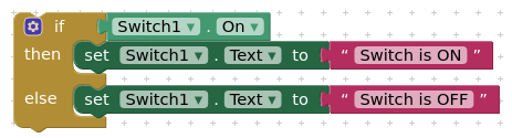
There is a work-around: Leave the Switch Text empty and width on Automatic. You can then layout Label - Switch - Label on a horizontal arrangement.
If we are honest, this is a first attempt at providing a switch component and it leaves a lot to be desired. You can, with a bit of thought, define your own with either a button (using alternate images) or a tiny Canvas.
Currently, we’re looking to reproduce the functionality that already exists in the Android and iOS switch components. What you describe here has benefits, but it doesn’t match the features of the native switches on our platforms.
An Android/iOS switch is essentially a different style of checkbox. It contains is a single label used to describe something that can be true/false or on/off, then a graphic displaying whether it is on or off.
If I understand you correctly, you’re describing a a toggle with two labels, one describing the off state of the toggle and another describing the on state. I can see how that’s useful, but it looks to me like an entirely different interface component.
No need to have a complete different UI component, cause it would be enough to have a twin label as:
[label] [switch] [label].
If the app developer decides to let a label empty, the same component will act as a single label switch.
So no need to have two different UI components, just one with two labels that can or cannot filled or left empty as needed.