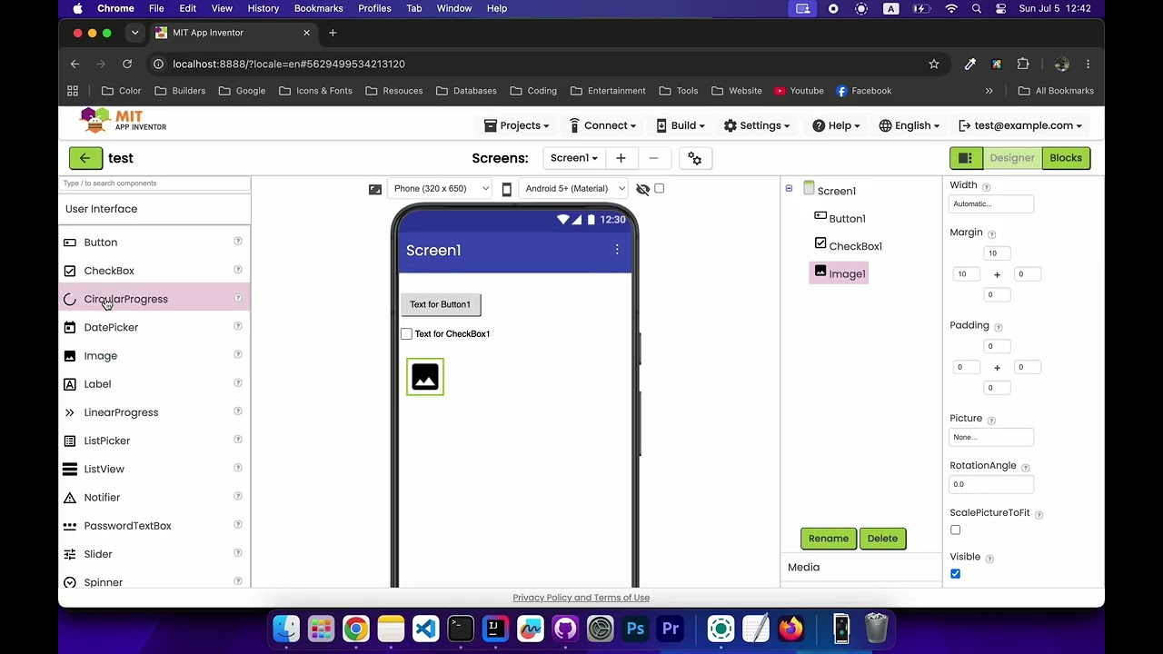
Implementing native Padding and Margin properties for visible components

I've been working on implementing native Padding and Margin properties
for visible components as requested in issue #4019. I'd love feedback
before opening a PR.

What this does

Adds Padding and Margin properties to AndroidViewComponent subclasses
where they have clear visual semantics. Values are comma-separated strings
in Top,Left,Right,Bottom format (e.g. "8,8,8,8").

Designer

A new cross-shaped 4-textbox property editor handles both properties:
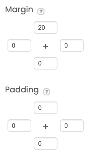
Margin is correctly accounted for in the Designer canvas layout,
components don't overlap when margin is set, because I hooked the
margin/padding values into LayoutInfo.getLayoutWidth/Height() so
MockHVLayoutBase reserves the correct space when positioning siblings.

Blocks

Supports both String and YailList

Padding/Margin Distribution Rules (Applies to both String and YailList):

  • 1 Value: Apply this single value to all 4 sides (e.g., "4" or [4] becomes 4, 4, 4, 4).
  • 2 Values: Keep the first 2 values; fill the remaining 2 sides with 0 (e.g., "2,4" becomes 2, 4, 0, 0).
  • 3 Values: Keep the first 3 values; fill the last side with 0 (e.g., "2,4,5" becomes 2, 4, 5, 0).
  • 4 Values: Behave exactly like the original logic.

Runtime

Scope

Included:
Button, Label, TextBox, EmailPicker, PasswordTextBox, CheckBox, Switch,
Image, HorizontalArrangement, VerticalArrangement,
HorizontalScrollArrangement, VerticalScrollArrangement, TableArrangement,
AbsoluteArrangement, ListView, Spinner, DatePicker, TimePicker,
ContactPicker, ImagePicker, ListPicker, PhoneNumberPicker, FilePicker

Excluded via override suppression:

  • Canvas — would break sprite coordinate assumptions
  • VideoPlayer, WebViewer — have their own internal padding concepts
  • Map, FeatureCollection — map rendering semantics don't fit box model
  • Chart, CircularProgress, LinearProgress, Slider — padding has no
    clear visual meaning for these widget types

Implementation notes

  • Property defined once in AndroidViewComponent, inherited by all
    in-scope components
  • ButtonBase overrides updateAppearance() and setHighContrast() to
    re-assert padding after background drawable reassignment (a known
    Android behavior that resets view padding when a new drawable is set)
  • All affected component versions bumped, upgrade paths added in
    YoungAndroidFormUpgrader, noUpgrade entries added in versioning.js
  • All 140 existing tests pass

Happy to discuss scope decisions or any implementation details.
Reference: Native Padding and Margin layout controls for UI components · Issue #4019 · mit-cml/appinventor-sources · GitHub

2 Likes

Do we really need this?

A simple text entry to set margins or padding for all sides (if 1 value supplied), or accept either a list or a comma separated text (top,right,bottom,left) ?

3 Likes

Thanks for the feedback!

Under the hood, the system actually works exactly like that. storing and parsing a single comma-separated CSV string.

The main reason for the 4-box cross layout in the UI is accessibility for App Inventor's primary audience (students and beginners). It makes the layout intuitive without risk string syntax errors in a blank text box.

However, I can easily tweak it so that if a user types a single value into a field, it automatically populates the other sides to speed things up for power users.

Would that be a good middle ground for everyone?

Drawing on my html/css experiences, what about providing auto ?

For example margin auto auto would centre a component to its containing arrangement both vertically and horizontally ?

margin auto 0 or margin auto would only centre horizontally, etc.

I guess much the same could apply to padding.

This would make the textbox approach for setup more useful...

I love the CSS line of thinking, but App Inventor compiles straight to native Android views, which work a bit differently.

In Android, centering an element is handled entirely by the parent container's alignment settings, not by the component's own margins. Android margins strictly require numbers, so passing "auto" would actually break the underlying layout engine.

Keeping it strictly numerical ensures that what you see in the Designer matches how it actually renders on a real device!

OK, not sure I agree there, though...:wink: One could set the containing arrangement to centre/centre, then set the margins of the component, which "could" move it (the visible element) from the centre...

How about percentages, which would help for consistent positioning on devices with different sized screens ?

Percentages introduce too much ambiguity, the system wouldn't know if you mean a percentage of the component, the parent layout, or the entire screen.

Android's layout engine needs absolute numbers. Resolving percentages dynamically would mean running heavy layout measuring passes constantly, which kills performance.

Keeping it strictly numerical avoids all that overhead and keeps things fast and predictable!

Again, I don't necessarily agree, we use percentages (and fillparent) all the time for positioning and sizing components inside an arrangements (especially if we use blank labels around a component to aid accurate positioning) - I am staying away from the "absolute arrangement" ...

:red_question_mark:

In blocks should i keep both list and string supported
and sanitize inputs like this:

Padding/Margin Distribution Rules (Applies to both String and YailList):

  • 1 Value: Apply this single value to all 4 sides (e.g., "4" or [4] becomes 4, 4, 4, 4).
  • 2 Values: Keep the first 2 values; fill the remaining 2 sides with 0 (e.g., "2,4" becomes 2, 4, 0, 0).
  • 3 Values: Keep the first 3 values; fill the last side with 0 (e.g., "2,4,5" becomes 2, 4, 5, 0).
  • 4 Values: Behave exactly like the original logic.
1 Like

That’s a fair point, But if we want to use percentages for a component, we can always apply them to the component's width or height, and then use fixed numbers for the padding and margins.

Just to be clear, in App Inventor percent measurements are always relative to the screen dimension, so 50% height is 50% of the height of the screen in its current orientation. This is more akin to using the CSS vw/vh units.

For the blocks, I think I'd be in favor of using a dictionary and then having a helper block for the different names of the dimensions.

One decision we'd have to make is whether to use Left/Right or Leading/Trailing. The latter are agnostic to right-to-left layouts, but require people to think about these things when designing apps vs keeping it simple.

​I really like the dictionary idea! It makes the block logic explicit and clean.

​To solve the naming dilemma, we could just include helper blocks for all of them: top, bottom, left, right, leading, and trailing. This gives advanced developers RTL support while keeping it dead simple for beginners.

Should we keep blocks support flexible by accepting text, lists, and dictionaries altogether (normalizing them behind the scenes), or should we strictly limit block inputs to just the dictionary approach?

Just pointing out here that however you decide to abstract padding and margin, it must also work for iOS, and margin as such does not exist in iOS (you either use fake padding or anchors).

Even if you are not planning to work on the iOS part, if your design follows the Android implementation, it won’t be possible to reuse it for iOS and that is a big problem.

Isn't it the other way around? The CSS margin equivalent in iOS constraint layouts is providing a constant on the constraint to the previous/next view, or to the edges of the parent view. Padding is harder because in CSS it is internal to the element's content/border box (depending the box model being applied). Some iOS views do have a means to control this (e.g., UIButton has contentInsets), but most don't. One question would be if we really need both, or whether margin would be sufficient to control the inter-component distances without having to use empty Labels or introduce some sort of "spacer" component.

// -*- mode: java; c-basic-offset: 2; -*-
// Copyright 2026 MIT, All rights reserved
// Released under the Apache License, Version 2.0
// http://www.apache.org/licenses/LICENSE-2.0

package com.google.appinventor.components.common;

import java.util.HashMap;
import java.util.Map;

/**
 * Defines a LayoutDimension type used by padding and margin helper blocks.
 */
public enum LayoutDimension implements OptionList<String> {
  All("all"),
  Top("top"),
  Bottom("bottom"),
  Left("left"),
  Right("right"),
  Leading("leading"),
  Trailing("trailing");

  private final String value;

  LayoutDimension(String value) {
    this.value = value;
  }

  public String toUnderlyingValue() {
    return value;
  }

  private static final Map<String, LayoutDimension> lookup = new HashMap<>();

  static {
    for (LayoutDimension dim : LayoutDimension.values()) {
      lookup.put(dim.toUnderlyingValue(), dim);
    }
  }

  public static LayoutDimension fromUnderlyingValue(String dim) {
    return lookup.get(dim);
  }
}

I created an OptionList enum class (LayoutDimension) for the sides (Top, Bottom, etc.), but the dropdown block isn't appearing in the component blocks.

Because the Padding/Margin properties accept a YailDictionary rather than a scalar type (String) , I cannot use @Options(LayoutDimension.class) annotation on the property setters.

How do I force App Inventor to recognize and render this OptionList standalone so users can plug it into generic dictionary blocks? What should I do next to get the block to show up?

Thanks!

Great job!!
Often, depending on the font used, text isn't centered perfectly.
This extension should solve the problem.

In my opinion there is no point in bringing the database into play, the text line with the 4 options is enough
Thanks

1 Like