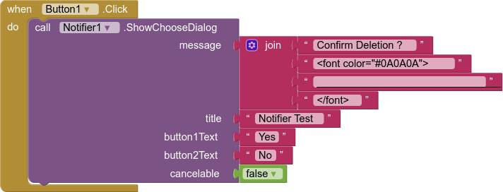
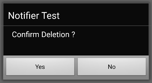
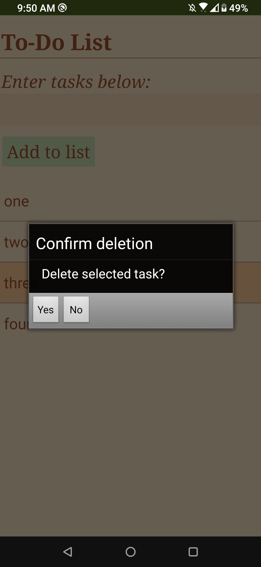
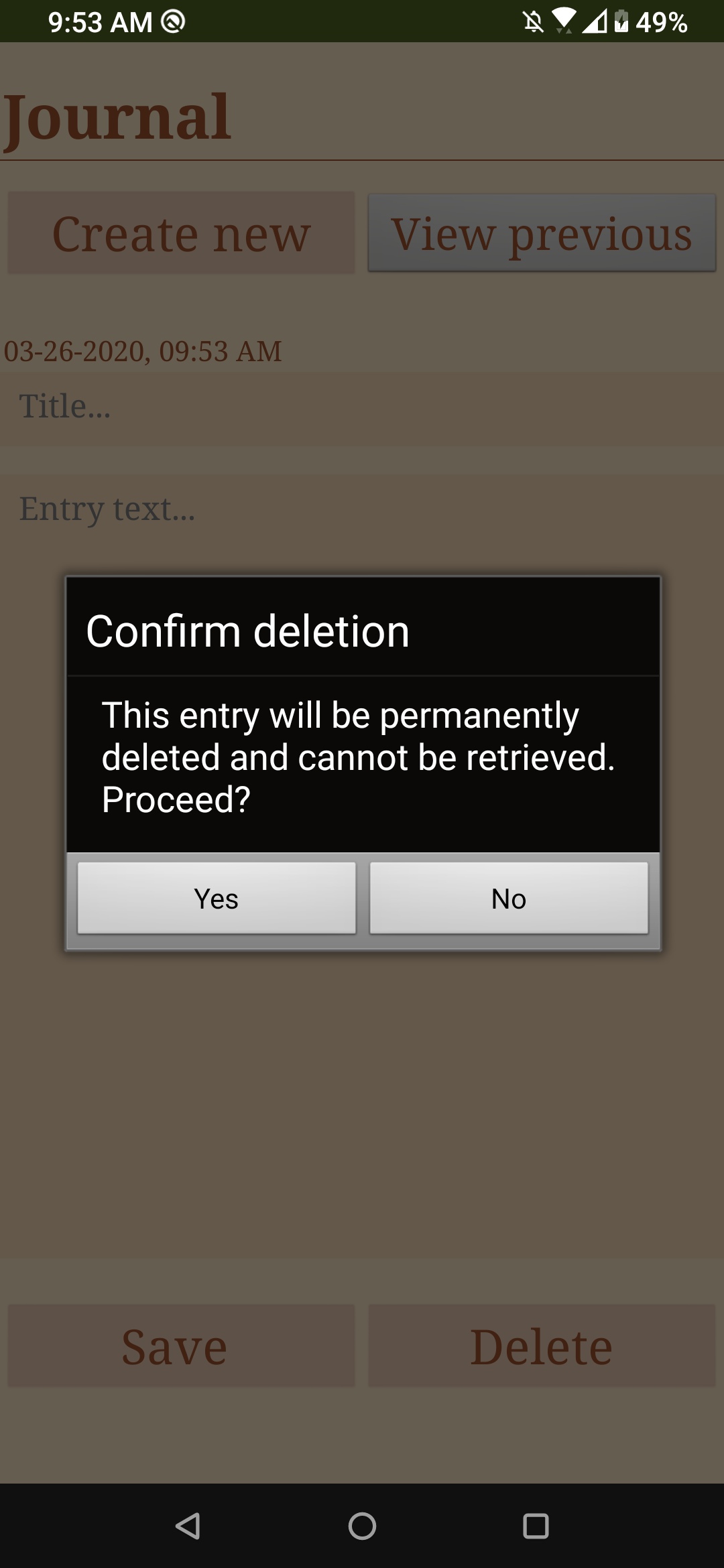
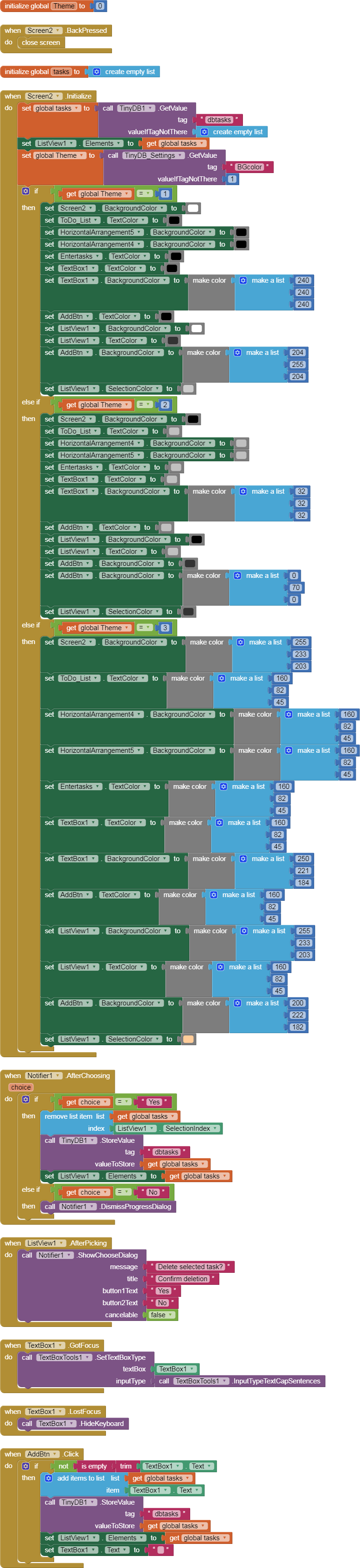
I have a problem with how the buttons look with a notifier's choose dialog. The first picture I've attached shows my problem - see how the "yes" and "no" buttons are all the way to the left? I'd like them to look like the second picture where their width takes up the entire box. I don't know why the first one looks so weird. I'd appreciate any help
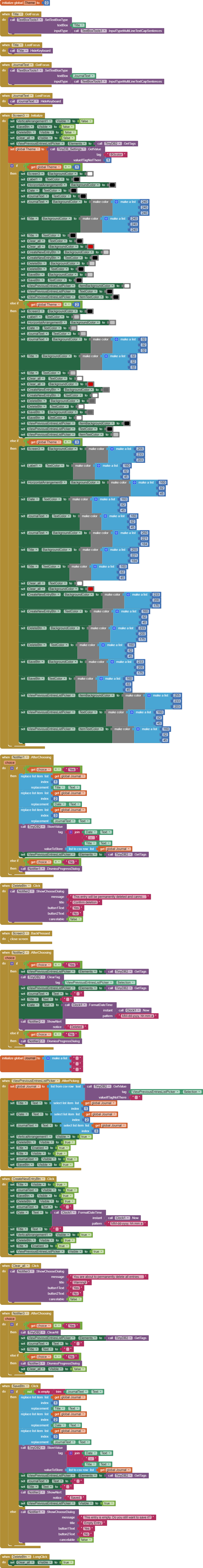
Well, the two cases are in the same app, on different screens. The first one is on Screen2 and the second one, which is what I want the first to look like, is on Screen3.
(I fixed the init global Theme block to clear its error, by the way, but it's not connected to this particular problem.)
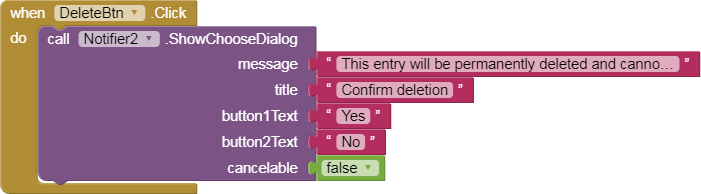
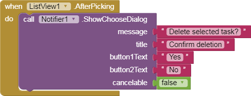
I only see 2 differences between the Notifier calls ...
One originates in a ListView.AfterSelection, and the other originates from a Button.Click event. Could the ListView component's leftward orientation be passing down to a pop up Notifier?
The working Notifier has enough text to wrap around, while the non-working Notifier has short text.
Those differences can be eliminated by your experimentation, to see which causes the difference.
Right, I didn't think about the ListView's left orientation influencing the notifier buttons. I think I've tried putting more text in the notifier before, but the buttons stayed the same. I'll experiment with changing the ListView orientation though; that might fix it.
If that doesn't work, try de-coupling the ListView selection event from the Notifier call, by interposing a global variable for the .Selection value and a single-shot Clock Timer to call the Notifier using the global variable, after the ListView event has completed.
After a short bit of testing, in Classic theme, it seems that the sizing of the buttons is related to the length of the message. If the message runs over one line, then the buttons are sized to fill. Not found a way to workaround this, tried adding a <br> but this didn’t help. Nothing to do with the listview.
In Device Default theme, the two button texts stay in the right and left bottom corners, regardless.