How do you set screen size to fit all mobile and tablet screen?

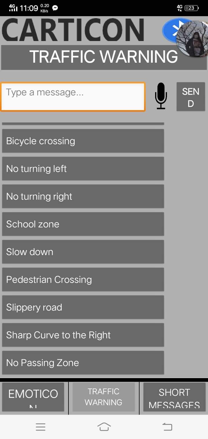
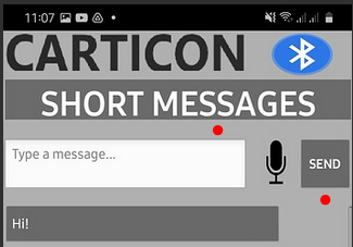
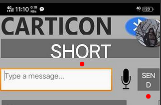
Hi, I have a problem with my application. When I tried the app on my phone, it was fine. Buttons images and text are fine, but when I tried it on another phone, there were some problems with other texts on the app.

Using my phone:


Using other phone:


Is your app set to responsive sizing on the Screen1 properties in Designer ?
image

Yes

1 Like

Ensure that all of your components (Button, Horizontal/Vertical Arrangement, Listview, etc.) width already set to "fill parent"
image

and also you can change Horizontal/Vertical Arrangement Align
image

1 Like

I did all of it but it still the same

That would be great if you share the project here, so I could debug it for you

Is your main problem e.g. here?

grafik

grafik

This can have various causes. Among other things, for example, which font size is used in the device settings (FontScale). This can of course be queried and catched via special blocks (extensions).

Set the Theme from Classic to DeviceDefault (or the other way around :slight_smile: 
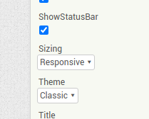
DeviceDefault to Classic ) might work might solve the problem.