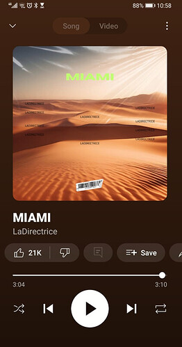
So, i want to create a responsive design that will work on different devices i thought to work in terms of percentages to make sure that it will be responsive to all devices, but what i didn't keep in mind is the fact that y-axis 100% and x-axis 100% is not the same thing, because the screen is longer than it is wider. And because phone sizes differ i don't want my images that are set in percentages to be distorted or out of proportion.
I want to create a UI like YT or Spotify:
-
Try the suggestions at Responsive Design in App Inventor as a start.
-
extensions might help you. Browse Taifun's list of extensions at App Inventor Extensions | Pura Vida Apps. Several extensions there might be helpful in enhancing your app's UI.
Also, consider what happens if the user rotates the device, or if they use a tablet, which is normally in landscape orientation.
I read the first 2, the percentages makes sense, it will still have some weird scaling's on different devices, but i guess this is my best route. The app extensions library i know of, but i don't know what to search and there is quite many extensions to read through.
But thanks still.
I have thought about it, and i don;t know what to do, because at least on a phone i can set an image to percentages and on different phones it may look kind of the same, but on a tablet if i set a picture to certain percentages, the quality will be ruined. But the phone won't be able to rotate with this, i switched that of. What do you recon i should do if they use a tablet?
