How can I set screen size?

Hi all,
First of all, I'm sorry because I'm French and since my English is very poor, I'm using "Google Translate" to write this topic.
I would like to know if when we create an App on MIT App inventor we can size the phone screen.
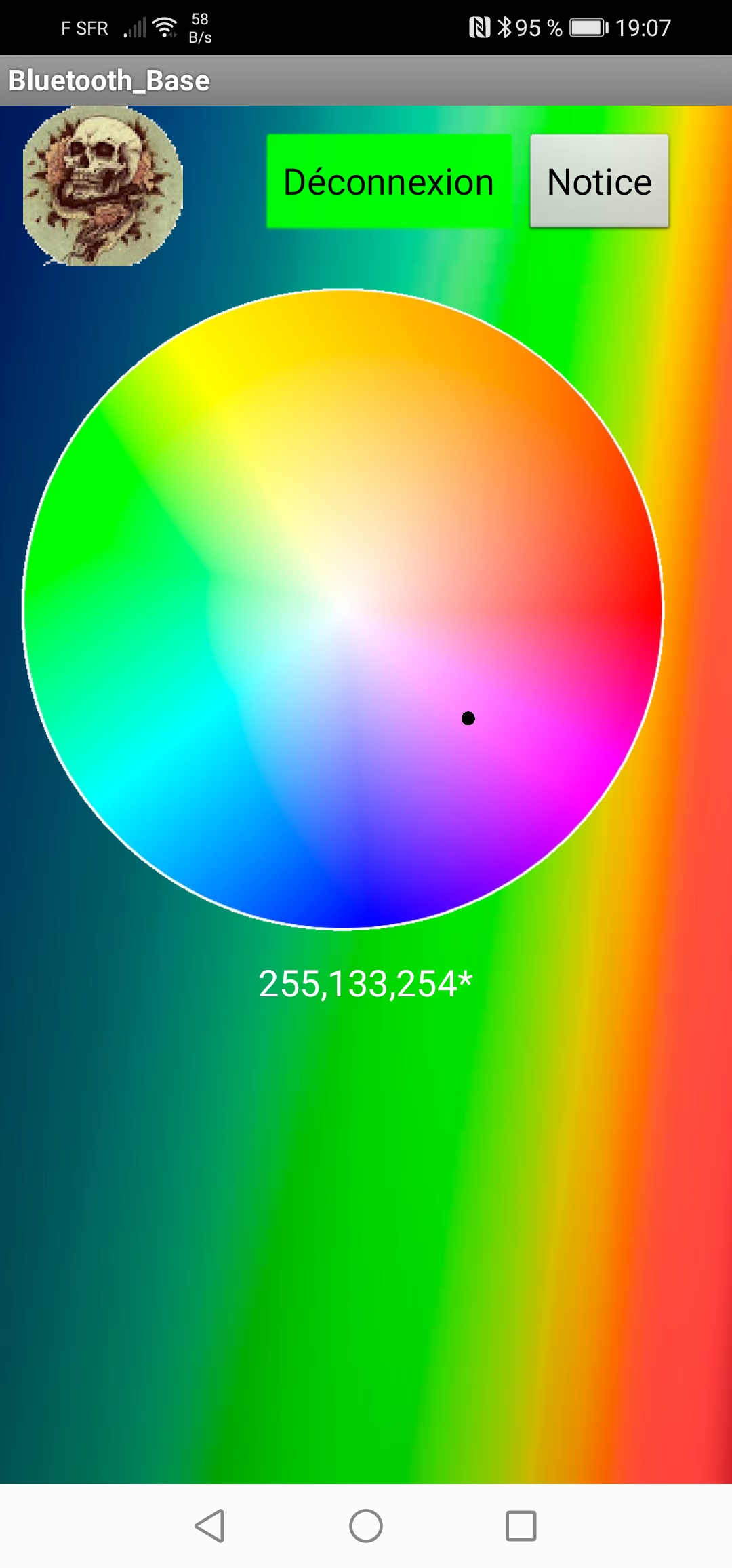
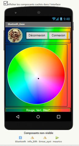
My problem is that when I open the app on the phone there is still space at the bottom of the screen (this suits me because I can add something else) that I do not have on the site . And on the site, I can't find how to go lower.
Could someone tell me if it is possible to adapt the screen dimension on the site to match that of my phone?
Thank you in advance for your help...
I add the photos of my phone screen and that of the site app.

Friendships to all.
@+

Ecran app bluetooth sur pc

This should help you
http://ai2.appinventor.mit.edu/reference/other/responsiveDesign.html

Thank you for the info.
I think the link will help me a lot with regard to the videos because I admit that I have trouble understanding what they say especially "Pixii Bomb" which speak very fast. Fortunately there are the images ... :wink:
Thanks again, I'll try to change the configuration.

Bonjour, moi aussi je suis Français, as tu trouver une réponse a ton problème car je suis aussi en galère, merci

possibly use Classic Theme and set Sizing to Fixed ..The app will fill a Tablet or a cell screen

er, which one is which ?

Do you want to display your website in your app, or recreate your website in your app ?

If you want web based, you could do something like this:

<!DOCTYPE html>
<html class= "w3-blue">
<meta name="viewport" content="width=device-width, initial-scale=1.0">
<link rel="stylesheet" href="https://www.w3schools.com/w3css/4/w3.css">
<head>
	<title>Circle</title>
	<style>
	@media only screen and (max-width: 600px) {
		#circle {width:75%}
	}
	@media only screen and (min-width: 600px) {
		#circle {width:25%}
	}
	</style>
</head>
<body>
	<div class = "w3-container w3-padding-64 w3-center"	>
	<img id="circle" src="greenCircle2.png">
	</div>
</body>
</html>

Computer screen (or any screen wider than 600px):

Phone screen (assumes webviewer is fill parent height and width)

You can edit the "circle" width percentages to your liking