Here is a working google apps script for returning either 7 days or 30 days. I had to adjust the dates by one day as they were coming through in the script as the day before (even though both my timezones are the same?). I used a script bound to the spreadsheet.
function doGet(e) {
  var ss = SpreadsheetApp.getActive();
  var sh = ss.getSheetByName('Sheet1');
  var data = sh.getDataRange().getDisplayValues();
  var arr = [];
  var now = new Date();
  var year = now.getFullYear();
  var month = now.getMonth();
  var first = now.getDate() - now.getDay() + 1;
  var lastWeek = new Date(year, month, first - 7).getTime();
  var lastMonth = new Date(year, month, first - 30).getTime();
  var history;
  if (e.parameter.history == 7) {
  history = lastWeek;
  } else {
    history = lastMonth;
  }
  for (var i=1;i<data.length;i++) {
    var firstDate = Date.parse(data[i][1]);
    var secondDate = new Date(firstDate + 24 * 60 * 60 * 1000);
    if (secondDate > history) {
     var fDate = Utilities.formatDate(secondDate, "GMT", "yyyy-MM-dd");
     arr.push([fDate,parseInt(data[i][2]),parseInt(data[i][3])]);
    }
  }
  arr.unshift([data[0][1],data[0][2],data[0][3]]);

  return ContentService.createTextOutput(JSON.stringify(arr));
}
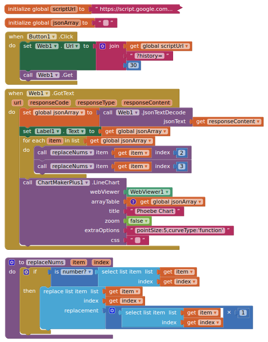
Blocks: