Link to app on my Google Drive:
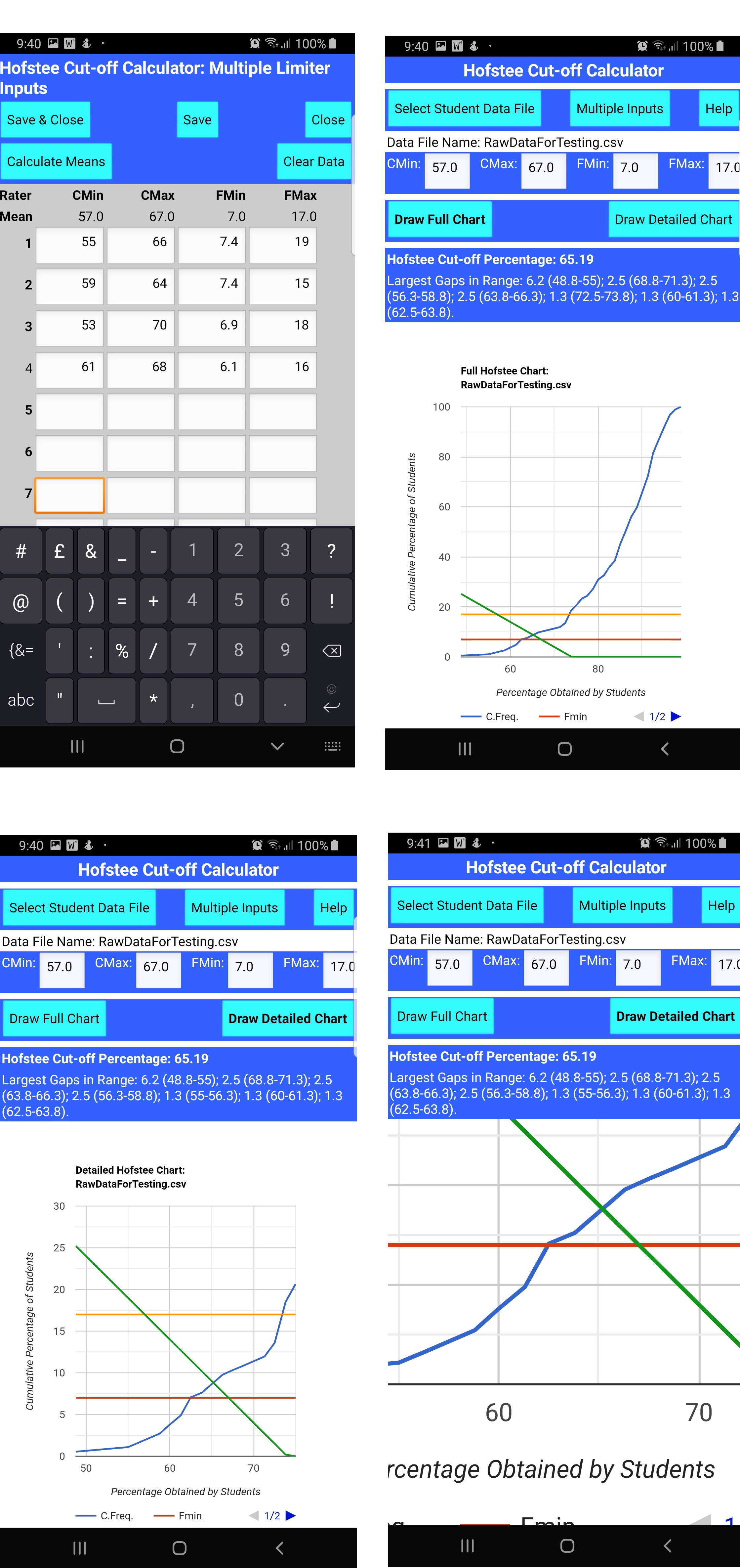
This little app reads a .csv file of student marks (sorted or unsorted), calculates the Hofstee cut-off point for the data set, and draws the resultant chart as a cumulative percentage line, the Hofstee line and the FMin and FMax lines. (The app assumes the person is familiar with the use of the Hofstee method).
On first running, the app automatically creates an app data folder (using the Taifun File Extension ), and then the user copies their .csv file into that folder (There is a .csv file already in the assets for user testing purposes).
Then the user enters the CMin, CMax, FMin and FMax. This can be done in two ways: (1) the data from each rater is entered, and the means are calculated, or (2) the final means are manually inserted/adjusted.
The raw data from the .csv are automatically sorted using Pevest.com ’s - QuickSort Routine. From the raw data, cumulative percentages are calculated, and then Kate Manning and Emily Kager’s ChartMaker is used to draw the lines. Because ChartMaker can draw only straight lines based on the start and finish x,y, and the cumulative chart is not a straight line, each component of the cumulative chart is drawn separately.
The formula for the Hofstee line is determined algebraically, and then the x,y intercept with the relevant straight line in the cumulative line is determined. (I am not a mathematician, so I used my 40-year old high-school maths to determine the formula (based on sine and cosine rules), so the maths is probably horrific, but it works.)
Strengths of the App
Time saving, as drawing the chart takes time.
Accuracy: Reading off a hand-drawn chart is never accurate.
What iffs: allowing the user to adjust the parameters means that they can test other possibilities.
Big gaps: identifying large gaps also allows for adjustments. Although these should never be done, in reality, there are frequently not enough experts available, and so tweaks have to be made.
Weaknesses of the app.
Because ChartMaker can draw only straight lines, and each line must have the same number of points, there is a problem when the y-value of the Hofstee line drop below 0. It has to be given a value, so I give it the value 0, and all Y values after that for the line are 0. Mostly, it looks fine (e.g. test with CMin=57, CMax=67, FMin=7, FMax=17). But, with some settings, (CMin=55, CMax=65, FMin=5, FMax=15) there is a kink in the Hofstee line as it approaches 0. It does not happen with all settings, but with many. (It happens because the next Hofstee Y-value is less than 0, the x-value has moved along, so, when I change the y-value to 0, the line kinks up).
I can’t figure out how to draw the CMin and CMax lines, as these are vertical (e.g. 55,0;55,100; 65,0;65,100). If the CMin and CMax x-value was the same as a data point value, then I could get it to work, but I cannot assume that. (Of course, given that the cut-off is calculated algebraically, those lines are not necessary for finding the cut-off) but most people working with a Hofstee chart on paper are used to seeing them, and it would be good to see them.)
2 Likes
Peter
March 10, 2020, 7:16am
2
Nice work,
In the near future we will have a new Chart component.
ucr ← elatoskinas:charts
opened 01:23PM - 16 Aug 19 UTC
# Chart Components
App Inventor [Chart Components](https://summerofcode.withg… oogle.com/projects/?sp-page=2#5496355911368704) project as part of the GSoC 2019.
[GitHub Project Board](https://github.com/elatoskinas/appinventor-sources/projects/1)
[Pull Request history](https://github.com/elatoskinas/appinventor-sources/pulls?q=is%3Aopen+is%3Apr)
[Issue history](https://github.com/elatoskinas/appinventor-sources/issues)
[App Spot Link](http://app-inventor-charts.appspot.com/)
[Companion Link](https://drive.google.com/open?id=1t8VPP7E9q8ejPrdJEUJ16i4oE8zvOXaF)
[Documentation & Tutorial](https://docs.google.com/document/d/1QqWWgkoZ9VIhkb1DLizhZD60I7Nt6SrM8jCAIWhtxM8)
## Features
### General
* Single Chart Component with a selection of 5 different types (as of now)
* Chart Data components which can be dragged & drop to the Chart. Each one corresponds to a single Data Series.
* New DataFile component which holds parsed CSV and JSON data upon loading files
* Chart Mock components are fully responsive
* Components are adapted to act as Chart Data Sources and can be attached to Data components
### Chart Types
* Line Chart type
* Area Chart type
* Scatter Chart type
* Pie Chart type
* Bar Chart type
* Each Chart type supports multiple Data Series. Line and Area types support multiple lines; Scatter Charts support multiple sets of points;
Bar Charts support multiple (grouped) bars; Pie Charts support concentric rings.
### Chart Data component
* Single Chart Data component that applies to all the different Chart types
* Supports CRUD operations (adding, removing, getting entries)
* Add Entry block
* Clear entries block
* Block to check if entry exists (by x and y value)
* Block to get all entries as a YailList representation
* Block to get entries by x value
* Block to get entries by y value
* Remove Entry block
* Blocks to Import from Data Source (on a case-by-case basis)
* Blocks to change/remove Data Source
* Full adaption and generalization of the code to make it simple to implement a 3-tuple (or higher) version of Charts (e.g. Bubble Chart or 3D Charts)
### Data Importing
* Manual entry adding via block
* Importing from ElementsFromPairs property
* Import from Lists block, where each entry of the List is a List of 2 values
* Importing from TinyDB (by Tag value)
* Importing from DataFile (both CSV and JSON supported)
* Importing from Web (both CSV and JSON supported)
* Importing from CloudDB (by Tag value)
* Importing from AccelerometerSensor (using X, Y or Z as the DataSourceValue)
* Importing from BluetoothClient (using prefix as the DataSourceValue)
* Importing from GyroscopeSensor (using X, Y or Z as the DataSourceValue)
* Importing from OrientationSensor (using azimuth, pitch or roll as the DataSourceValue)
* Importing from Pedometer (using SimpleSteps, WalkSteps or Distance as the DataSourceValue)
* Importing from LocationSensor (using longitude, latitude, altitude or speed as the DataSourceValue)
* Importing from ProximitySensor (no DataSourceValue needs to be specified; imports anyway)
### Designer
* Fully responsive Charts, Data component attaching and property setting
* DataFile drag & droppable onto Chart to import all columns into the Chart
* Property hiding based on state of the Chart (type, Data Source attached)
* DataFile dropdown column selectors (+ internal storage of DataFile data in the Mock Component)
* Responsive Chart Data components when setting Source to DataFile (and selecting columns)
### Chart Customization
* Chart Background Color
* Chart Description (Title)
* Chart Data Color
* Chart Data Label
* Chart Data Colors (multiple Colors)
* Pie Chart Radius
* Line Chart Type (Stepped, Curved, Linear lines)
* Scatter Chart Point Style
* Legend hiding/showing
* Grid hiding/showing
* Custom X axis labels for axis-based Charts
## Blog Posts
The following series of blog posts document my work throughout the Summer. The posts without links are still in the works!
[GSoC with App Inventor (introduction)](https://elatoskinas.github.io/blog/open%20source/2019/05/18/gsoc-2019-announcement.html)
[Community Bonding](https://elatoskinas.github.io/blog/open%20source/2019/05/26/gsoc-2019-community-bonding.html)
[First Steps](https://elatoskinas.github.io/blog/open%20source/2019/06/01/gsoc-2019-first-steps.html)
[Prototype](https://elatoskinas.github.io/blog/open%20source/2019/06/01/gsoc-2019-prototype.html)
[Workflow Preview](https://elatoskinas.github.io/blog/open%20source/2019/06/09/gsoc-2019-workflow-preview.html)
[Workflow Implementation](https://elatoskinas.github.io/blog/open%20source/2019/06/15/gsoc-2019-charts-workflow-implementation.html)
[MPAndroidChart Concentric Pie Charts early concept](https://elatoskinas.github.io/blog/android/2019/06/23/mpandroidchart-concentric-pie-charts.html)
[Data Importing from Tuples](https://elatoskinas.github.io/blog/open%20source/2019/07/09/gsoc-2019-data-importing-from-tuples.html)
[Chart Type Selection, Area and Scatter Charts](https://elatoskinas.github.io/blog/open%20source/2019/07/27/gsoc-2019-chart-type-selection-area-scatter.html)
[Chart Data Source Concepts, TinyDB and CloudDB importing](https://elatoskinas.github.io/blog/open%20source/2019/08/14/gsoc-2019-chart-data-source-concepts-and-db.html)
[CSV, JSON and Web Import](https://elatoskinas.github.io/blog/open%20source/2019/08/20/gsoc-2019-chart-data-source-csv-json-web.html)
[Real-Time Importing](https://elatoskinas.github.io/blog/open%20source/2019/08/20/gsoc-2019-chart-data-source-real-time-import.html)
[Pie Chart](https://elatoskinas.github.io/blog/open%20source/2019/08/24/gsoc-2019-chart-pie-chart.html)
[Bar Chart & Chart Customization](https://elatoskinas.github.io/blog/open%20source/2019/08/24/gsoc-2019-chart-bar-chart-customization.html)
[Summary](https://elatoskinas.github.io/blog/open%20source/2019/08/25/gsoc-2019-project-summary.html)
## To-do List
- [x] Fix [breaking Refresh issue](https://github.com/elatoskinas/appinventor-sources/issues/114) (high priority)
- [x] [Revise updating and synchronizing t value](https://github.com/elatoskinas/appinventor-sources/issues/133) for Real Time multi-series Data import
- [x] Add support for more Android sensors (e.g. GyroscopeSensor)
- [x] Extend customization options for Chart & Data components
- [x] [Automated tests](https://github.com/elatoskinas/appinventor-sources/issues/97)
for ChartDataBase & CoordinateData class (this one I have
currently overlooked testing via JUnit, since I tested it manually and most
of the functionality is tested in the Model/View classes)
- [x] Change OnInitializeListener implementation to BeforeChangeListener instead (#1748)
- [x] Add versioning entries
- [x] Rename CoordinateData to ChartData or ChartData2D to cause less confusion (since the component applies to all Chart types currently)
- [x] Create documentation
- [x] Fix Pie Chart Legend Entries for Clear block
- [x] Hide Label property for Data components when Chart type is set to Pie
- [x] Apply Labels from smallest x axis value
## Known Issues
* The Charba library (the Charts library used for the Mock Carts) is currently compiled from the source rather than using the .jar due to some recent changes in the master that have not yet been released.
* The legend entries are currently not truncated. This could result in legend entries overwhelming the Chart for many entries, especially for the Pie Chart.
* The Pie Chart's scaling can be quite a bit inconsistent. Due to concentric Pie Chart rings not being supported, all of the scaling had to be done manually.
* The Pie Chart's height offset with more Legend Entries can also be quite a bit inconsistent due to the same reason. Also, if the Legend Entries start overwhelming the Chart, some Legend Entries go behind the Chart rings rather than in front.
* Real Time Chart Data t value syncing is at a very early stage, and can certainly be improved.
* Bluetooth Client multiple data series import can appear choppy at times due to the polling reading in a single value at a time. Reading in multiple values can cause other issues (incomplete reading, stuck on reading, etc.)
* In VERY rare cases, rapid data refreshing can cause crashes after a while (although it mostly works fine). The scenario in which this happened is when 500 entries were removed and imported in an interval of some milliseconds, so it was not a very realistic scenario.
## Future Work
In the future, the following features could be considered and implemented:
* More informative warnings and displayed information. For instance, some methods are blocking (e.g. Rows, Columns and ColumnNames in DataFile, or the GetEntries method in the Chart Data component). UI information could be displayed to indicate loading. For warnings and errors, Toast notifications could be thrown in certain scenarios to indicate warnings. For now, most issues are handled and invalid data is simply not imported, but in the future, some mechanism of information could be added.
* Bubble Chart Type (using 3D data)
* Radar Chart Type (using 2D data)
* Stacked Bar Chart Type/Subtype - this will be more tricky to accomplish due to the current implementation of stacked Bar Charts in MPAndroidChart. For now, grouped Bar Charts were easier to implement.
* Horizontal Bar Chart Type/Subtype
* TinyWebDB support (implementation should be roughly similar to TinyDB/CloudDB)
* BLE Data Source Support (suggested)
* Real Time Sync for wave form display (suggested)
I guess, some things in your app can be made more easily with the use of the new component.
1 Like
Thank you. Sounds great, and I look forward to that.
1 Like
ABG
March 10, 2020, 6:07pm
6
kmasters:
Weaknesses of the app.
Because ChartMaker can draw only straight lines, and each line must have the same number of points, there is a problem when the y-value of the Hofstee line drop below 0. It has to be given a value, so I give it the value 0, and all Y values after that for the line are 0. Mostly, it looks fine (e.g. test with CMin=57, CMax=67, FMin=7, FMax=17). But, with some settings, (CMin=55, CMax=65, FMin=5, FMax=15) there is a kink in the Hofstee line as it approaches 0. It does not happen with all settings, but with many. (It happens because the next Hofstee Y-value is less than 0, the x-value has moved along, so, when I change the y-value to 0, the line kinks up).
I can’t figure out how to draw the CMin and CMax lines, as these are vertical (e.g. 55,0;55,100; 65,0;65,100). If the CMin and CMax x-value was the same as a data point value, then I could get it to work, but I cannot assume that. (Of course, given that the cut-off is calculated algebraically, those lines are not necessary for finding the cut-off) but most people working with a Hofstee chart on paper are used to seeing them, and it would be good to see them.)
Can't advise on how to deal with those without source code.
Taifun
March 10, 2020, 6:18pm
7
thank you for using the file extension
keep up the good work!
Taifun
Trying to push the limits! Snippets Tutorials Extensions Pura Vida Apps by
Taifun.
1 Like
Thanks. Unfortunately, I do not have access to the ChartMaker extension code, and that is the code that is being used to draw the chart.
Thank you for a great extension.
App has been updated to 0.2 to fix problems that occurred if any of the data items were “100” or had a varying number of decimal places.