Wheel Calendar Extension
Description:
I am thrilled to bring the Wheel Calendar Picker to the MIT App Inventor community, a feature I was eager to utilize in my own apps. After much effort, I’m excited to share this customizable and interactive calendar picker that will help you easily integrate a wheel-based calendar into your app. Whether you're building a scheduling app, a form, or anything that requires date selection, the Wheel Calendar Picker offers a user-friendly interface to pick dates with ease..It is a versatile and customizable extension for MIT App Inventor that allows you to integrate a wheel-based calendar picker in your app. It enables users to easily select a day, month, and year with a smooth and intuitive scrollable interface. Perfect for apps that require date selection functionality, the extension is highly flexible and easy to use, with full control over the visual appearance and behavior of the calendar.
Key Features:
- Customizable Background Color: Set a background color that matches the design of your app, providing a personalized touch.
- Font Size Adjustment: Modify the font size to match your layout and design needs.
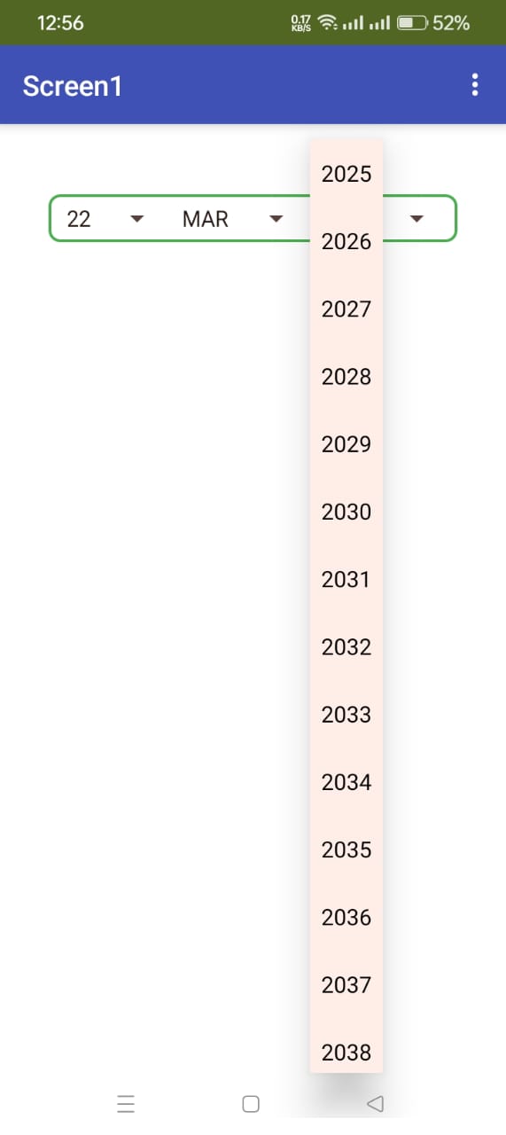
- Customizable Year Range: Define a specific year range for the picker, which is ideal for apps with date constraints.
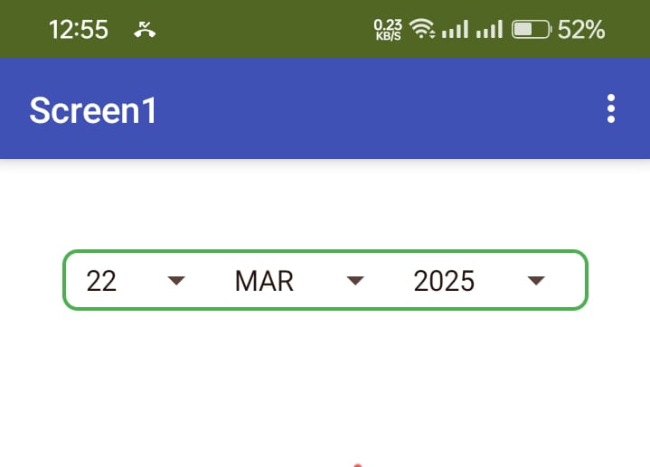
- Date Selection: Users can easily select a day, month, and year, and the picker will automatically update the selected date.
- Automatic Text Color: The text color adjusts automatically when the background color is set to dark, ensuring optimal readability.
- Event Handling: Trigger events when the date is changed, allowing developers to respond dynamically to user input.
Blocks Overview:
The Wheel Calendar Picker extension offers several blocks that allow developers to interact with and customize the calendar picker. Here is a breakdown of the available blocks and their functionality:
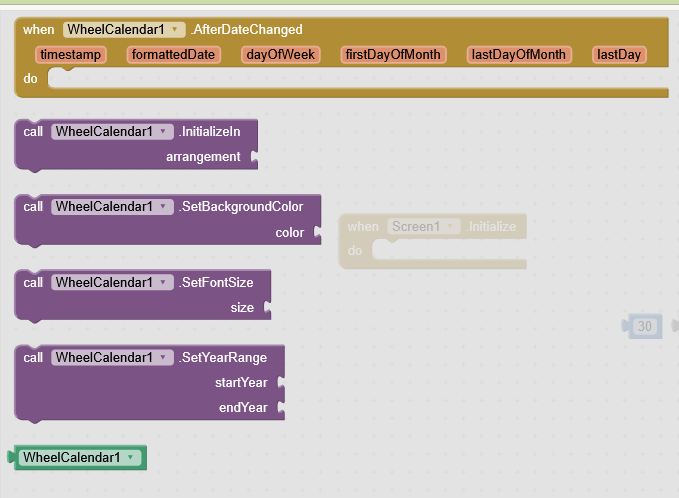
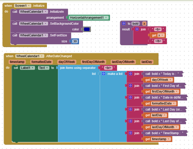
InitializeIn(Procedure)
- Purpose: Initializes the calendar picker and adds it to an arrangement in your app.
- Input:
hVArrangement: The arrangement (container) where the calendar picker will be placed.
- Output: None (void procedure).
- Usage: This block must be used to initialize the picker in an arrangement, setting it up for use in your app.
SetBackgroundColor(Function)
- Purpose: Sets the background color of the calendar picker.
- Input:
Color: A color value (e.g.,0xFFFFFFFFfor white,0xFF000000for black).
- Output: None (void procedure).
- Usage: Use this block to change the background color of the calendar picker to match your app's design.
SetFontSize(Function)
- Purpose: Sets the font size for the text within the calendar picker.
- Input:
Size: An integer value representing the font size (e.g.,20for font size 20).
- Output: None (void procedure).
- Usage: Use this block to modify the font size of the day, month, and year text.
SetYearRange(Function)
- Purpose: Sets the range of years available for selection in the calendar picker.
- Input:
StartYear: The starting year (e.g.,1900).EndYear: The ending year (e.g.,2100).
- Output: None (void procedure).
- Usage: Use this block to define the minimum and maximum years users can select.
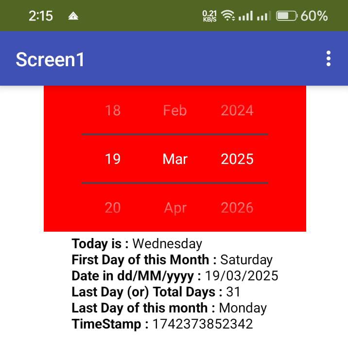
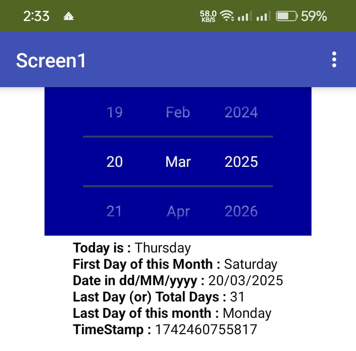
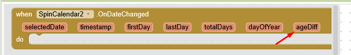
AfterDateChanged(Event)
- Purpose: This event is triggered whenever the user changes the selected date (day, month, or year) using the picker.
- Inputs:
TimeInMillis: The date in milliseconds (long value).FormattedDate: The selected date formatted as a string indd/MM/yyyyformat.DayOfWeek: The day of the week (e.g., "Monday", "Tuesday").FirstDayOfMonth: The first day of the selected month (e.g., "Monday").LastDayOfWeek: The last day of the selected month (e.g., "Sunday").LastDay: The total number of days in the selected month (e.g., 28, 29, 30, or 31).
- Usage: This event provides all the necessary information about the updated date. You can use it to trigger further actions, such as updating other parts of your app based on the selected date.
Available Blocks
Blocks Setup
Output
Extension
Version 1: WheelCalendarV1.0.aix (14.1 KB) 2025-03-18T18:30:00Z
Version 2: Destroyed
Version 3: SpinCalendarV3.aix (12.7 KB) 2025-03-21T18:30:00Z
Spin Calendar Images:
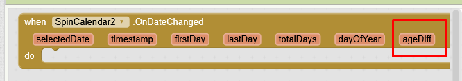
ageDiff will give the users age compare with current date, Also it will alert you how many days is there yet to attain his next birthday
Published on :
V1: 2025-03-18T18:30:00Z
V2: N/A
V3: 2025-03-21T18:30:00Z
Please test this Very Simple Extension and share your valuable feedback.
Extension created by using Niotron IDE and no external lib are used.
Views are welcome for any updation.
Thanks a lot