🧩 TimeSelectView
An extension for MIT App Inventor 2.A custom time selection view developed by TechHamara using Fast. This component allows users to visually select time ranges within a 24-hour period. It features a circular interface with anchors for start and end times, degree markers, and number markers for each hour. The component is highly customizable, offering properties to change the appearance and behavior of the time selection view.
Telegram | GitHub
Blogger | YouTube
Find More Extension
Terms & Conditions
 Specifications
 Package: io.th.timeselectview
 Size: 27.64 KB
 Version: 1.1
 Minimum API Level: 7
 Updated On: 2025-06-05T18:30:00Z
 Built & documented using: FAST v2.8.4
Library zjun615 thank you for your awesome library.
 Download aix
io.th.timeselectview.aix (27.6 KB)
Get aia here
time_select_view.aia (28.8 KB)
 Get apk on GitHub here
Demo
Blocks


Documentation
Events:
TimeSelectView has total 5 events.
TimeChanged
Event raised when time sections are changed. Returns a list of sections, where each section is a list of [startMinute, endMinute].
| Parameter | Type |
|---|---|
| sections | list |
TimeInserted
Event raised when a new time section is inserted. Returns the start and end minutes.
| Parameter | Type |
|---|---|
| startMinute | number |
| endMinute | number |
SelectionStarted
Event raised when time selection starts. Minutes are from midnight (0-1440 in 24h mode, 0-60 in 1h mode).
| Parameter | Type |
|---|---|
| minute | number |
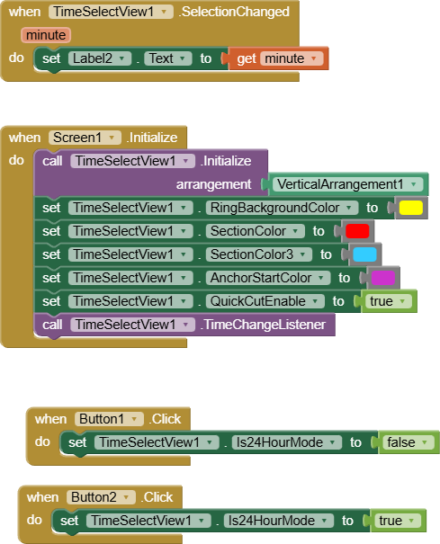
SelectionChanged
Event raised when time selection changes. Minutes are from midnight.
| Parameter | Type |
|---|---|
| minute | number |
SelectionFinished
Event raised when time selection finishes
Methods:
TimeSelectView has total 6 methods.
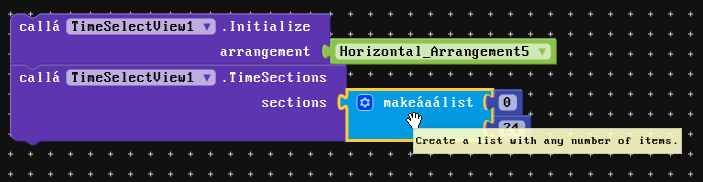
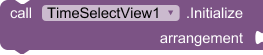
Initialize
Initialize inside an arrangement.
| Parameter | Type |
|---|---|
| arrangement | component |
TimeChangeListener
Registers a listener to be notified when the selected time changes.
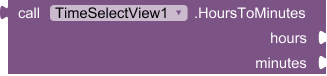
HoursToMinutes
Convert hours and minutes to total minutes from midnight. Example: HoursToMinutes(9, 30) returns 570 for 09:30.
- Return type:
number
| Parameter | Type |
|---|---|
| hours | number |
| minutes | number |
GetHour
Get hour component from minutes from midnight. Example: GetHour(570) returns 9.
- Return type:
number
| Parameter | Type |
|---|---|
| minutesFromMidnight | number |
GetMinute
Get minute component from minutes from midnight. Example: GetMinute(570) returns 30.
- Return type:
number
| Parameter | Type |
|---|---|
| minutesFromMidnight | number |
FormatTime
Format minutes from midnight as HH:mm string. Example: FormatTime(570) returns '09:30'.
- Return type:
text
| Parameter | Type |
|---|---|
| minutesFromMidnight | number |
Setters:
TimeSelectView has total 24 setter properties.
RingWidth
Width of the ring in dp
- Input type:
number
RingBackgroundColor
Background color of the ring
- Input type:
number
SectionColor
Color of the time sections
- Input type:
number
SectionColor2
Second color for gradient (optional, use -1 to disable)
- Input type:
number
SectionColor3
Third color for gradient (optional, use -1 to disable)
- Input type:
number
AnchorDiameter
Diameter of the anchor points in dp
- Input type:
number
AnchorStrokeWidth
Stroke width of anchor points in dp
- Input type:
number
AnchorTextSize
Text size of anchor points in sp
- Input type:
number
AnchorNeedMerge
Whether to merge overlapping anchors when start=0 and end=1440 (full day)
- Input type:
boolean
AnchorStartColor
Color of the start anchor
- Input type:
number
AnchorStartStrokeColor
Stroke color of the start anchor
- Input type:
number
AnchorStartText
Text for the start anchor
- Input type:
text
AnchorStartTextColor
Text color of the start anchor
- Input type:
number
AnchorEndColor
Color of the end anchor
- Input type:
number
AnchorEndStrokeColor
Stroke color of the end anchor
- Input type:
number
AnchorEndText
Text for the end anchor
- Input type:
text
AnchorEndTextColor
Text color of the end anchor
- Input type:
number
DegreeColor
Color of the degree markers
- Input type:
number
NumberSize
Size of the hour number markers in sp
- Input type:
number
NumberColor
Color of the hour number markers
- Input type:
number
QuickCutEnable
Enable quick cut functionality (tap within a section to set end time to that point)
- Input type:
boolean
SectionSum
Maximum number of time sections allowed (1-24)
- Input type:
number
InitialMinutes
Initial duration in minutes when creating new time sections by tapping on the ring (1-1440)
- Input type:
number
Is24HourMode
When true, displays 24-hour mode (0-23 hours, 0-1440 minutes). When false, displays 1-hour mode (0-60 minutes). Changing this clears existing time sections.
- Input type:
boolean
Getters:
TimeSelectView has total 24 getter properties.
RingWidth
Width of the ring in dp
- Return type:
number
RingBackgroundColor
Background color of the ring
- Return type:
number
SectionColor
Color of the time sections
- Return type:
number
SectionColor2
Second color for gradient (optional, use -1 to disable)
- Return type:
number
SectionColor3
Third color for gradient (optional, use -1 to disable)
- Return type:
number
AnchorDiameter
Diameter of the anchor points in dp
- Return type:
number
AnchorStrokeWidth
Stroke width of anchor points in dp
- Return type:
number
AnchorTextSize
Text size of anchor points in sp
- Return type:
number
AnchorNeedMerge
Whether to merge overlapping anchors when start=0 and end=1440 (full day)
- Return type:
boolean
AnchorStartColor
Color of the start anchor
- Return type:
number
AnchorStartStrokeColor
Stroke color of the start anchor
- Return type:
number
AnchorStartText
Text for the start anchor
- Return type:
text
AnchorStartTextColor
Text color of the start anchor
- Return type:
number
AnchorEndColor
Color of the end anchor
- Return type:
number
AnchorEndStrokeColor
Stroke color of the end anchor
- Return type:
number
AnchorEndText
Text for the end anchor
- Return type:
text
AnchorEndTextColor
Text color of the end anchor
- Return type:
number
DegreeColor
Color of the degree markers
- Return type:
number
NumberSize
Size of the hour number markers in sp
- Return type:
number
NumberColor
Color of the hour number markers
- Return type:
number
QuickCutEnable
Enable quick cut functionality (tap within a section to set end time to that point)
- Return type:
boolean
SectionSum
Maximum number of time sections allowed (1-24)
- Return type:
number
InitialMinutes
Initial duration in minutes when creating new time sections by tapping on the ring (1-1440)
- Return type:
number
Is24HourMode
When true, displays 24-hour mode (0-23 hours, 0-1440 minutes). When false, displays 1-hour mode (0-60 minutes). Changing this clears existing time sections.
- Return type:
boolean
Update
Update
- Remove time sections function to simplify this function.
- new function Is24HourMode
When true, displays 24-hour mode (0-23 hours, 0-1440 minutes). When false, displays 1-hour mode (0-60 minutes). Changing this clears existing time sections.
Thanks
TechHamara
Feel free to contact us any quarry or suggestions.