you can add a option to select a range of text?
I am looking for a way to do that. Thank you.
Maybe this one can help you
@SimpleFunction(description = "Test")
public void SelectText(int start, int end) {
textbox.setSelection(start - 1, end - 1);
}
Probably this would help.
@SimpleFunction(description = "Selects the text of the TextBox according to the start and the end position. Only works if the TextBox is focused.")
    public void SelectPartial(AndroidViewComponent textBox, int start, int end) {
    View view = textBox.getView();
    EditText edit = (EditText) view;
    edit.setSelection(start - 1, end);
}
Version 4 updated!
New blocks:
AlignText
Aligns the text of the TextBox. 1 is left, 2 is center and 3 is right.
Parameters: textBox = component, position = number (int)
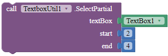
SelectPartial
Selects the text of the TextBox according to the start and the end position. Only works if the TextBox is focused.
Parameters: textBox = component, start = number (int), end = number (int)
Oh! Yes,
A perfect gooseman that can make life easy. 
*Just for fun. Don't take it seriously. 
Version 5 updated!
New blocks:
Methods
MoveCursorPosition
Moves the cursor to the specific position. Only works when the TextBox is focused.
Parameters: textBox = component, position = number (int)
SetFont
Sets the font type of the TextBox. Use the blocks in the properties of this extension for the font parameter.
Parameters: textBox = component, font = text
SetTypeface
Sets the font type of the TextBox. Use the blocks in the properties of this extension for the font parameter.
Parameters: textBox = component, bold = boolean, italic = boolean
Properties
DefaultFont
A font block.
Returns: "DEFAULT"
Monospace
A font block.
Returns: "MONOSPACE"
SansSerif
A font block.
Returns: "SANS SERIF"
Serif
A font block.
Returns: "SERIF"
You can set textbox direct like view
I'll try. I never thought setSelection can apply to View.
Add one more properties
@DesignerProperty(editorType = PropertyTypeConstants.PROPERTY_TYPE_BOOLEAN,
defaultValue = "True")
@SimpleProperty(category = PropertyCategory.APPEARANCE)
public void CursorVisible(boolean enabled) {
if(enabled){
view.setCursorVisible(enabled);
view.invalidate();
}
}
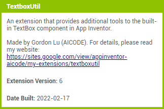
Version 6 available!
Updated description of extension.

Combined SetFont and SetTypeface blocks to SetFontTypeface.
New blocks:
SetCursorVisibility
Sets the visibility of the cursor.
Parameters: textBox = component, visible = boolean
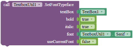
SetFontTypeface
Sets the font typeface of the TextBox, including whether to bold, italicize, and the font of the TextBox. Use the blocks in the properties of this extension for the font parameter. If useCurrentFont is true, the font parameter will be ignored.
Parameters: textBox = component, bold = boolean, italic = boolean, font = text, useCurrentFont = boolean
Version 7 available!
DismissErrorMessage
Clears the error message shown on the tip of the given TextBox.
Parameters: textBox = component
SetHintColor
Sets the hint color for the given TextBox.
Parameters: textBox = component, color = color
SetMaxLines
Sets the maximum lines the TextBox can contain. This block only works with TextBoxes with normal input type.
Parameters: textBox = component, lines = number (int)
ShowErrorMessage
Shows an error message on the tip of the given TextBox.
Parameters: textBox = component, message = text
P.S. All features except RemoveFocus are available with the aiStarter Android emulator.
Version 8!
SetElevation
Sets the elevation for the given TextBox in pixels.
Parameters: textBox = component, elevation = number (float)
SetInputType
Sets the input type for the TextBox. Use the blocks in the Properties to set the type parameter.
Parameters: textBox = component, type = number (int)
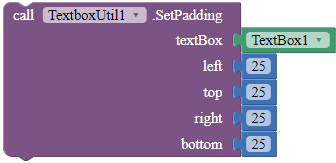
SetPadding
Sets the padding of the given TextBox.
Parameters: textbox = component, left = number (int), top = number (int), right = number (int), bottom = number (int)
SetRotation
Rotates the TextBox according to the rotation angle.
Parameters: textBox = component, rotation = number (float)
Oh yes
Now tell textbox component to leave his job. Because now no need of him. The extensions are the king now. 
We have more options to add in this lol 
我都不知道該用哪一版了 
I don't know which version to study.
現在下載 ,現在是最後一版。
ENGLISH: This is the latest version. Read the main post to download.
Tks your help! 
At the moment in my four textbobes the cursor shows up as a very tiny line.
How could I make the cursors bigger and more noticeable ?


