Enhance Your App's Design with Custom Shadows, Gradients, and Borders!
The StyledLayout extension, empowers App Inventor creators to bring modern and visually appealing designs to their applications. Go beyond basic styling and add realistic shadows, vibrant gradient backgrounds, and custom borders to your VerticalArrangement and HorizontalArrangement components.
Key Features
- Realistic Blending Shadows: Apply soft, diffused shadows with adjustable color, opacity, offset, and blur radius.
- Gradient Backgrounds: Create smooth color transitions with customizable start and end colors, and various orientations (vertical, horizontal, diagonal).
- Custom Borders: Add borders with control over size, color, and transparency.
- Flexible Application: Apply shadows with either solid or gradient backgrounds, or just a standalone gradient.
- Dynamic Removal: Easily remove applied custom styles to revert components.
How to Use
- Import the Extension:
- Download the
StyledLayout.aixfile (after compiling your Java code). - In your App Inventor project, go to the Palette on the left, scroll down to "Extension," and click "Import extension."
- Choose the
.aixfile and click "Import." - Drag the
StyledLayoutcomponent from the "Extension" category onto your screen. It's a non-visible component.
- **Understanding the Blocks:**The extension provides several powerful blocks:
-
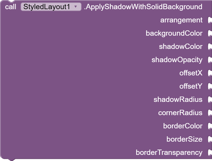
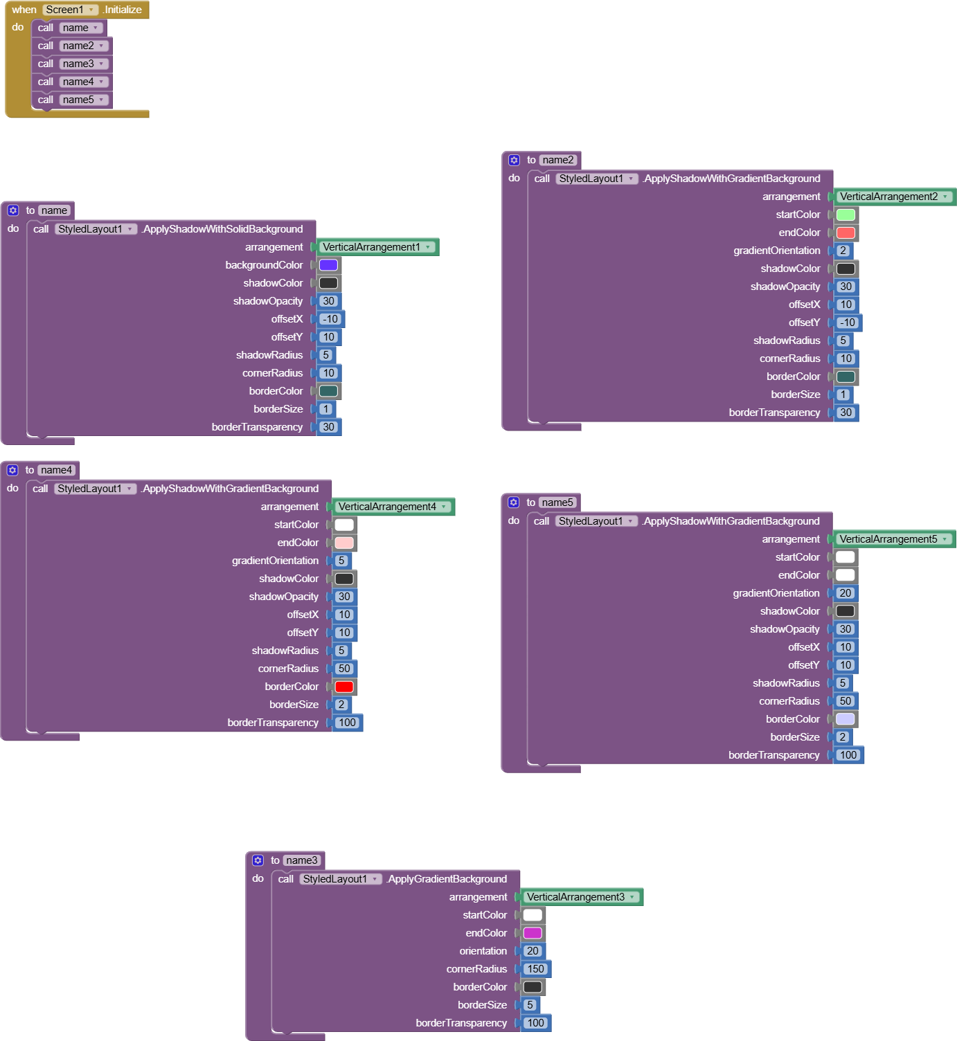
ApplyShadowWithSolidBackground
- Purpose: Applies a blending shadow to your arrangement, with a solid background color.
- Parameters:
arrangement: YourVerticalArrangementorHorizontalArrangementcomponent.backgroundColor: The solid color (ARGB integer) for the arrangement's main body (e.g.,Colors.White).shadowColor: The base color (RGB integer, e.g.,Colors.Black) for the shadow. Its transparency will be controlled byshadowOpacity.shadowOpacity: The shadow's transparency (0 = fully transparent, 100 = fully opaque).offsetX: Horizontal shift of the shadow in pixels (positive = right).offsetY: Vertical shift of the shadow in pixels (positive = down).shadowRadius: The blur intensity of the shadow in pixels (higher = softer).cornerRadius: The roundness of the corners for both the arrangement and its shadow in pixels (0 = sharp corners).borderColor: The base color (RGB integer) for the border. Its transparency will be controlled byborderTransparency.borderSize: The thickness of the border in pixels (0 = no border).borderTransparency: The border's transparency (0 = fully transparent, 100 = fully opaque).
-
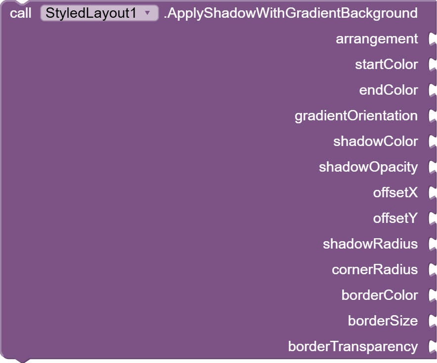
ApplyShadowWithGradientBackground
- Purpose: Applies a blending shadow to your arrangement, with a gradient background.
- Parameters:
arrangement: YourVerticalArrangementorHorizontalArrangementcomponent.startColor: The starting color (ARGB integer) of the gradient.endColor: The ending color (ARGB integer) of the gradient.gradientOrientation: The direction of the gradient. Use theORIENTATION_constants (see below).shadowColor: (Same as above)shadowOpacity: (Same as above)offsetX: (Same as above)offsetY: (Same as above)shadowRadius: (Same as above)cornerRadius: (Same as above)borderColor: (Same as above)borderSize: (Same as above)borderTransparency: (Same as above)
-
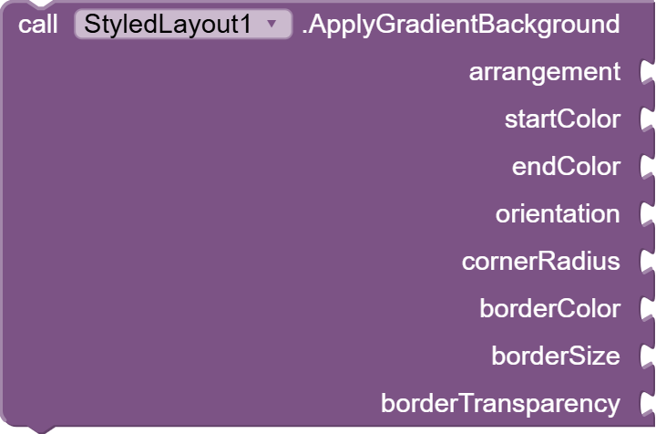
ApplyGradientBackground
- Purpose: Applies only a gradient background to your arrangement, without a shadow.
- Parameters:
arrangement: YourVerticalArrangementorHorizontalArrangementcomponent.startColor: The starting color (ARGB integer) of the gradient.endColor: The ending color (ARGB integer) of the gradient.orientation: The direction of the gradient. Use theORIENTATION_constants (see below).cornerRadius: The roundness of the corners for the gradient background in pixels (0 = sharp corners).borderColor: (Same as above)borderSize: (Same as above)borderTransparency: (Same as above)
-
RemoveShadow
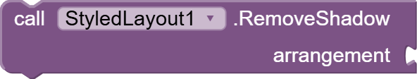
- Purpose: Removes any custom shadow or gradient background applied by this extension, reverting the arrangement's background to its default (usually transparent).
- Parameters:
arrangement: YourVerticalArrangementorHorizontalArrangementcomponent.
- Gradient Orientation Constants: When using
ApplyShadowWithGradientBackgroundorApplyGradientBackground, you'll find these constants under theStyledLayoutcomponent in the Blocks Editor:
ORIENTATION_TOP_BOTTOMORIENTATION_TR_BL(Top-Right to Bottom-Left)ORIENTATION_RIGHT_LEFTORIENTATION_BR_TL(Bottom-Right to Top-Left)ORIENTATION_BOTTOM_TOPORIENTATION_BL_TR(Bottom-Left to Top-Right)ORIENTATION_LEFT_RIGHTORIENTATION_TL_BR(Top-Left to Bottom-Right)
Important Considerations
- Component Dimensions: For the shadow to render correctly, ensure your
VerticalArrangementorHorizontalArrangementhas been laid out and has a width and height greater than zero. It's often best to call these functions inScreen.Initializeor after any operations that might change the arrangement's size or visibility. - ARGB Colors: All color parameters (e.g.,
backgroundColor,startColor,endColor,shadowColor,borderColor) expect an ARGB integer value. In App Inventor, you can get these from theColorsblock or by using theMake Colorblock. Remember thatshadowColorandborderColorwill have their alpha (transparency) component overridden by their respectiveopacity/transparencyparameters. - Pixels vs. DP: All size-related parameters (
offsetX,offsetY,shadowRadius,cornerRadius,borderSize) are in pixels . App Inventor's default units are often pixels, but be mindful if you are converting from density-independent pixels (dp) in your design. - Background Overwrite: Applying any of these custom styling blocks will overwrite any background color or image previously set directly in the App Inventor designer for that arrangement. Use
RemoveShadowto clear the custom styling.
Compatibility
- The realistic shadow effects (blur) are fully functional on Android Lollipop (API 21) and above . On older Android versions, the shadow effect may not appear, or an error might be dispatched (as indicated in the Java code).
- Gradient backgrounds and borders should work across a wider range of Android versions.
Sample Block Code:
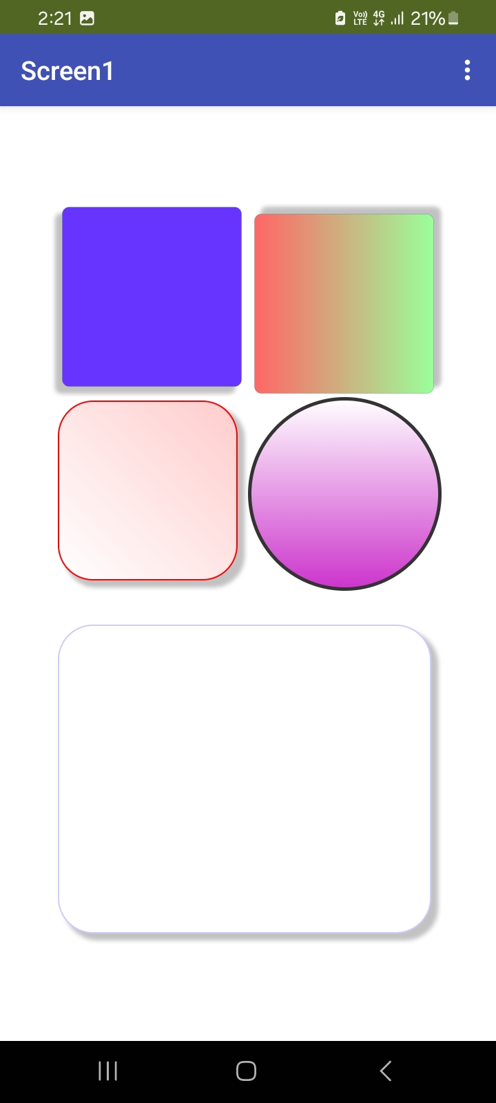
Sample OutPut:
If you find this extension useful and wish to support further development, you can support us via: PayPal.Me
License: Developed by Kenneth Mark Morales with Fast builder.
You can download the aix extension provided bellow.
StyledLayout aix extension Download Link:
com.kenmor.styledlayout.aix (11.5 KB)