Free StyledButton AIX Extension
By Kenneth Oragon
Overview
The StyledButton extension allows you to fully customize any Button component in MIT App Inventor with:
-
Gradient or solid background colors
-
Custom corner radius and stroke (border)
-
Start and end icons (from asset or URL)
-
Custom font and text color
-
Custom pressed-state color
This extension is perfect for developers who want to give their apps a modern UI style.
How to Use
-
Drag a Button component from the Designer.
-
Add the StyledButton extension.
-
Call Button block and connect it to the button you want to style.
-
Customize appearance using the blocks below.
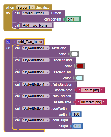
Binding
Button(component)
Purpose: Binds the StyledButton extension to a Button component.
Use first before any other block.
Example:
StyledButton.Button(Button1)
Background Styling
GradientStart(color)

Sets the starting color of the gradient background.
GradientEnd(color)

Sets the ending color of the gradient.
If not used, a solid background will be applied using NormalColor.
NormalColor(color)

Sets a solid color for the button background (used if gradient is not set).
PressedColor(color)

Changes the background color when the button is pressed.
Border & Corner
StrokeColor(color)

Set the border color.
StrokeWidth(width)

Sets the border width in pixels.
CornerRadius(radius)

Sets how rounded the corners of the button are.
Icons
PathStartIcon(assetName)
Adds an icon on the left side of the text from your app's assets.
PathEndIcon(assetName)

Adds an icon on the right side of the text from your app's assets.
UrlStartIcon(url)

Loads an icon from a URL and places it on the left.
UrlEndIcon(url)

Loads an icon from a URL and places it on the right.
IconWidth(width)

Sets the icon width in pixels.
IconHeight(height)
Sets the icon height in pixels.

Font & Text
Font(fontAsset)
Loads a custom font (from the assets folder).
Example: "fonts/MyFont.ttf"
TextColor(color)

Sets the text color.
 Reset
Reset
ResetStyle()
Resets the button to default values:
-
White background
-
Light gray pressed color
-
Black border, text
-
No gradient
-
No icons
-
Corner radius = 20
-
Stroke width = 0
Example Setup
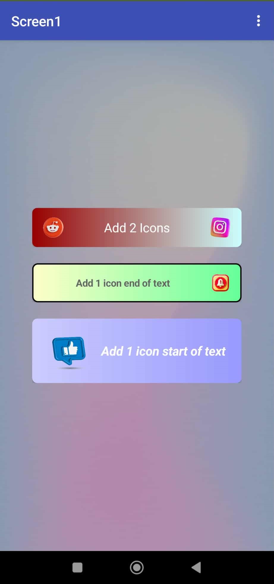
Sample Output:
Compatibility
Works with any Button-based component like:
-
Button
-
Notifier buttons (custom layout)
-
Extension-based buttons
Suitable for any Android device supported by MIT App Inventor.
Notes
-
Always call Button(...) before applying styles.
-
Icon images should be small for performance.
If using custom fonts, make sure they are added to the assets folder in .aia.
 License & Contribution
You are free to use and distribute this extension.
If you'd like to contribute improvements or ideas, feel free to fork or suggest updates in the community.
 Good extension I rate it 7/10 You did well :3