🧩 SemiCircleArc
An extension for MIT App Inventor 2.An advanced, customizable semi-circle progress bar extension for MIT App Inventor 2.
##Features
- **Smooth Animation**: Animate progress changes smoothly.
- **Custom Gradients**: Support for gradients on the progress bar, placeholder, and background.
- **Dual Text Support**: Display both the percentage and a custom label (e.g., "Loading...").
- **Custom Fonts**: Load custom fonts (TTF/OTF) from assets or storage.
- **Full Customization**: Control colors, sizes, widths, and padding for all elements.
Developed by TechHamara using Fast.
Find More Extension
Terms & Conditions
Find More On BuyMeCoffee Page
 Specifications
 Package: io.th.semicirclearc
 Size: 16.20 KB
 Version: 1.0
 Minimum API Level: 7
 Updated On: 2026-01-17T18:30:00Z
 Built & documented using: FAST v2.8.4
 Library Used thank you hadibtf for your SemiCircleArcProgressBar library.
 Sponsor by Kushagra Innovations @Kushagra_Innovations
 Get aix here io.th.semicirclearc.aix (16.2 KB)
Get aia here semi_arc.aia (1.0 MB)
Find more info and apk on GitHub
Demo
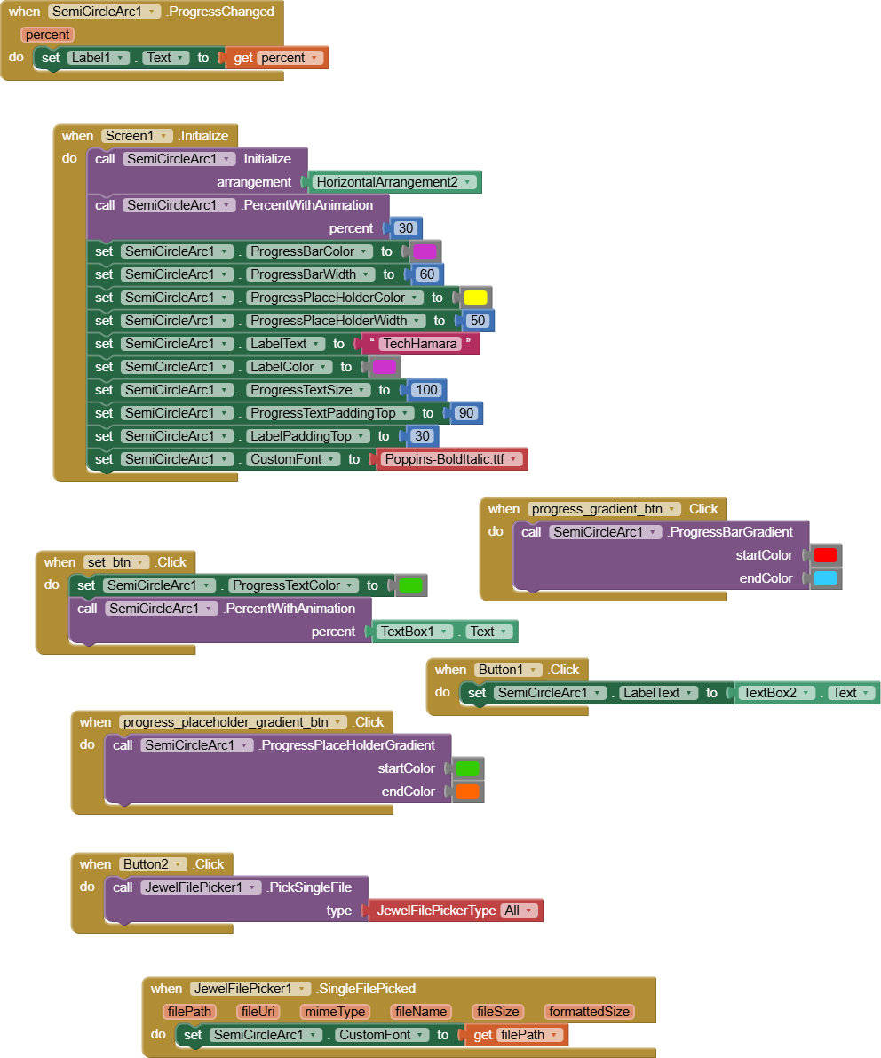
Blocks
Documentations
Events:
SemiCircleArc has total 2 events.
AnimationFinished
Event raised when the progress animation finishes.
ProgressChanged
Event raised when the progress changes.
| Parameter | Type |
|---|---|
| percent | number |
Methods:
SemiCircleArc has total 6 methods.
Initialize
Initialize inside an arrangement.
| Parameter | Type |
|---|---|
| arrangement | component |
ProgressBarGradient
Set the progress bar gradient colors.
| Parameter | Type |
|---|---|
| startColor | number |
| endColor | number |
ProgressPlaceHolderGradient
Set the placeholder gradient colors.
| Parameter | Type |
|---|---|
| startColor | number |
| endColor | number |
BackgroundGradient
Set the background gradient colors.
| Parameter | Type |
|---|---|
| startColor | number |
| endColor | number |
PercentWithAnimation
Set the percentage with animation.
| Parameter | Type |
|---|---|
| percent | number |
ResetFont
Resets Font to default Sans Serif Font
Designer:
SemiCircleArc has total 1 designer property.
CustomFont
- Input type:
asset
Setters:
SemiCircleArc has total 17 setter properties.
ProgressPlaceHolderColor
Set the color of the progress placeholder.
- Input type:
number
ProgressBarColor
Set the color of the progress bar.
- Input type:
number
ProgressPlaceHolderWidth
Set the width of the progress placeholder.
- Input type:
number
ProgressBarWidth
Set the width of the progress bar.
- Input type:
number
ShowProgressText
Show or hide the percentage text.
- Input type:
boolean
ProgressTextColor
Set the text color.
- Input type:
number
ProgressTextSize
Set the text size.
- Input type:
number
ProgressTextPaddingTop
Set the text top padding.
- Input type:
number
ProgressTextPaddingBottom
Set the text bottom padding.
- Input type:
number
BackgroundColor
Set the background color.
- Input type:
number
LabelText
Set the label text.
- Input type:
text
LabelColor
Set the label text color.
- Input type:
number
LabelSize
Set the label text size.
- Input type:
number
LabelPaddingTop
Set the label top padding.
- Input type:
number
LabelPaddingBottom
Set the label bottom padding.
- Input type:
number
Percent
Set the current percentage.
- Input type:
number
CustomFont
Set the custom font. Input type: asset
- Input type:
text
Thanks
TechHamara