🏃♂️ RulerView
An extension for MIT App Inventor 2. Specifications
 Package: io.th.rulerview
 Size: 66.96 KB
 Version: 1.0
 Minimum API Level: 7
 Updated On: 2025-05-23T18:30:00Z
 Built & documented using: FAST v2.8.4
 Library Use from zjun615 thank you for awesome lib.
 Get aix
Get aia
Get apk
 Find more info on GitHub
 Multi-Components
Demo
Ruler Docs
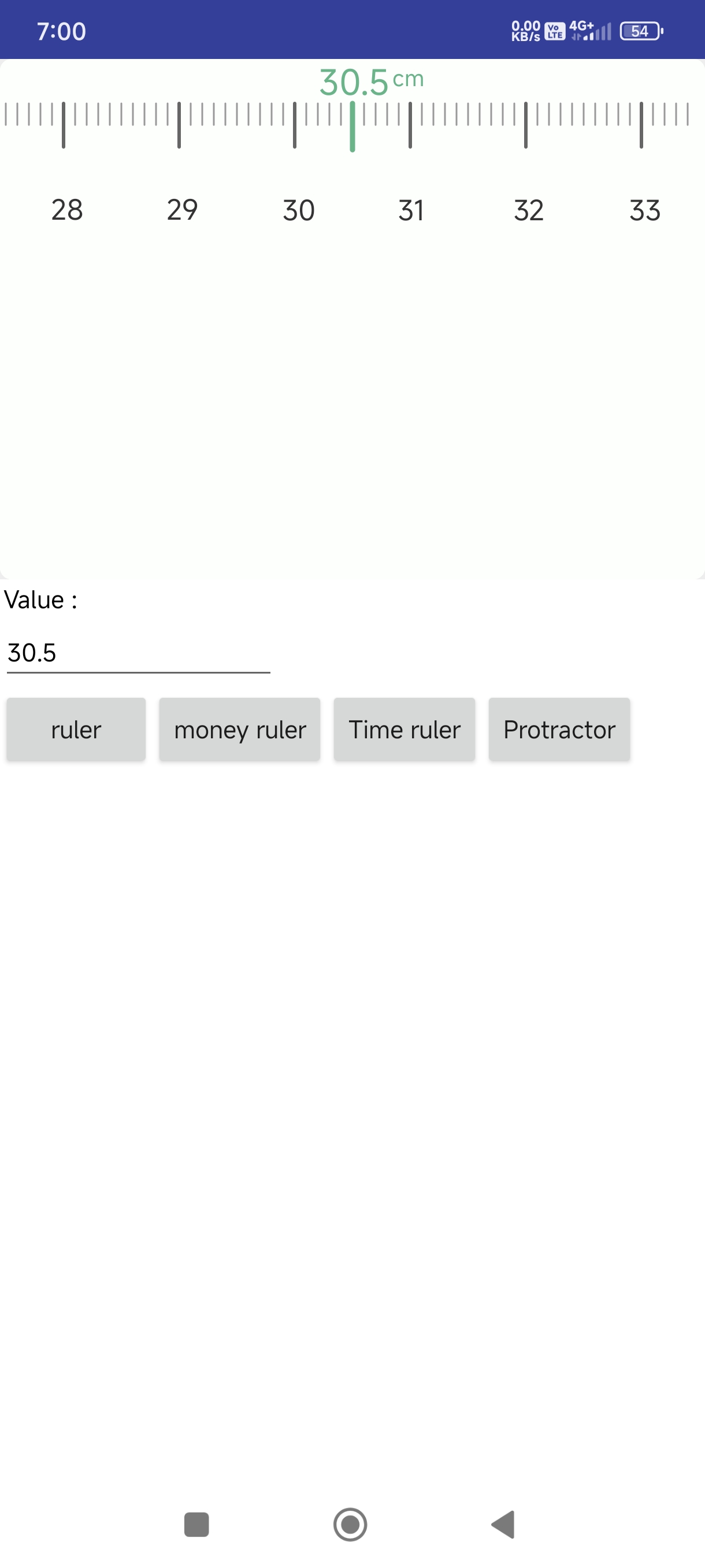
 RulerView
This is a custom Ruler View component developed by TechHamara using Fast. It allows users to interactively scroll and select a value on a ruler scale.
Telegram | GitHub
Blogger | YouTube
Find More Extension
Terms & Conditions
Events:
RulerView has total 2 events.
ScaleChanged
Event raised when the scale value changes.
| Parameter | Type |
|---|---|
| value | text |
ScaleChangeEnded
Event raised when scrolling stops and the final scale value is selected.
| Parameter | Type |
|---|---|
| value | text |
Methods:
RulerView has total 2 methods.
Initialize
Initialize inside an arrangement.
| Parameter | Type |
|---|---|
| arrangement | component |
GetCurrentScale
Get the current scale value.
- Return type:
text
Setters:
RulerView has total 25 setter properties.
ScaleLimit
Set the scale limit. This is the multiplier for the scale values.
- Input type:
number
RulerHeight
Set the ruler height in pixels.
- Input type:
number
RulerToResultGap
Set the gap between ruler and result in pixels.
- Input type:
number
ScaleCount
Set how many segments between large scale marks.
- Input type:
number
ScaleGap
Set the gap between scale marks in pixels.
- Input type:
number
MinScale
Set the minimum scale value.
- Input type:
number
FirstScale
Set the initial scale value to display.
- Input type:
number
MaxScale
Set the maximum scale value.
- Input type:
number
BackgroundColor
Set the background color of the ruler.
- Input type:
number
SmallScaleColor
Set the color of the small scale marks.
- Input type:
number
MidScaleColor
Set the color of the middle scale marks.
- Input type:
number
LargeScaleColor
Set the color of the large scale marks.
- Input type:
number
ScaleNumberColor
Set the color of the scale numbers.
- Input type:
number
ResultNumberColor
Set the color of the result number.
- Input type:
number
Unit
Set the unit text (e.g. 'kg', 'cm').
- Input type:
text
UnitColor
Set the color of the unit text.
- Input type:
number
SmallScaleStroke
Set the thickness of small scale marks in pixels.
- Input type:
number
MidScaleStroke
Set the thickness of middle scale marks in pixels.
- Input type:
number
LargeScaleStroke
Set the thickness of large scale marks in pixels.
- Input type:
number
ResultNumberTextSize
Set the text size of the result number in pixels.
- Input type:
number
ScaleNumberTextSize
Set the text size of scale numbers in pixels.
- Input type:
number
UnitTextSize
Set the text size of the unit text in pixels.
- Input type:
number
ShowScaleResult
Show or hide the scale result display.
- Input type:
boolean
BackgroundRoundRect
Set whether the background should have rounded corners.
- Input type:
boolean
ScrollToScale
Move the ruler to a specific scale value.
- Input type:
number
Getters:
RulerView has total 24 getter properties.
ScaleLimit
Set the scale limit. This is the multiplier for the scale values.
- Return type:
number
RulerHeight
Set the ruler height in pixels.
- Return type:
number
RulerToResultGap
Set the gap between ruler and result in pixels.
- Return type:
number
ScaleCount
Set how many segments between large scale marks.
- Return type:
number
ScaleGap
Set the gap between scale marks in pixels.
- Return type:
number
MinScale
Set the minimum scale value.
- Return type:
number
FirstScale
Set the initial scale value to display.
- Return type:
number
MaxScale
Set the maximum scale value.
- Return type:
number
BackgroundColor
Set the background color of the ruler.
- Return type:
number
SmallScaleColor
Set the color of the small scale marks.
- Return type:
number
MidScaleColor
Set the color of the middle scale marks.
- Return type:
number
LargeScaleColor
Set the color of the large scale marks.
- Return type:
number
ScaleNumberColor
Set the color of the scale numbers.
- Return type:
number
ResultNumberColor
Set the color of the result number.
- Return type:
number
Unit
Set the unit text (e.g. 'kg', 'cm').
- Return type:
text
UnitColor
Set the color of the unit text.
- Return type:
number
SmallScaleStroke
Set the thickness of small scale marks in pixels.
- Return type:
number
MidScaleStroke
Set the thickness of middle scale marks in pixels.
- Return type:
number
LargeScaleStroke
Set the thickness of large scale marks in pixels.
- Return type:
number
ResultNumberTextSize
Set the text size of the result number in pixels.
- Return type:
number
ScaleNumberTextSize
Set the text size of scale numbers in pixels.
- Return type:
number
UnitTextSize
Set the text size of the unit text in pixels.
- Return type:
number
ShowScaleResult
Show or hide the scale result display.
- Return type:
boolean
BackgroundRoundRect
Set whether the background should have rounded corners.
- Return type:
boolean
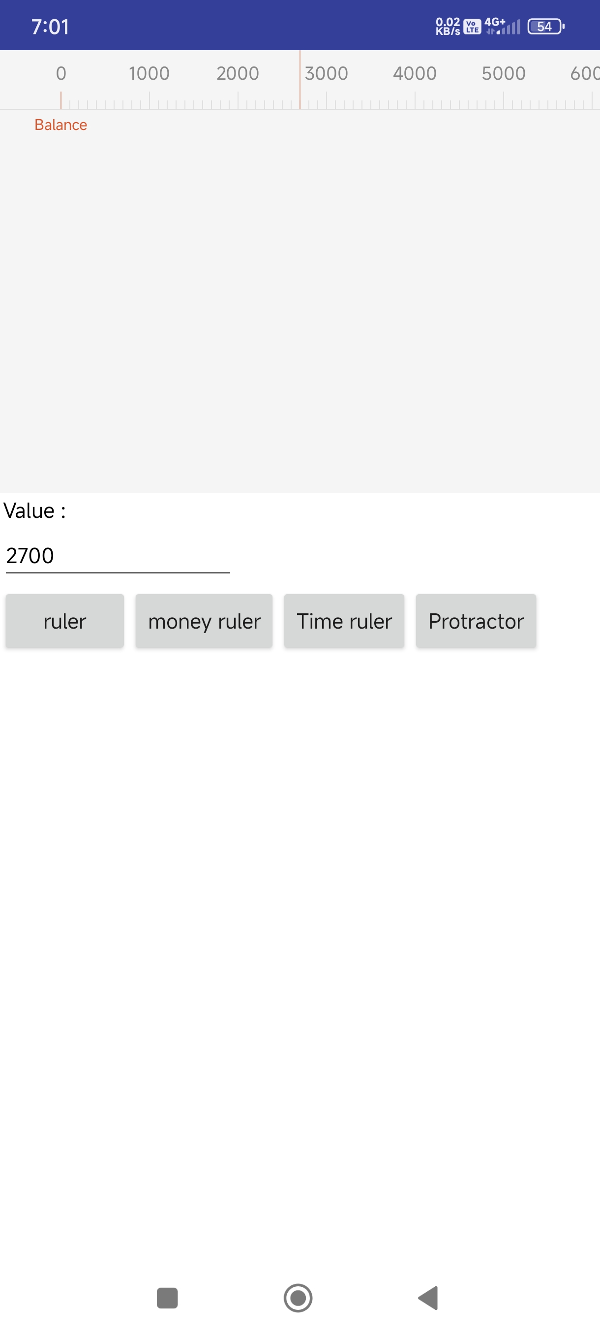
MoneyRuler
MoneyRuler
This is a custom Money Ruler View component developed by TechHamara using Fast. It allows users to interactively scroll and select a value on a ruler scale. The component is designed to provide a seamless user experience for selecting values within a defined range.
Telegram | GitHub
Blogger | YouTube
Find More Extension
Terms & Conditions
Events:
MoneyRuler has total 2 events.
ScaleChanged
Event raised when the scale value changes.
| Parameter | Type |
|---|---|
| value | text |
ScaleChangeEnded
Event raised when scrolling stops and the final scale value is selected.
| Parameter | Type |
|---|---|
| value | text |
Methods:
MoneyRuler has total 8 methods.
Initialize
Initialize inside an arrangement.
| Parameter | Type |
|---|---|
| arrangement | component |
GetValue
Get the current value.
- Return type:
number
GetBalance
Get the balance value.
- Return type:
number
ResetToZero
Reset the ruler value to zero.
GoToValue
Go to a specific value on the ruler. This is equivalent to setting the Value property.
| Parameter | Type |
|---|---|
| value | number |
Cleanup
Removes the ruler view and cleans up resources.
HeightInDP
Set the height of the ruler in density-independent pixels (dp). This provides consistent sizing across different screen densities.
| Parameter | Type |
|---|---|
| dp | number |
StandardHeight
Sets the ruler to a standard fixed height of 60dp, which is a good default size.
Setters:
MoneyRuler has total 12 setter properties.
Value
Set the current value. Example: Value(100) sets the current value to 100.
- Input type:
number
Balance
Set the balance value. Example: Balance(100) sets the balance value to 100.
- Input type:
number
MaxValue
Get the maximum value of the ruler.
- Input type:
number
ValueUnit
Get the value unit (step size) of the ruler.
- Input type:
number
ValuePerCount
Get the number of units per long gradation.
- Input type:
number
BackgroundColor
Get the background color of the ruler.
- Input type:
number
GradationColor
Get the gradation color of the ruler.
- Input type:
number
IndicatorColor
Get the indicator color of the ruler.
- Input type:
number
TextColor
Get the text color of the ruler.
- Input type:
number
BalanceText
Get the balance text.
- Input type:
text
BalanceVisible
Check if balance is visible.
- Input type:
boolean
Height
Get the height of the ruler in pixels. Returns -1 for MATCH_PARENT, -2 for WRAP_CONTENT.
- Input type:
number
Getters:
MoneyRuler has total 10 getter properties.
MaxValue
Get the maximum value of the ruler.
- Return type:
number
ValueUnit
Get the value unit (step size) of the ruler.
- Return type:
number
ValuePerCount
Get the number of units per long gradation.
- Return type:
number
BackgroundColor
Get the background color of the ruler.
- Return type:
number
GradationColor
Get the gradation color of the ruler.
- Return type:
number
IndicatorColor
Get the indicator color of the ruler.
- Return type:
number
TextColor
Get the text color of the ruler.
- Return type:
number
BalanceText
Get the balance text.
- Return type:
text
BalanceVisible
Check if balance is visible.
- Return type:
boolean
Height
Get the height of the ruler in pixels. Returns -1 for MATCH_PARENT, -2 for WRAP_CONTENT.
- Return type:
number
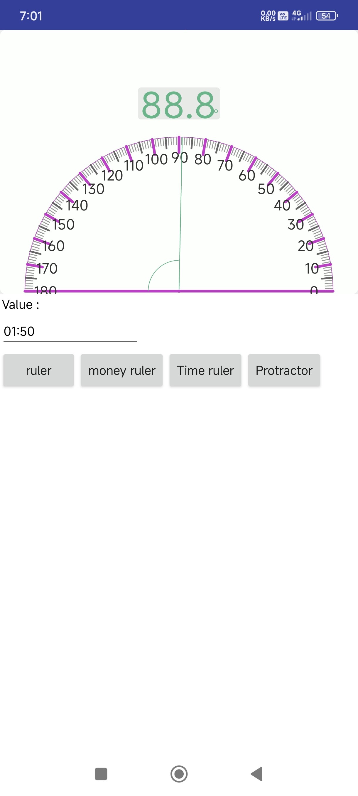
Protractor
Protractor
This is a custom Ruler View component developed by TechHamara using Fast. It allows users to interactively scroll and select a value on a ruler scale.
Telegram | GitHub
Blogger | YouTube
Find More Extension
Terms & Conditions
Events:
Protractor has total 2 events.
ScaleChanged
Event raised when the scale value changes.
| Parameter | Type |
|---|---|
| value | text |
ScaleChangeEnded
Event raised when scrolling stops and the final scale value is selected.
| Parameter | Type |
|---|---|
| value | text |
Methods:
Protractor has total 2 methods.
Initialize
Initialize inside an arrangement.
| Parameter | Type |
|---|---|
| arrangement | component |
GetCurrentScale
Get the current scale value.
- Return type:
text
Setters:
Protractor has total 28 setter properties.
ScaleLimit
Set the scale limit. This is the multiplier for the scale values.
- Input type:
number
Height
Set the ruler height in pixels.
- Input type:
number
ResultGap
Set the gap between ruler and result in pixels.
- Input type:
number
ScaleCount
Set how many segments between large scale marks.
- Input type:
number
ScaleGap
Set the gap between scale marks in pixels.
- Input type:
number
MinScale
Set the minimum scale value.
- Input type:
number
FirstScale
Set the initial scale value to display.
- Input type:
number
MaxScale
Set the maximum scale value.
- Input type:
number
BackgroundColor
Set the background color of the ruler.
- Input type:
number
SmallScaleColor
Set the color of the small scale marks.
- Input type:
number
MidScaleColor
Set the color of the middle scale marks.
- Input type:
number
LargeScaleColor
Set the color of the large scale marks.
- Input type:
number
ScaleNumberColor
Set the color of the scale numbers.
- Input type:
number
ResultNumberColor
Set the color of the result number.
- Input type:
number
Unit
Set the unit text (e.g. 'kg', 'cm').
- Input type:
text
UnitColor
Set the color of the unit text.
- Input type:
number
SmallScaleStroke
Set the thickness of small scale marks in pixels.
- Input type:
number
MidScaleStroke
Set the thickness of middle scale marks in pixels.
- Input type:
number
LargeScaleStroke
Set the thickness of large scale marks in pixels.
- Input type:
number
ResultNumberTextSize
Set the text size of the result number in pixels.
- Input type:
number
ScaleNumberTextSize
Set the text size of scale numbers in pixels.
- Input type:
number
UnitTextSize
Set the text size of the unit text in pixels.
- Input type:
number
ShowScaleResult
Show or hide the scale result display.
- Input type:
boolean
BackgroundRoundRect
Set whether the background should have rounded corners.
- Input type:
boolean
ScrollToScale
Move the ruler to a specific scale value.
- Input type:
number
ProtractorWidth
Set the width of the protractor as a multiplier of the height.
- Input type:
number
GuideLineColor
Set the color of the reference guide line (0-degree line).
- Input type:
number
IndicatorLineColor
Set the color of the indicator line showing the current angle.
- Input type:
number
Getters:
Protractor has total 27 getter properties.
ScaleLimit
Set the scale limit. This is the multiplier for the scale values.
- Return type:
number
Height
Set the ruler height in pixels.
- Return type:
number
Gap
Get the gap between ruler and result in pixels.
- Return type:
number
ScaleCount
Set how many segments between large scale marks.
- Return type:
number
ScaleGap
Set the gap between scale marks in pixels.
- Return type:
number
MinScale
Set the minimum scale value.
- Return type:
number
FirstScale
Set the initial scale value to display.
- Return type:
number
MaxScale
Set the maximum scale value.
- Return type:
number
BackgroundColor
Set the background color of the ruler.
- Return type:
number
SmallScaleColor
Set the color of the small scale marks.
- Return type:
number
MidScaleColor
Set the color of the middle scale marks.
- Return type:
number
LargeScaleColor
Set the color of the large scale marks.
- Return type:
number
ScaleNumberColor
Set the color of the scale numbers.
- Return type:
number
ResultNumberColor
Set the color of the result number.
- Return type:
number
Unit
Set the unit text (e.g. 'kg', 'cm').
- Return type:
text
UnitColor
Set the color of the unit text.
- Return type:
number
SmallScaleStroke
Set the thickness of small scale marks in pixels.
- Return type:
number
MidScaleStroke
Set the thickness of middle scale marks in pixels.
- Return type:
number
LargeScaleStroke
Set the thickness of large scale marks in pixels.
- Return type:
number
ResultNumberTextSize
Set the text size of the result number in pixels.
- Return type:
number
ScaleNumberTextSize
Set the text size of scale numbers in pixels.
- Return type:
number
UnitTextSize
Set the text size of the unit text in pixels.
- Return type:
number
ShowScaleResult
Show or hide the scale result display.
- Return type:
boolean
BackgroundRoundRect
Set whether the background should have rounded corners.
- Return type:
boolean
ProtractorWidth
Set the width of the protractor as a multiplier of the height.
- Return type:
number
GuideLineColor
Set the color of the reference guide line (0-degree line).
- Return type:
number
IndicatorLineColor
Set the color of the indicator line showing the current angle.
- Return type:
number
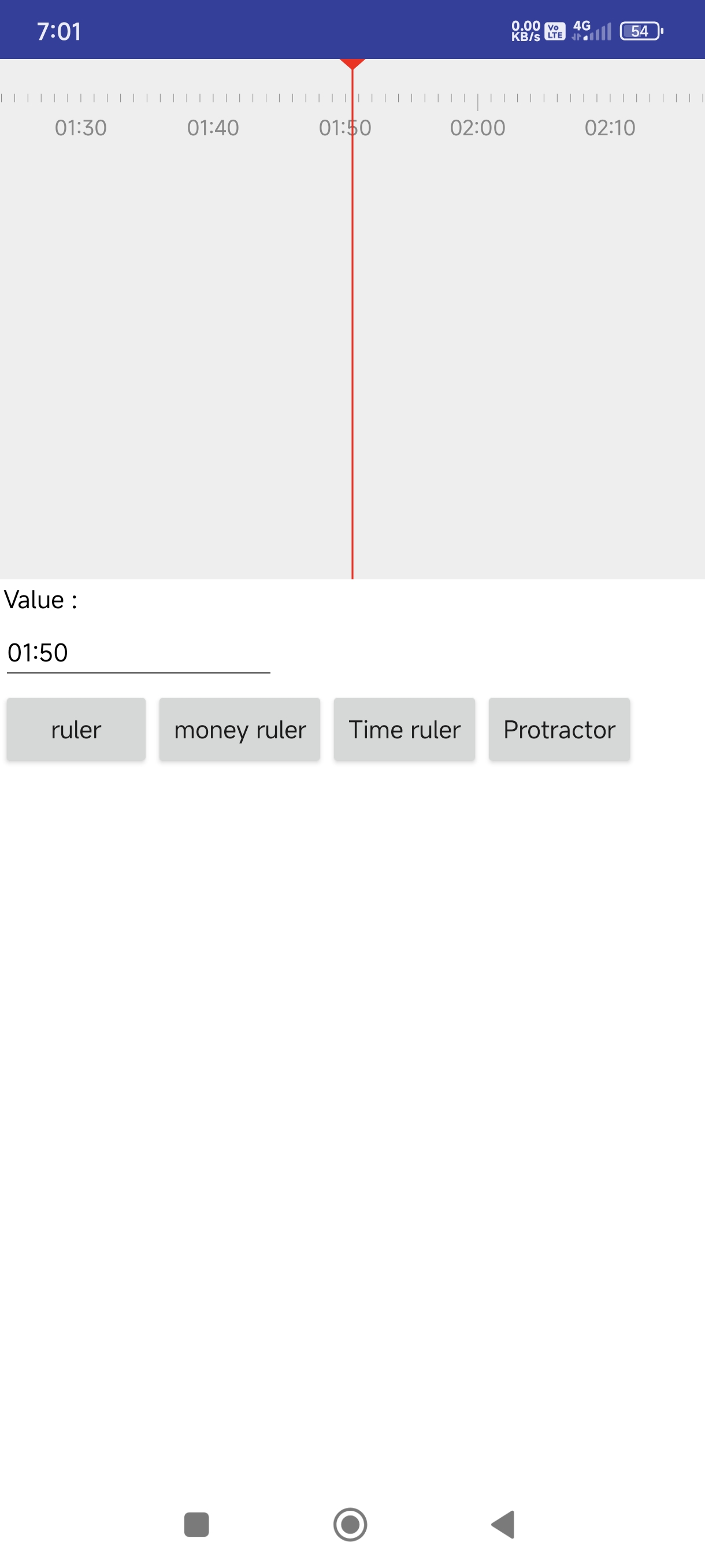
Time Ruler
TimeRuler
This is a custom Time Ruler View component developed by TechHamara using Fast. It allows users to interactively scroll and select a time value on a ruler scale.
Telegram | GitHub
Blogger | YouTube
Find More Extension
Terms & Conditions
Event:
TimeRuler has total 1 event.
TimeChanged
Event raised when the time value changes.
| Parameter | Type |
|---|---|
| timeValue | number |
| formattedTime | text |
Methods:
TimeRuler has total 13 methods.
Initialize
Initialize inside an arrangement.
| Parameter | Type |
|---|---|
| arrangement | component |
FormatTimeHHmm
Format time in seconds to HH:mm format
- Return type:
text
| Parameter | Type |
|---|---|
| timeValue | number |
FormatTimeHHmmss
Format time in seconds to HH:mm:ss format
- Return type:
text
| Parameter | Type |
|---|---|
| timeValue | number |
TimeStringToSeconds
Convert a time string (HH:mm or HH:mm:ss) to seconds
- Return type:
number
| Parameter | Type |
|---|---|
| timeString | text |
SetCurrentTimeFromString
Set current time from a time string (HH:mm or HH:mm:ss)
- Return type:
boolean
| Parameter | Type |
|---|---|
| timeString | text |
JumpToHour
Jump to a specific hour (0-23)
| Parameter | Type |
|---|---|
| hour | number |
AddTimePart
Add a time part with start and end times in seconds
| Parameter | Type |
|---|---|
| startTime | number |
| endTime | number |
AddColoredTimePart
Add a colored time part
| Parameter | Type |
|---|---|
| startTime | number |
| endTime | number |
| color | number |
ClearTimeParts
Clear all time parts
SetScaleLevel
Set the scale level by index (0-13)
| Parameter | Type |
|---|---|
| level | number |
GetScaleLevel
Get the current scale level index (0-13)
- Return type:
number
AnimateToTime
Animate to a specific time
| Parameter | Type |
|---|---|
| targetTime | number |
| duration | number |
ResetToDefaults
Reset all customizations to default values
Setters:
TimeRuler has total 22 setter properties.
CurrentTime
Set or get the current time in seconds (0-86400)
- Input type:
number
Scale
Set or get the scale factor (zoom level)
- Input type:
number
ScaleEnabled
Enable or disable scaling (pinch zoom)
- Input type:
boolean
ScrollEnabled
Enable or disable scrolling
- Input type:
boolean
ShowSecondTicks
Show or hide second ticks
- Input type:
boolean
ShowMinuteTicks
Show or hide minute ticks
- Input type:
boolean
ShowTimeLabels
Show or hide time labels
- Input type:
boolean
ShowIndicatorTriangle
Show or hide the indicator triangle
- Input type:
boolean
BackgroundColor
Set the background color
- Input type:
number
GradationColor
Set the gradation (tick marks) color
- Input type:
number
PartHeight
Set the part height in pixels
- Input type:
number
PartColor
Set the part color
- Input type:
number
GradationWidth
Set the gradation width in pixels
- Input type:
number
SecondTickLength
Set the second tick length in pixels
- Input type:
number
MinuteTickLength
Set the minute tick length in pixels
- Input type:
number
HourTickLength
Set the hour tick length in pixels
- Input type:
number
GradationTextColor
Set the gradation text color
- Input type:
number
GradationTextSize
Set the gradation text size in pixels
- Input type:
number
GradationTextGap
Set the gradation text gap in pixels
- Input type:
number
IndicatorColor
Set the indicator color
- Input type:
number
IndicatorTriangleSize
Set the indicator triangle size in pixels
- Input type:
number
IndicatorLineWidth
Set the indicator line width in pixels
- Input type:
number
Getters:
TimeRuler has total 4 getter properties.
CurrentTime
Set or get the current time in seconds (0-86400)
- Return type:
number
Scale
Set or get the scale factor (zoom level)
- Return type:
number
ScaleEnabled
Enable or disable scaling (pinch zoom)
- Return type:
boolean
ScrollEnabled
Enable or disable scrolling
- Return type:
boolean