Overview
The PopupListView is a non-visible component that creates a customizable popup dialog with a list of items. It's designed to be used in Android applications to provide a rich, interactive user interface for selecting items from a list. The extension supports:
- A customizable list of items with multiple text fields and an image.
- A built-in search bar to filter items.
- Individual styling for each item's text color.
- A fully customizable appearance for the popup dialog, list items, search bar, and buttons.
- Two optional, fully customizable bottom buttons.
Key Features and Blocks
Adding and Managing Items
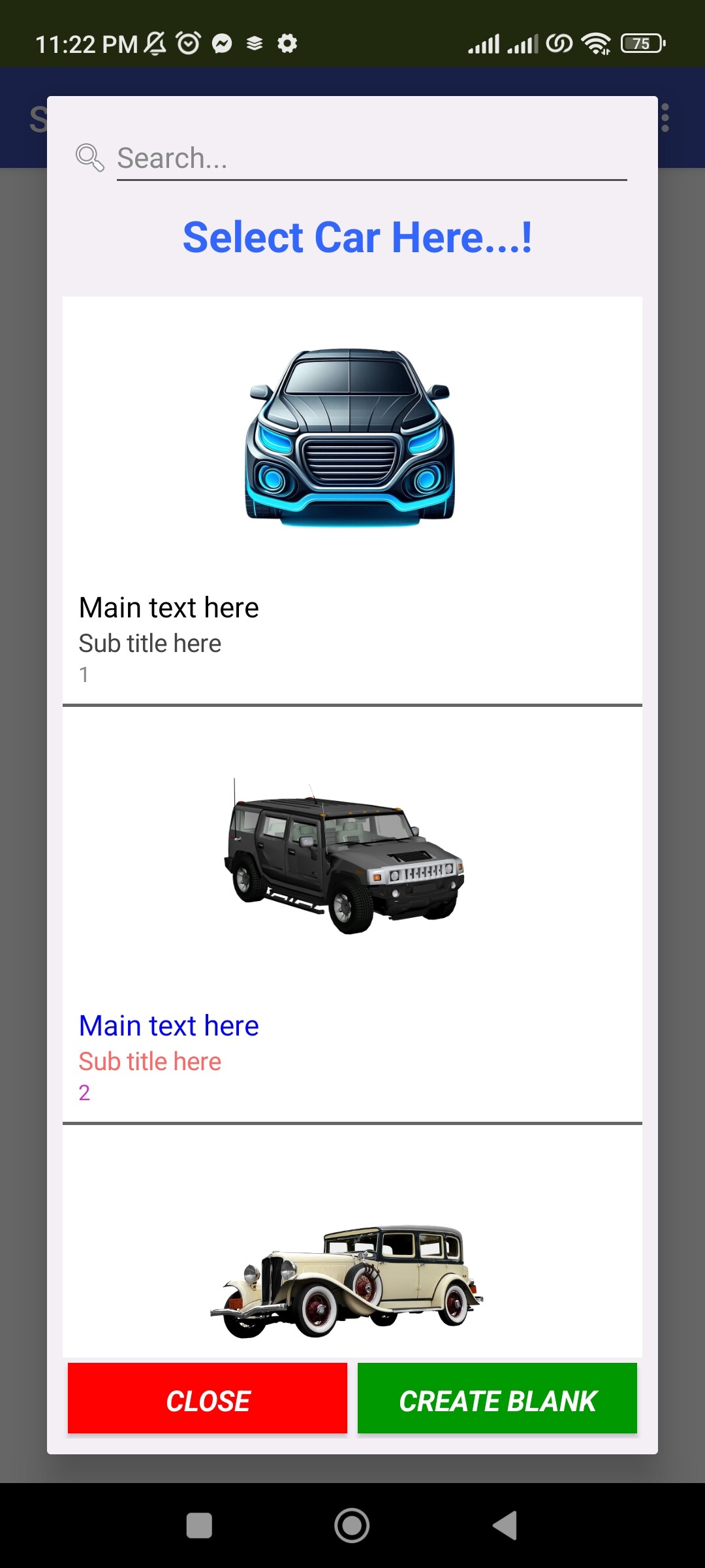
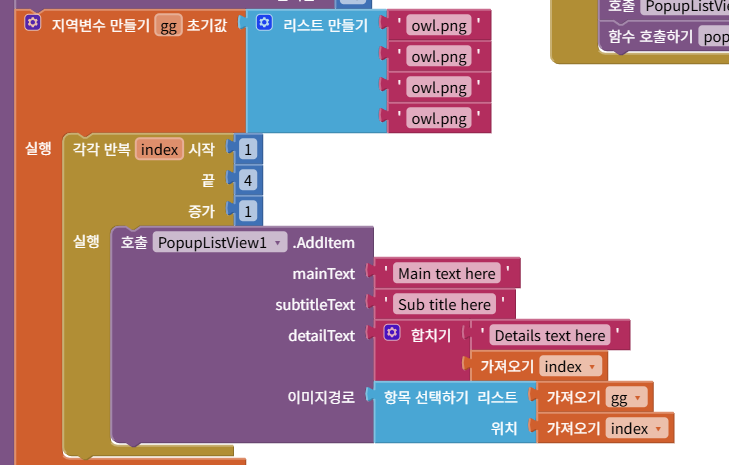
AddItem(mainText, subtitleText, detailText, imagePath):
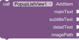
Use this block to add a new item to the list. mainText, subtitleText, and detailText are the three lines of text that will be displayed. imagePath can be an asset name (e.g., "my_icon.png") or a URL (e.g., "https://example.com/image.jpg").
Clear():

Removes all items from the list.
SetItemTextColor(index, mainColor, subColor, detailColor):
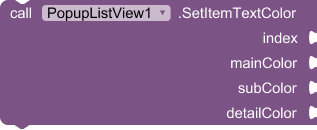
Changes the text colors of a specific item. The index is 1-based (the first item is index 1).
ClearItemTextColor(index):
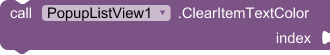
Resets the text colors of a specific item to the default component colors.
Displaying the Popup
Show():

Displays the popup dialog on the screen.
Hide():

Closes and dismisses the popup dialog.
Event Handling
ItemSelected(index, mainText, subtitle, detail):
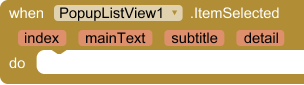
This event is triggered when a user taps on an item in the list. The event returns the 1-based index of the selected item and its corresponding text content.
BottomButtonClicked():
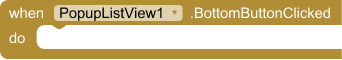
This event is triggered when the first bottom button is clicked. Use this event to define the button's action, such as calling the Hide() block to close the popup.
SecondBottomButtonClicked():
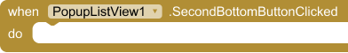
This event is triggered when the second bottom button is clicked. Use this for another action, like confirming a selection.
Customizing Appearance
The PopupListView has numerous blocks to control its appearance.
SetCornerRadius(radius):

Sets the rounded corner radius for the entire popup dialog.
SetItemCornerRadius(radius):

Sets the rounded corner radius for each individual list item.
SetInternalBackgroundColor(color):
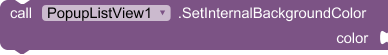
Sets the background color of the popup.
SetSelectionColor(color):
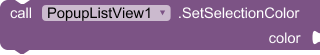
Sets the background color of a list item when it is selected by the user.
SetListHeight(height, unit):
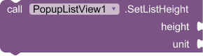
Adjusts the height of the list view area. unit can be PX or PERCENT. Use AUTO for the default behavior.
Styling Text and Images
SetMainTextStyle(size, color, bold):
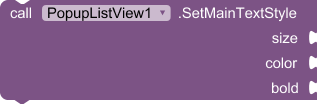
Sets the font size, color, and bold style for the main text of all list items. Similar blocks exist for subtitles and detail text.
SetTextAlignment(alignment):
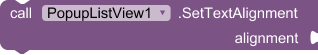
Aligns all item text to the LEFT (1), CENTER (2), or RIGHT (3).
SetImagePosition(position):
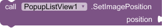
Positions the image for all list items. Valid values are left, right, or center.
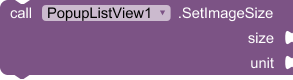
SetImageSize(size, unit):
Sets the size of all images. unit can be PX or PERCENT.
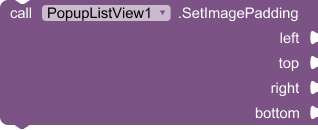
SetImagePadding(left, top, right, bottom):
Adds padding (space) around the images in pixels.
Customizing Search and Buttons
EnableSearchBar(enabled):

Shows or hides the search bar.
EnableBottomButton(enabled): Shows or hides the first bottom button.SetBottomButtonStyle(...): Fully customizes the first bottom button's text, colors, and font style. A similar block exists for the second button.SetDividerHeight(height): Sets the thickness of the divider lines between list items in pixels.SetDividerColor(color):

Sets the color of the divider lines.
Sample output:
Change image position into left side and also you can assign specific color using Index
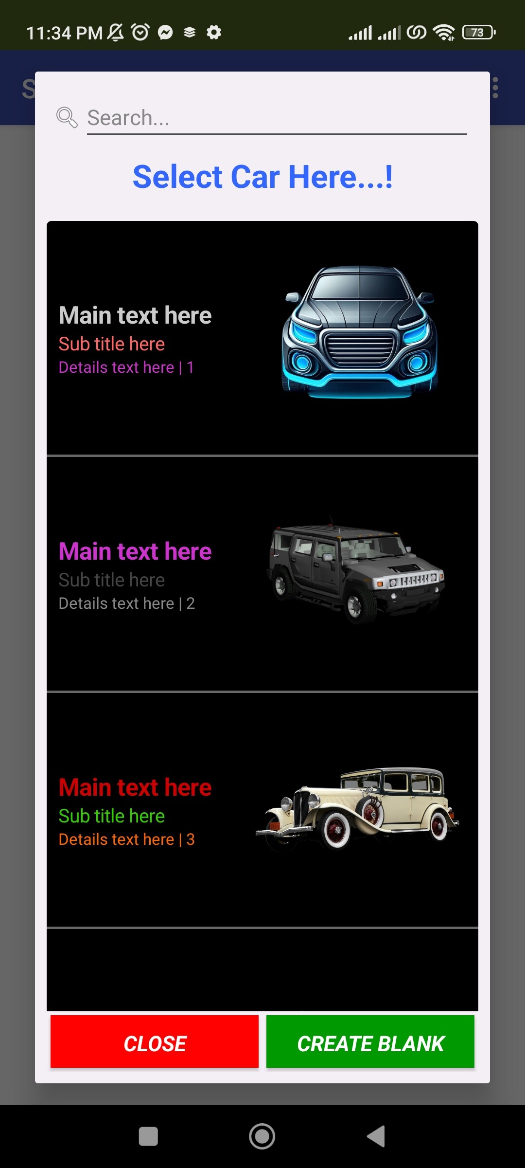
Change image position into right side
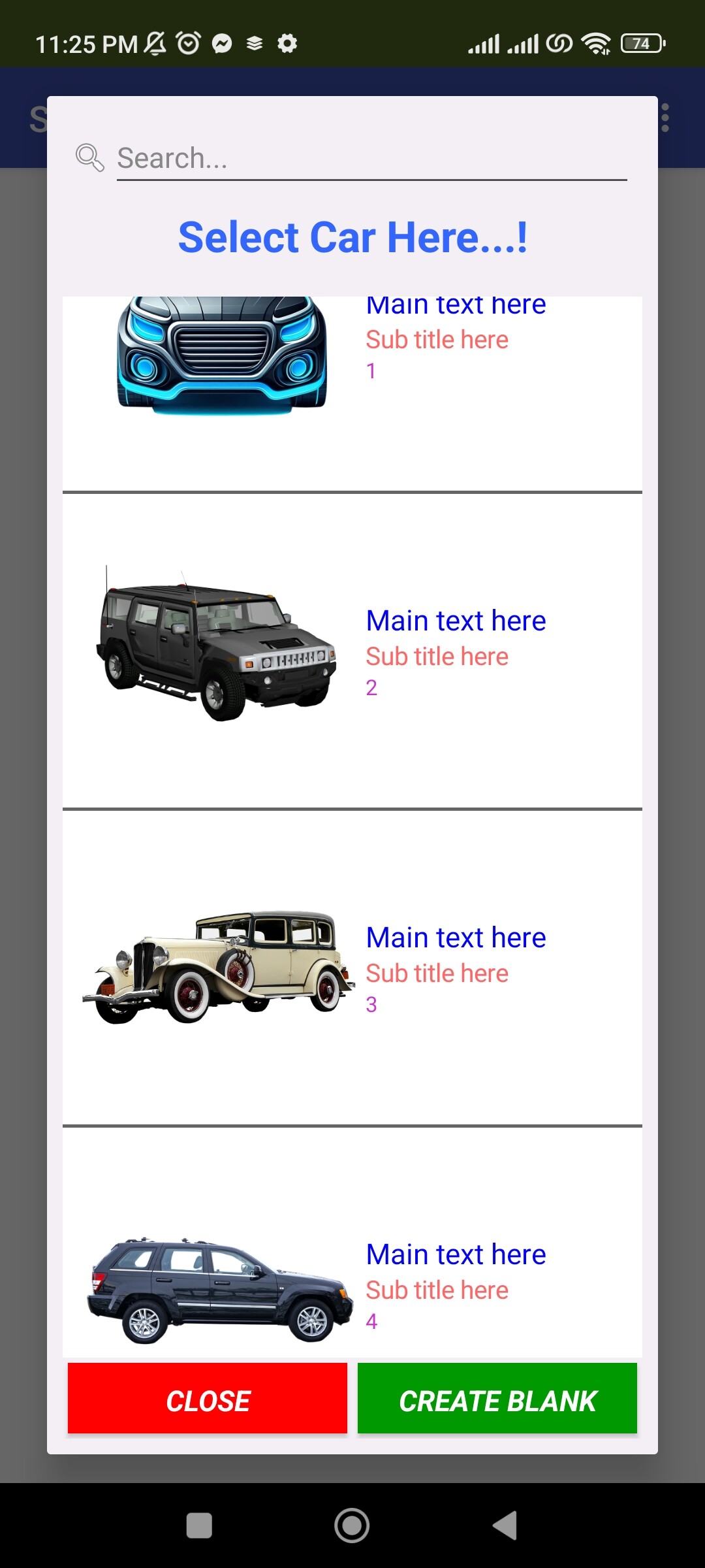
Assign image position into center.
Sample Block code:

If you find this extension useful and wish to support further development, you can support us via:
License: Developed by Kenneth Morales using Fast builder.
You can download the aix extension provided bellow.
popuplistview aix extension Download Link:
Latest version:
com.kenmor.popuplistview.aix (24.8 KB)