🧩 NeoDialog
An extension for MIT App Inventor 2.NeoDialog Final: Input Support, Shimmer Effect, Transparency Control, and Strict Block Dropdowns.
 Specifications
 Package: jsr.neodialog
 Size: 45.49 KB
 Minimum API Level: 14
 Updated On: 2026-01-23T18:30:00Z
 Built & documented using: FAST v5.3.2-premium
This is a fantastic extension! It includes advanced features like Shimmer effects, Glassmorphism, and Input handling which are highly sought after in the community.
Here is a comprehensive guide formatted for the Kodular Community and MIT App Inventor Community. You can copy and paste this directly into a new post.
 Introducing NeoDialog: The Ultimate Custom Dialog Extension
Created by: @Still-learning
Version: 1.0
Platform: Kodular & MIT App Inventor
Credit to: @JEWEL for his wounderful FAST@CLi platfrom for making extension easily.
 Overview
NeoDialog is a powerful, non-visible extension that allows you to create stunning, fully customizable dialogs. Move away from boring standard alerts and create modern UIs with curves, gradients, glassmorphism, animations, and input fields.
 Key Features
 Advanced Styling: Support for gradient backgrounds, transparency, borders, and Glassmorphism.
 Flexible Positioning: Show dialogs at Top, Center, or Bottom.
 Animations: Enable Shimmer effects on text and Rotation animations for icons.
 Input Support: Add TextBoxes (Text, Number, or Password) with Submit/Cancel buttons.
 Material Icons: Built-in support for Material Design icons using just strings.
 Curved Layouts: Option for beautiful curved dialog corners.
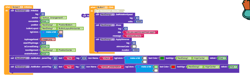
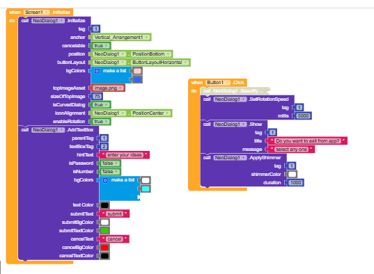
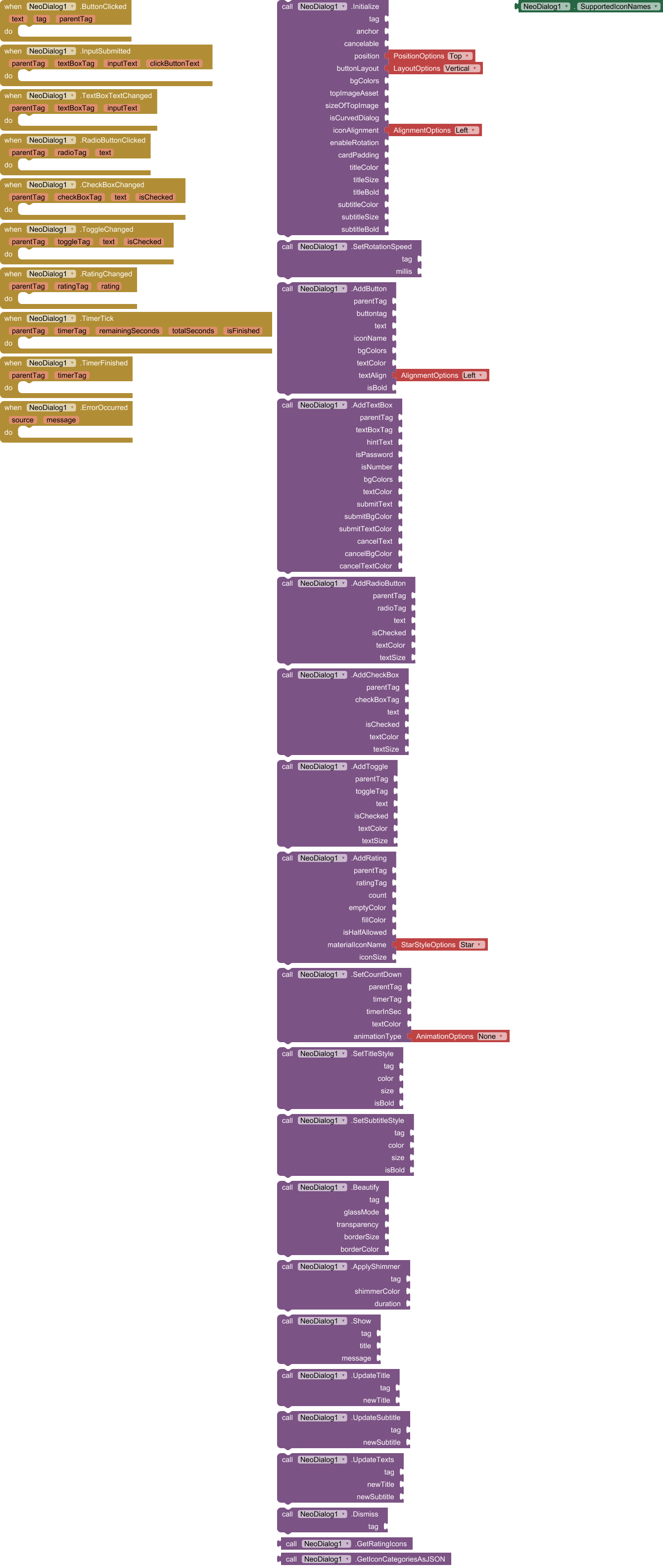
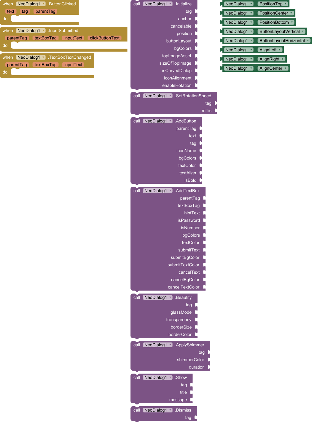
Blocks Documentation
1. Initialization
Use this block to set up a new dialog. You must assign a unique Tag to every dialog (e.g., "Dialog1").
- Tag: A unique string to identify the dialog.
- Anchor: Can be set to
Any Componentor left as generic if not used for anchoring. - Cancelable:
Trueif user can tap outside to close. - Position: Use the dropdown blocks (e.g.,
PositionBottom). - Layout: Vertical or Horizontal button arrangement.
- Background Colors: A list of colors for the gradient (e.g., create a list with Red and Blue).
- Top Image: The filename of an image in your assets (or "default" for app icon).
- Size: Size of the top image in dp.
- Curved:
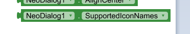
Truefor rounded corners. - Icon Alignment:
AlignLeft,AlignRight, orAlignCenter. - Rotation:
Trueto animate the top image spinning.
2. Adding Content
These blocks allow you to add elements to the dialog identified by the Parent Tag.
AddButton:
Adds a clickable button to the dialog.
- Icon Name: Use text strings like
"check","close","delete", etc. (See full list below).
AddTextBox:
Adds an input field with custom Submit/Cancel buttons.
- Tag: A unique ID for this specific textbox.
- Hint: The placeholder text.
- Is Password/Number: Toggle input type.
- Submit/Cancel Configs: Customize text and colors for the action buttons.
3. Styling & Effects
Beautify:
Apply modern visual effects.
- Glass Mode:
Truefor a blur effect (depending on system support). - Transparency: 0 (invisible) to 255 (solid).
- Border Size & Color: Add a custom border outline.
ApplyShimmer:
Creates a moving light reflection effect on the dialog's text.
- Shimmer Color: The color of the light beam.
- Duration: Speed of the animation in milliseconds.
SetRotationSpeed:
Change how fast the top icon spins (if enabled in Initialize).
4. Actions
Show:
Displays the dialog.
- Tag: The ID of the dialog to show.
- Title: The main heading.
- Message: The sub-text.
Dismiss:
Closes the dialog programmatically.
Available Material Icons
You can use the following strings in the Icon Name property:
- Actions:
check,close,cancel,add,delete,edit,save,exit,search,refresh,share,star,favorite,thumb_up,warning,error,info,help - Navigation:
arrow_back,arrow_forward,home,exit_to_app,open_in_new,history,map,location_on - Social:
email,phone,chat,notifications - Media:
photo,camera_alt,videocam,music_note,mic - System:
settings,lock,lock_open,power_settings_new,fingerprint,wifi,bluetooth,airplanemode_active,battery_full
(Note: The extension uses MaterialIcons-Regular.ttf internally, ensuring these icons render without needing external image files.)
Example Usage (Logic Flow)
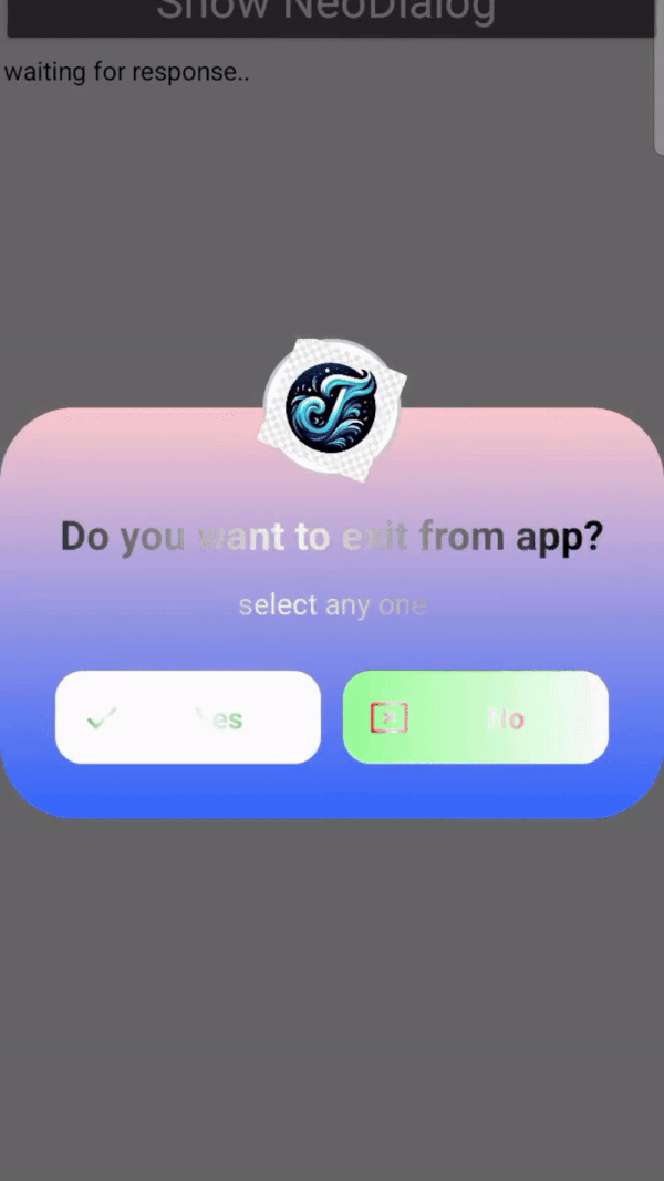
Here is a simple example of how to create a Login Dialog:
-
When Screen1 Initialize:
- Call
Initialize:- Tag:
"LoginDialog" - Position:
PositionCenter - BgColors: Make a list of
(White),(Light Gray) - Curved:
True
- Tag:
- Call
-
When Button1 Click:
- Call
AddTextBox:- ParentTag:
"LoginDialog" - Hint: "Enter Password"
- IsPassword:
True - SubmitText: "Login"
- ParentTag:
- Call
Beautify:- Tag:
"LoginDialog" - GlassMode:
True - Transparency:
230
- Tag:
- Call
Show:- Tag:
"LoginDialog" - Title: "Welcome Back"
- Message: "Please enter your credentials."
- Tag:
- Call
-
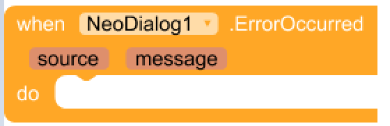
When InputSubmitted (Event):
- Check
clickButtonText. If it equals "Login":- If
inputTextis correct, do something. Else, show a notification.
- If
- Check
 Download
V1: jsr.neodialog.aix (45.5 KB)
V2: jsr.neodialog.aix (42.4 KB)
MaterialIcon : Direct Download from GoogleFonts
 V3: jsr.neodialog.aix (43.4 KB)
(it doesnot require material icon font in their app asset. Already i have inbuild into extension asset and i called it successfully without troubling kodular or mit app).
V2 Updates:
Wheni try to access material icon from the extension assets i find difficulty to access it in various app platforms. So the best approach (in my conscern), kindly upload the MaterialIcons-Reguls.ttf
in to your app asset. I find no difficulty insetting material icons in any kind of appdeleopment platforms. No change in the blocks setup.
V3 Updates:
I have modified the code so here then user no need to upload materialicon font in their app assest. I struggled a lot to solve this issue but it was achieved and i felt very very happy. Now it supports more than 128 material icons code.
No change in the blocks. only logic was changed.
Recommened Version is V3:
 Blocks
License
Free to use for personal and commercial projects.
Feedback and bug reports are welcome!
{Note] If you do not want top image then set empty text box. if you give text as default then app icon will set as topimage. You canuse gradient effects and shimmer effects to import beautiful notification card