🧩 DynamicListView
An extension for MIT App Inventor 2.Dynamic CardView List with async batch loading, customizable animations, and extensive item management
 Specifications
 Package: io.jai.dynamiclistview
 Size: 34.35 KB
 Minimum API Level: 7
 Updated On: 2025-05-21T18:30:00Z
 Built & documented using: FAST v3.4.0
Events:
DynamicListView has total 6 events.
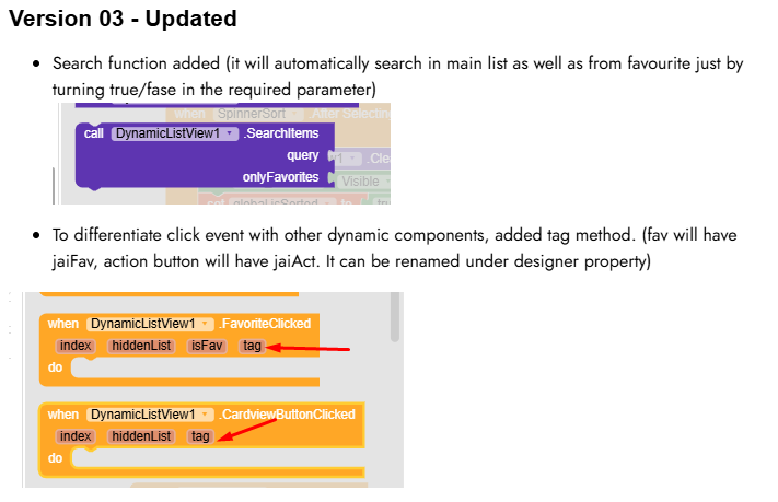
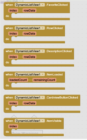
FavoriteClicked
Fired when a favorite button is clicked, returns 1-based index and row data [imageUrl, titles, description, isFav]
| Parameter | Type |
|---|---|
| index | number |
| rowData | list |
RowClicked
Fired when a row is clicked, returns 1-based index and row data [imageUrl, titles, description, isFav]
| Parameter | Type |
|---|---|
| index | number |
| rowData | list |
DescriptionClicked
Fired when description text is clicked, returns 1-based index and row data [imageUrl, titles, description, isFav]
| Parameter | Type |
|---|---|
| index | number |
| rowData | list |
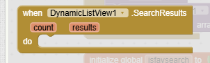
ItemLoaded
Fired when an item is loaded, with the number of loaded and remaining items
| Parameter | Type |
|---|---|
| loadedCount | number |
| remainingCount | number |
CardviewButtonClicked
Fired when the cardview button is clicked, returns 1-based index and row data [imageUrl, titles, description, isFav]
| Parameter | Type |
|---|---|
| index | number |
| rowData | list |
ItemVisible
Fired when an item becomes visible during scrolling, returns 1-based index
| Parameter | Type |
|---|---|
| index | number |
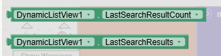
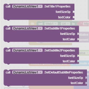
Methods:
DynamicListView has total 8 methods.
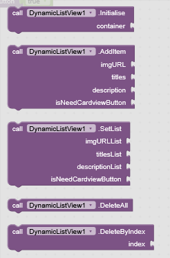
Initialise
Initializes the DynamicListView in the specified container with animation
| Parameter | Type |
|---|---|
| container | component |
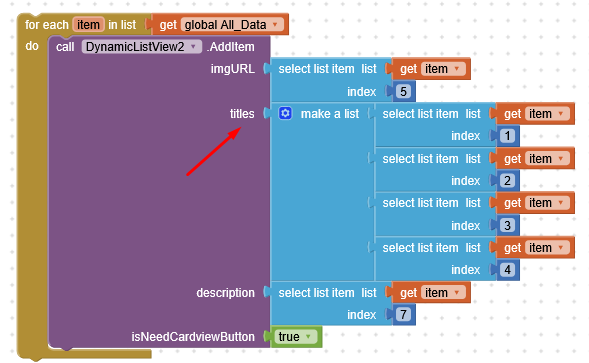
AddItem
Adds an item with image URL, list of titles, description, and cardview button flag
| Parameter | Type |
|---|---|
| imgURL | text |
| titles | list |
| description | text |
| isNeedCardviewButton | boolean |
SetList
Sets the full list with image URLs, titles, descriptions, and a cardview button flag for all items
| Parameter | Type |
|---|---|
| imgURLList | list |
| titlesList | list |
| descriptionList | list |
| isNeedCardviewButton | boolean |
DeleteAll
Removes all items from the list
DeleteByIndex
Removes an item at the specified 1-based index
| Parameter | Type |
|---|---|
| index | number |
InsertItemAtIndex
Inserts an item at the specified 1-based index
| Parameter | Type |
|---|---|
| index | number |
| imgURL | text |
| titles | list |
| description | text |
| isNeedCardviewButton | boolean |
GetItemData
Returns the data [imageUrl, titles, description, isFav] for the item at the specified 1-based index
- Return type:
list
| Parameter | Type |
|---|---|
| index | number |
UpdateItem
Updates the item at the specified 1-based index
| Parameter | Type |
|---|---|
| index | number |
| imgURL | text |
| titles | list |
| description | text |
| isNeedCardviewButton | boolean |
Designer:
DynamicListView has total 25 designer properties.
RoundImage
- Input type:
boolean - Default value:
False
TitleTextColor
- Input type:
color - Default value:
&HFF000000
TitleFontBold
- Input type:
boolean - Default value:
False
TitleFontSize
- Input type:
float - Default value:
14
Title1TextColor
- Input type:
color - Default value:
&HFF000000
Title1FontBold
- Input type:
boolean - Default value:
False
DescriptionTextColor
- Input type:
color - Default value:
&HFF000000
DescriptionFontBold
- Input type:
boolean - Default value:
False
DescriptionFontSize
- Input type:
float - Default value:
12
CardviewButtonText
- Input type:
string - Default value:
Click Me
CardviewButtonBackgroundColor
- Input type:
color - Default value:
&HFF6200EE
CardviewButtonTextColor
- Input type:
color - Default value:
&HFFFFFFFF
CardviewButtonVisible
- Input type:
boolean - Default value:
True
CardViewBackgroundColor
- Input type:
color - Default value:
&HFFFFFFFF
CardviewStrokeColor
- Input type:
color - Default value:
&HFF000000
CardviewStrokeWidth
- Input type:
integer - Default value:
0
CardElevation
- Input type:
integer - Default value:
4
CardCornerRadius
- Input type:
integer - Default value:
8
IsFavButtonHeart
- Input type:
boolean - Default value:
False
IsFavButtonRound
- Input type:
boolean - Default value:
False
FontPath
- Input type:
asset
FavIconOn
- Input type:
asset
FavIconOff
- Input type:
asset
CreationAnimationType
- Input type:
choices - Default value:
Fade - Arguments:
Fade,Slide,Scale,Bounce
ScrollAnimationType
- Input type:
choices - Default value:
Fade - Arguments:
Off,Fade,Slide,Scale,Bounce
Setters:
DynamicListView has total 25 setter properties.
RoundImage
If true, displays images as circular
- Input type:
boolean
TitleTextColor
Sets the title text color (ARGB)
- Input type:
number
TitleFontBold
If true, sets the title font to bold
- Input type:
boolean
TitleFontSize
Sets the title font size in sp
- Input type:
number
Title1TextColor
Sets the first title text color (ARGB)
- Input type:
number
Title1FontBold
If true, sets the first title font to bold
- Input type:
boolean
DescriptionTextColor
Sets the description text color (ARGB)
- Input type:
number
DescriptionFontBold
If true, sets the description font to bold
- Input type:
boolean
DescriptionFontSize
Sets the description font size in sp
- Input type:
number
CardviewButtonText
Sets the text for the cardview button
- Input type:
text
CardviewButtonBackgroundColor
Sets the cardview button background color (ARGB)
- Input type:
number
CardviewButtonTextColor
Sets the cardview button text color (ARGB)
- Input type:
number
CardviewButtonVisible
If true, displays the cardview button
- Input type:
boolean
CardViewBackgroundColor
Sets the cardview background color (ARGB)
- Input type:
number
CardviewStrokeColor
Sets the cardview stroke color (ARGB)
- Input type:
number
CardviewStrokeWidth
Sets the cardview stroke width in dp
- Input type:
number
CardElevation
Sets the elevation of the cards in dp
- Input type:
number
CardCornerRadius
Sets the corner radius of the cards in dp
- Input type:
number
IsFavButtonHeart
If true, uses a heart icon for the favorite button
- Input type:
boolean
IsFavButtonRound
If true, makes the favorite button round (affects star icon only)
- Input type:
boolean
FontPath
Sets the font file for titles and description (path to .ttf in assets)
- Input type:
text
FavIconOn
Sets the drawable resource for favorited state (asset path)
- Input type:
text
FavIconOff
Sets the drawable resource for non-favorited state (asset path)
- Input type:
text
CreationAnimationType
Sets the animation type for item creation as Fade, Slide, Scale, Bounce
- Input type:
text
ScrollAnimationType
Sets the animation type for scrolling as Fade, Slide, Scale, Bounce
- Input type:
text
Getters:
DynamicListView has total 25 getter properties.
RoundImage
If true, displays images as circular
- Return type:
boolean
TitleTextColor
Sets the title text color (ARGB)
- Return type:
number
TitleFontBold
If true, sets the title font to bold
- Return type:
boolean
TitleFontSize
Sets the title font size in sp
- Return type:
number
Title1TextColor
Sets the first title text color (ARGB)
- Return type:
number
Title1FontBold
If true, sets the first title font to bold
- Return type:
boolean
DescriptionTextColor
Sets the description text color (ARGB)
- Return type:
number
DescriptionFontBold
If true, sets the description font to bold
- Return type:
boolean
DescriptionFontSize
Sets the description font size in sp
- Return type:
number
CardviewButtonText
Sets the text for the cardview button
- Return type:
text
CardviewButtonBackgroundColor
Sets the cardview button background color (ARGB)
- Return type:
number
CardviewButtonTextColor
Sets the cardview button text color (ARGB)
- Return type:
number
CardviewButtonVisible
If true, displays the cardview button
- Return type:
boolean
CardViewBackgroundColor
Sets the cardview background color (ARGB)
- Return type:
number
CardviewStrokeColor
Sets the cardview stroke color (ARGB)
- Return type:
number
CardviewStrokeWidth
Sets the cardview stroke width in dp
- Return type:
number
CardElevation
Sets the elevation of the cards in dp
- Return type:
number
CardCornerRadius
Sets the corner radius of the cards in dp
- Return type:
number
IsFavButtonHeart
If true, uses a heart icon for the favorite button
- Return type:
boolean
IsFavButtonRound
If true, makes the favorite button round (affects star icon only)
- Return type:
boolean
FontPath
Sets the font file for titles and description (path to .ttf in assets)
- Return type:
text
FavIconOn
Sets the drawable resource for favorited state (asset path)
- Return type:
text
FavIconOff
Sets the drawable resource for non-favorited state (asset path)
- Return type:
text
CreationAnimationType
Sets the animation type for item creation as Fade, Slide, Scale, Bounce
- Return type:
text
ScrollAnimationType
Sets the animation type for scrolling as Fade, Slide, Scale, Bounce
- Return type:
text
Extension (Version 5)
io.jai.dynamiclistview.aix (36.6 KB)
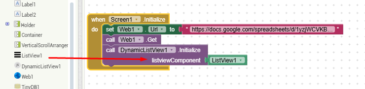
You can set items in two ways
Method -1
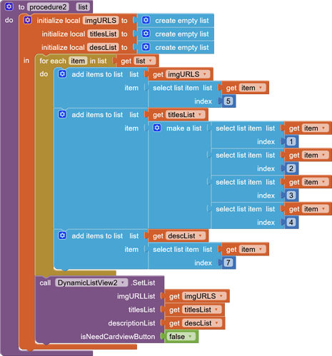
Method-II
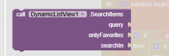
Blocks

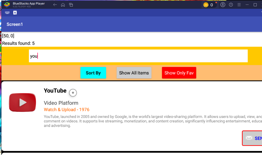
Sample pictures

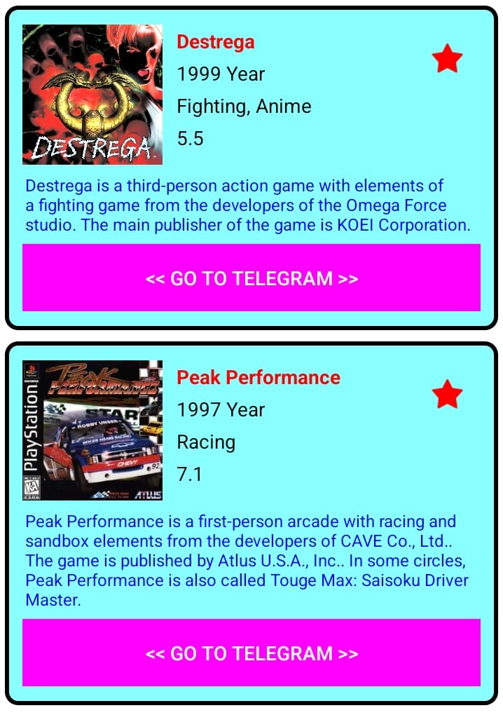
a
- Cardview button, fav button, description can be set visibility false if it doesnt needed
- You can set as many titles as a list, here i have used 4 lists
- Image can be set as round on/off
- In fav button if heart is choosen the star will be filled in red else mild red dot be filled
Credit:
Thanks to @JEWEL for his beautiful extension building platform