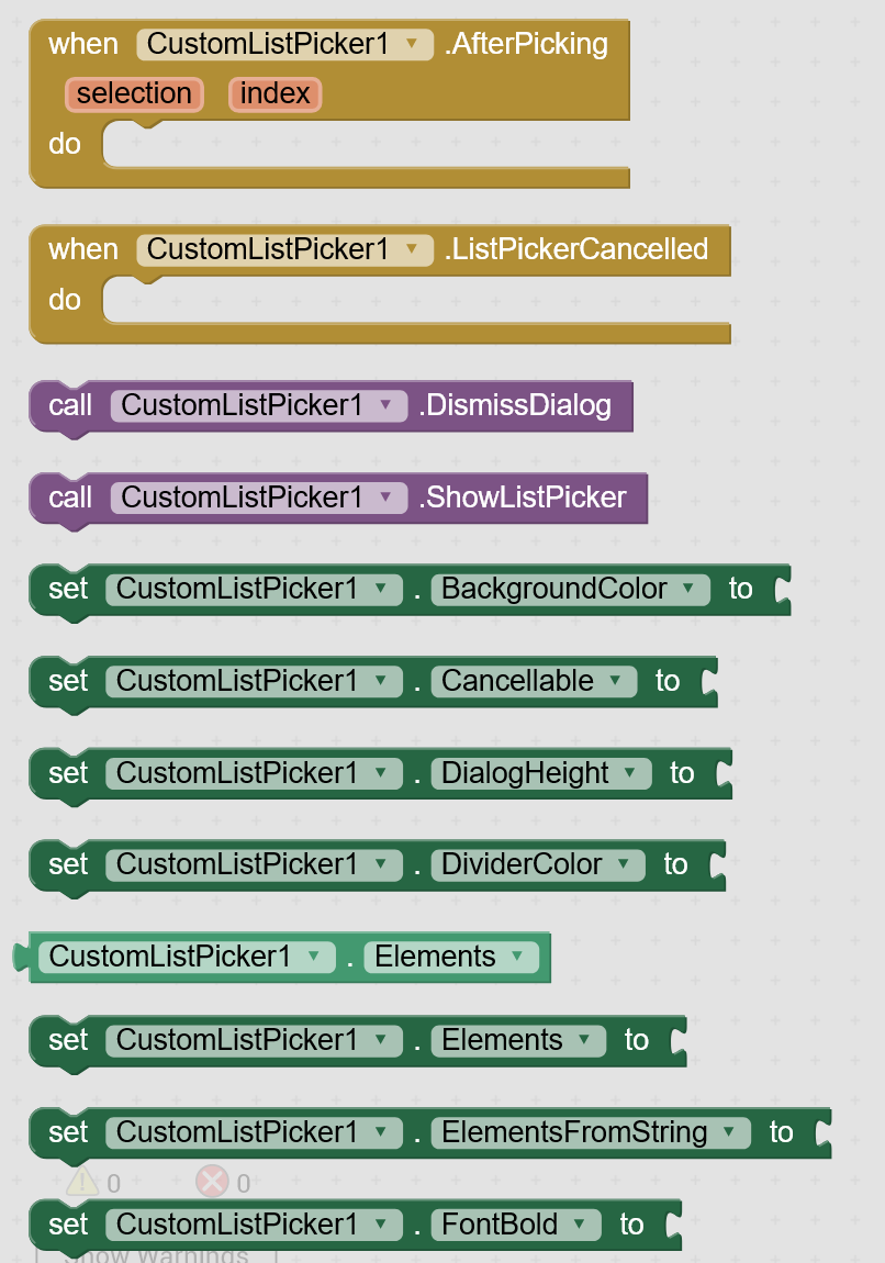
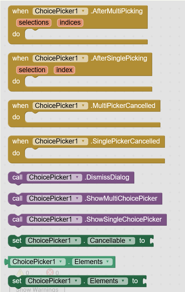
Custom List Picker shows different types of list picker dialog to pick a list item with customization of list picker dialog.
It is different from inbuilt list picker component, list picker component shows list items in a new activity/screen with less customization where custom list picker shows a dialog and you can customize its appearance.
This extension provides two separate aix files.
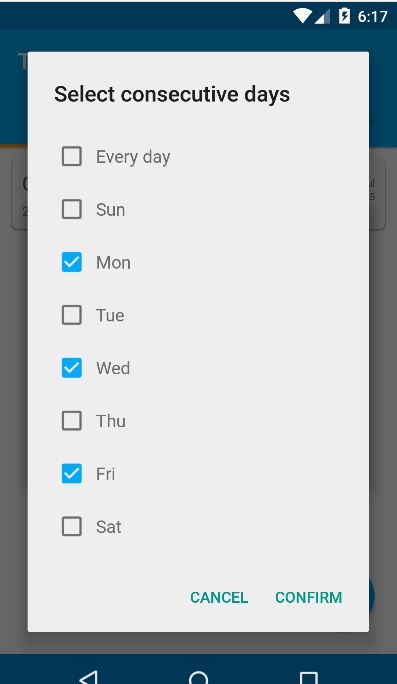
Custom List Picker which shows a customizable list picker dialog.
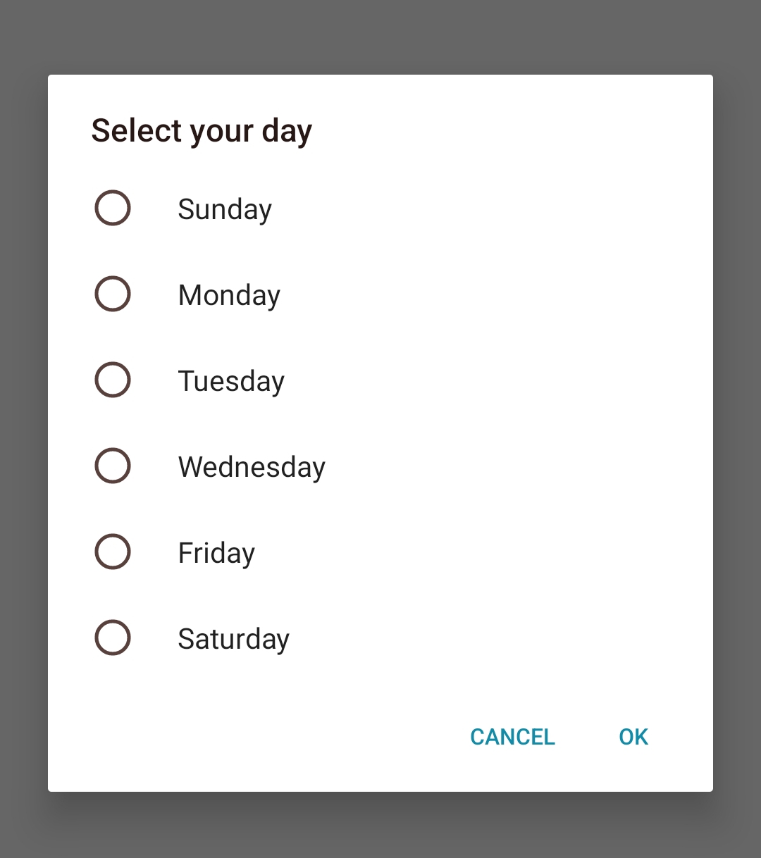
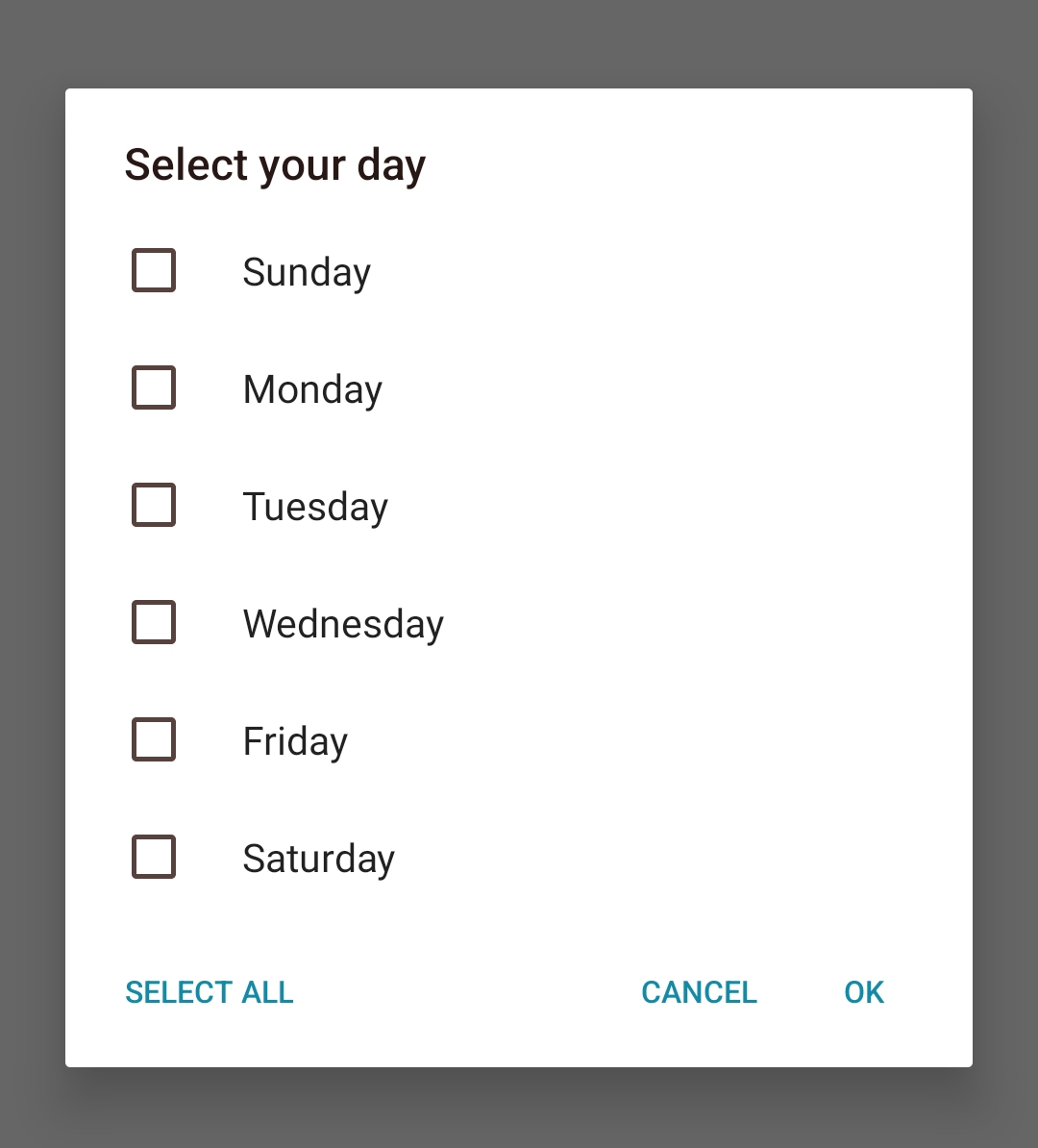
Choice Picker which shows single choice picker dialog and multi choice picker dialog.
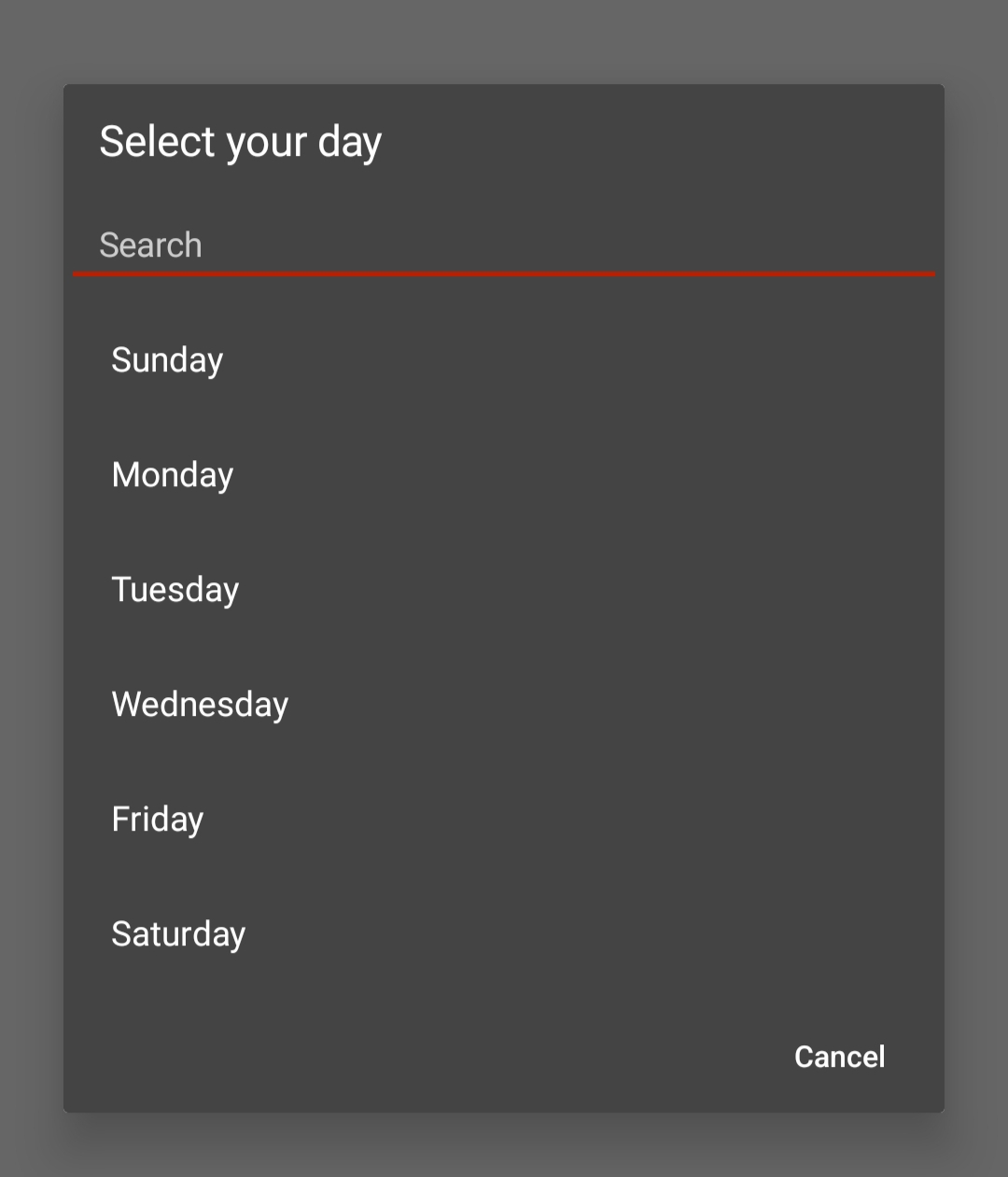
Yes because we are not setting background color for default theme so when you first show dark theme and switch to default theme it takes background color of dark theme. If you are trying in companion then you need to refresh it before switching.
Thank you for your contribution
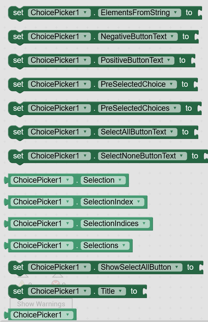
A probably better name for the SetList property might be Elements, similar to the default listpicker...
Also you might consider to add an ElementsFromString property
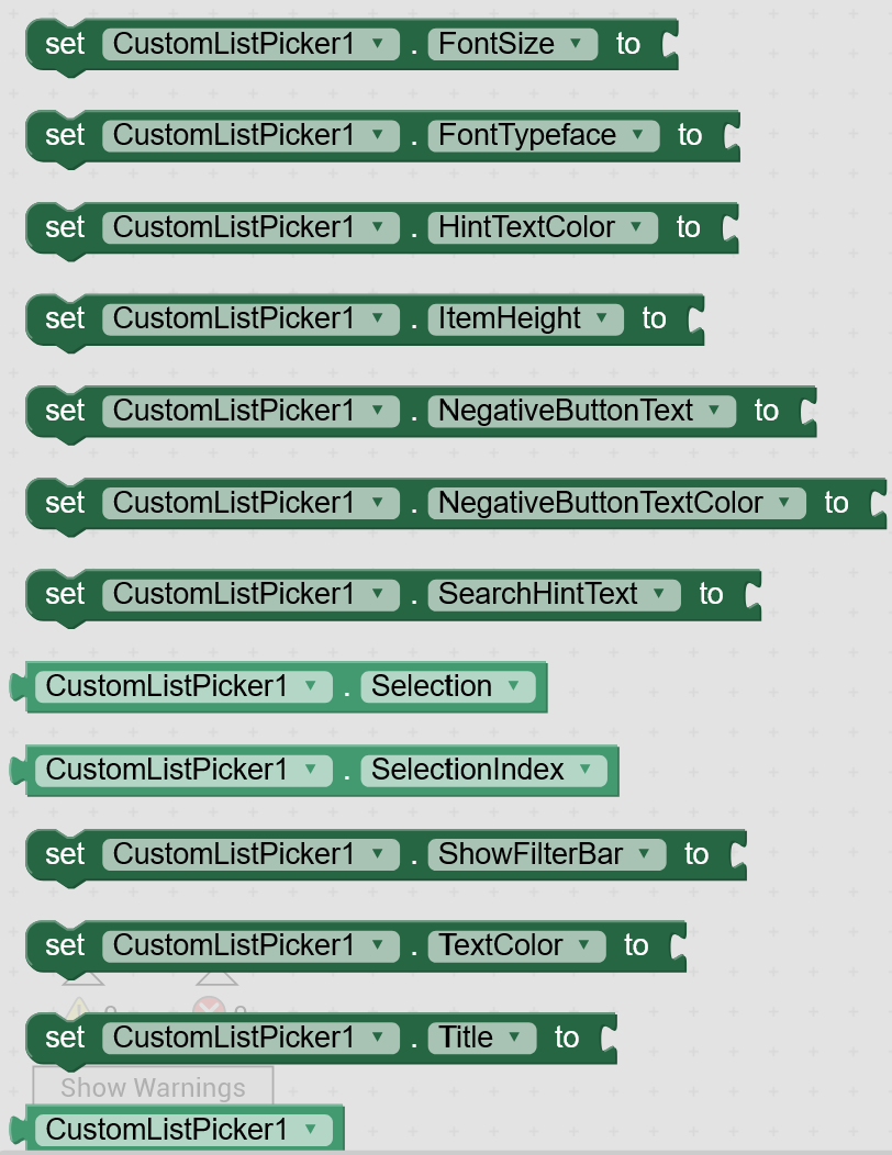
Elements
Specifies the list of choices to display.
ElementsFromString
Set the list of choices from a string of comma-separated values.
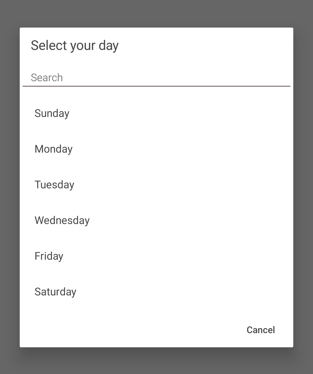
Ugh.. I am not a fan of the other themes. I do like this extension and am building an app with it but I sure do wish there was a fix for this. The color schemes of the other themes is messing me up!
I did see that some users are requesting features.. something that would help me without having to change the Theme would be to have a way to change the text color of the hints in a text box.. is this possible?
I also notice that the Title Bar has changed when I use this extension. Any way to edit the text size?