AwesomeDialog Extension Documentation
Version: 1.0
Author: MrKoder
Description: Create modern, beautiful, and highly customizable dialogs within your App Inventor projects. Move beyond the basic Notifier component with styled pop-ups featuring icons, custom colors, multiple button layouts, and even frosted glass effects.
Downloads:
Introduction
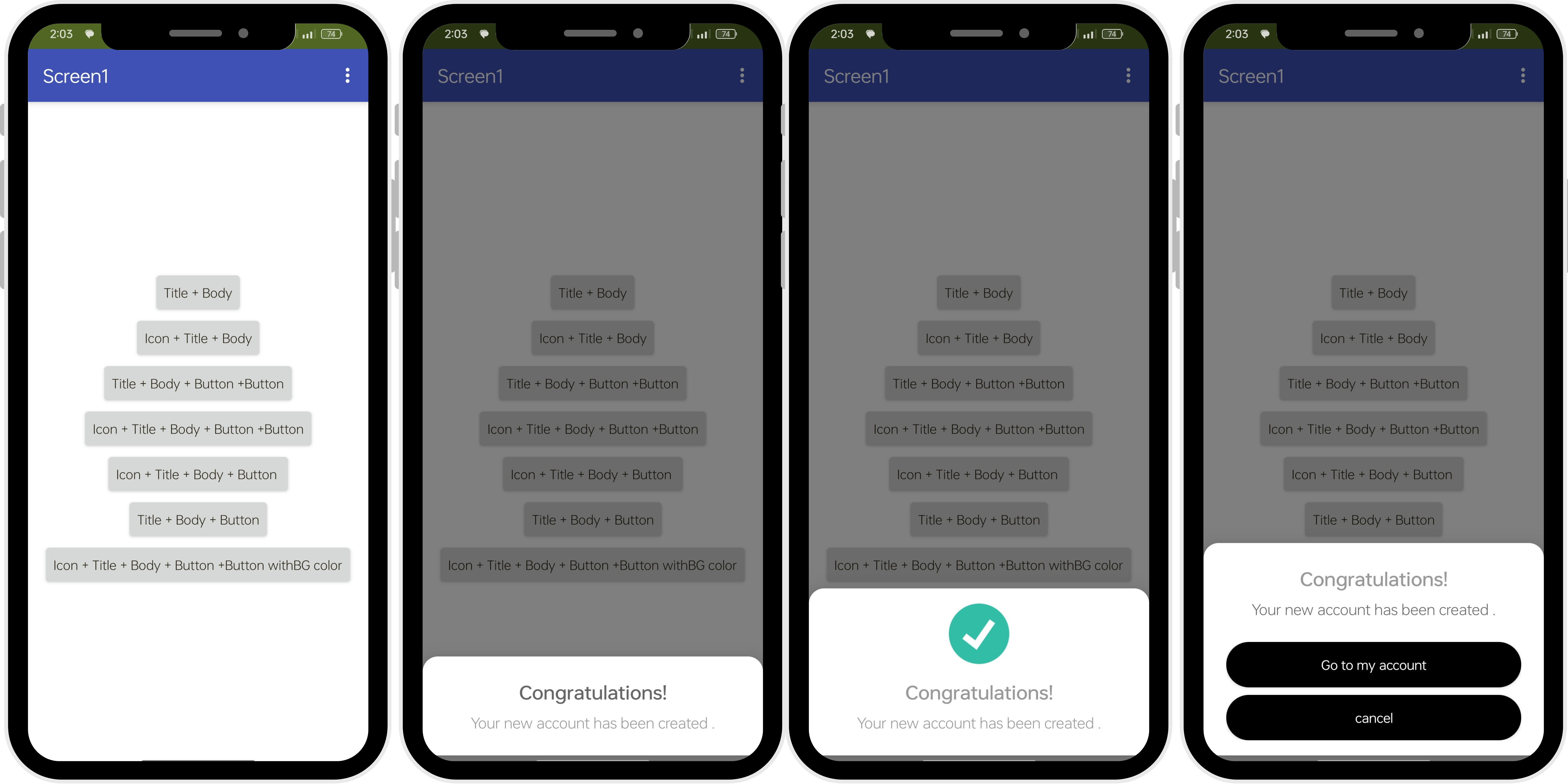
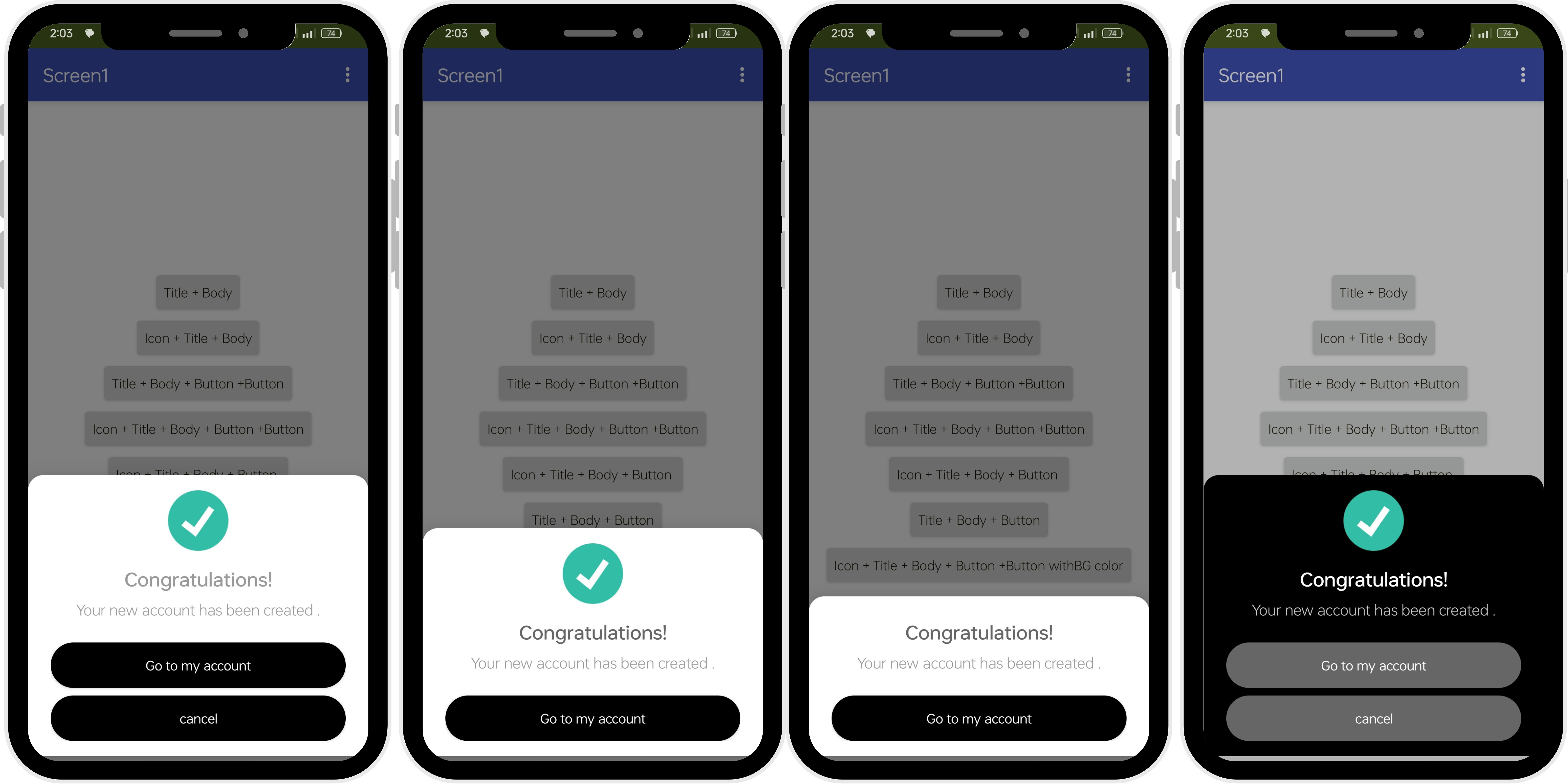
The AwesomeDialog extension provides blocks to create various types of dialogs (pop-up messages) that appear at the bottom of the screen. These dialogs are more visually appealing and flexible than the standard App Inventor Notifier. You can customize:
-
Icons (loaded from URLs, assets, or storage)
-
Titles and Messages
-
Text colors
-
Button text, colors, and arrangements (single, double vertical)
-
Background colors and corner rounding
-
Cancelability (whether tapping outside dismisses the dialog)
-
Frosted glass background effect
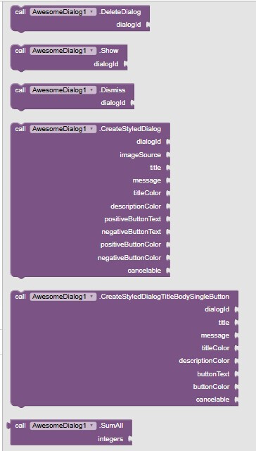
Each dialog you create needs a unique dialogId (text string). This ID is used to show, dismiss, or delete that specific dialog later.
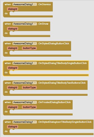
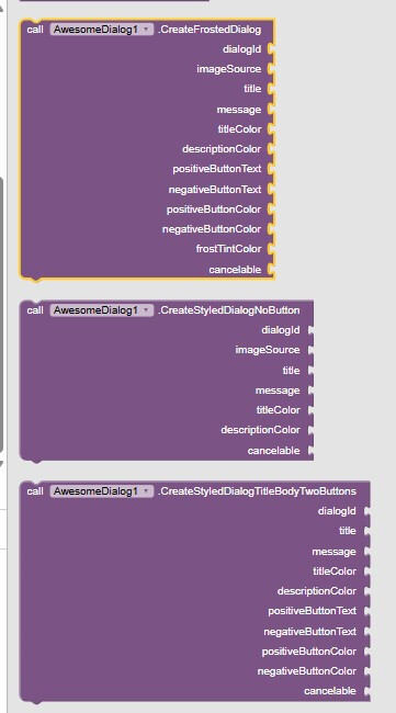
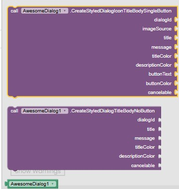
Blocks Reference
Notes and Tips
-
Unique IDs: Always use unique dialogId strings for each distinct dialog you want to manage independently.
-
Color Contrast: Ensure your text colors have good contrast against the white dialog background and your button text (usually white) contrasts well with the button background color.
-
Image Loading: Images from URLs or storage might take a moment to load. Consider this in your UI flow. Asset images load much faster.
-
Cancelable: Think about the user experience. Should the user be forced to interact with the dialog (cancelable = false), or can they easily dismiss it (cancelable = true)?
-
Dismissal: Dialogs created with buttons are automatically dismissed when a button is clicked. You usually don't need to call the Dismiss block within the button click events unless you want to dismiss it programmatically at another time.
-
Frosted Dialog: The frostTintColor must have transparency (alpha channel) for the effect to work. Use the Make Color block and adjust the alpha slider.
If you like my work, you can support me here 
8 Likes
possibly to show more than 1 dialog same time?
if not, then what's the use of id ?
Yes but not exactly showing them at the same time, however you can do this,
Instead you can store dialogs under a unique IDs and show them at any where by the id in your blocks of your app screen .
This will help developers to arrange the blocks without conflicts
i see. first create, then show. with two blocks.
Nice work.
Does this uses any library possibly Material Components?
I tried similar to this using material but due to size of this library I discarded it.
Yes, I am using the material Components liberary .
You are right it has a big size but the latest version of it has a powerful features.
1 Like
Yes but just for now ,
And I am working on adding other customizable styled components like toasts buttons , textboxes and more .
Also you can recommend on me other additional components .
1 Like
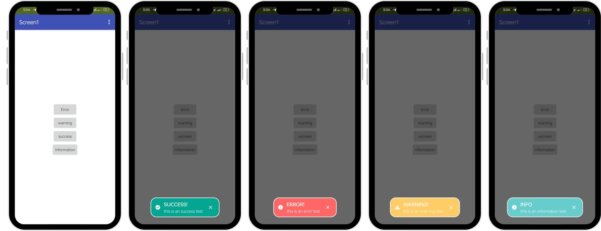
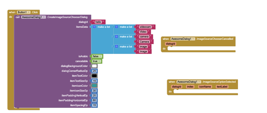
New Update
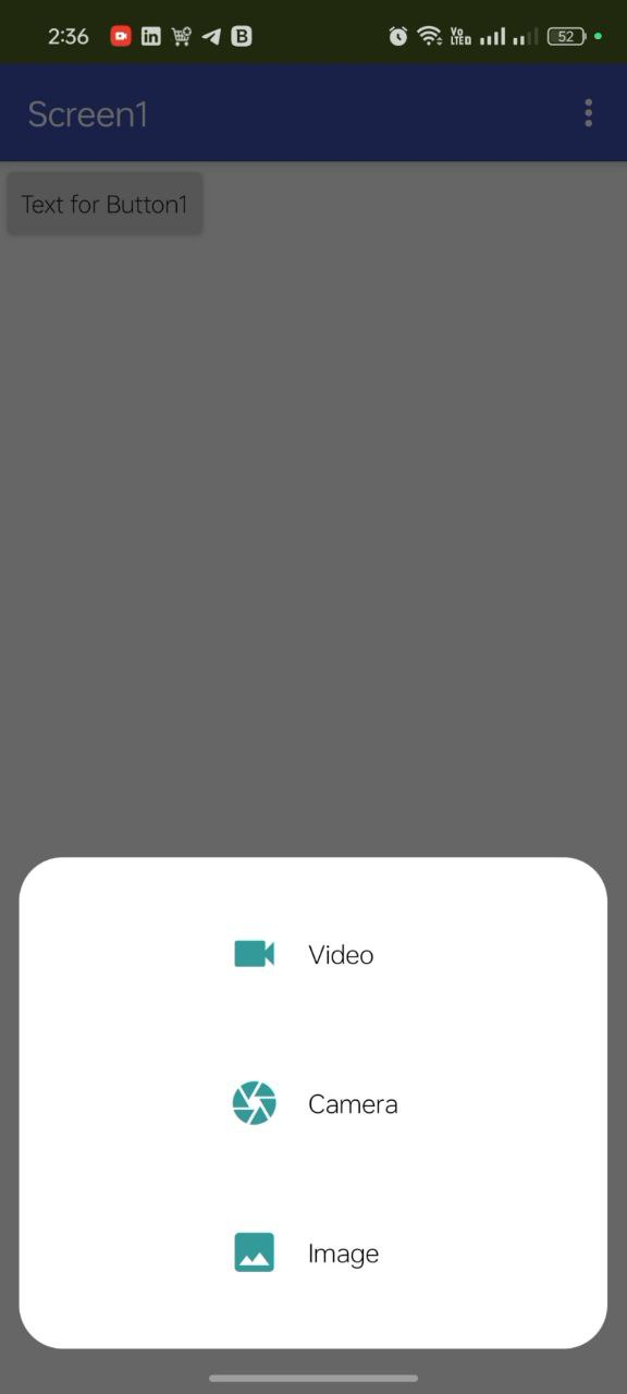
Show Styled UI options dialogs
Result :
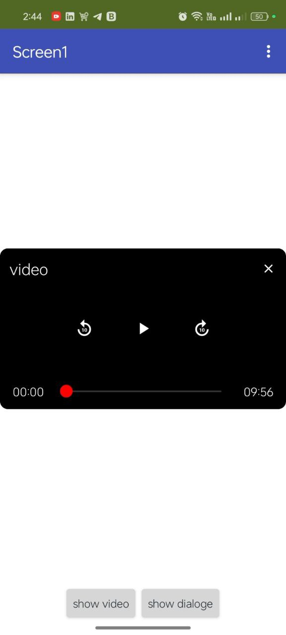
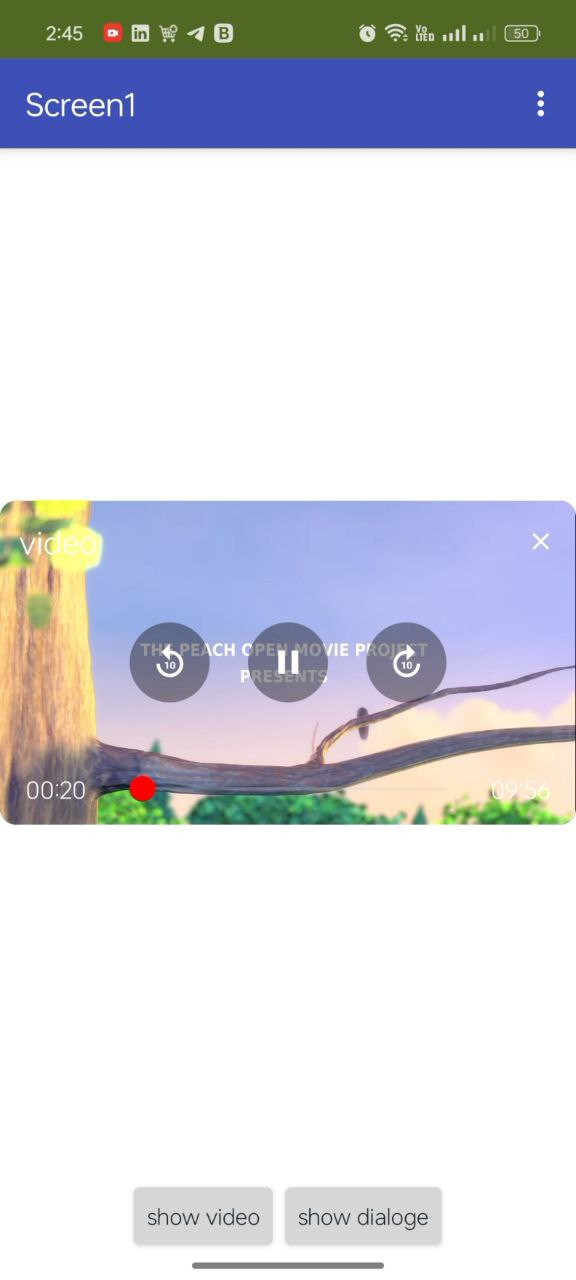
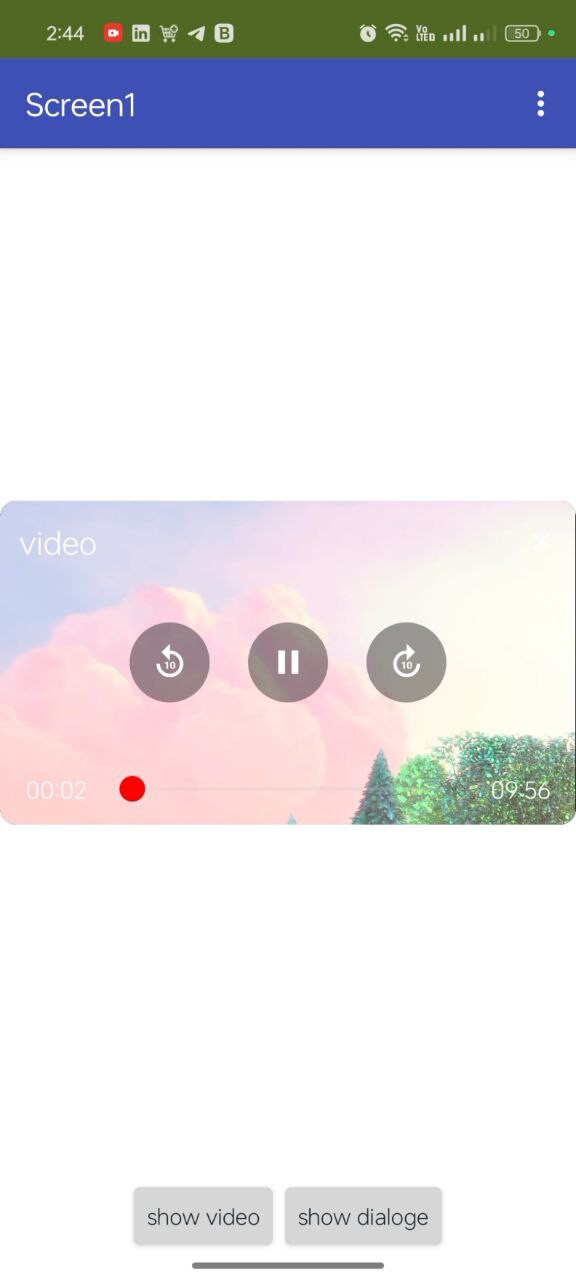
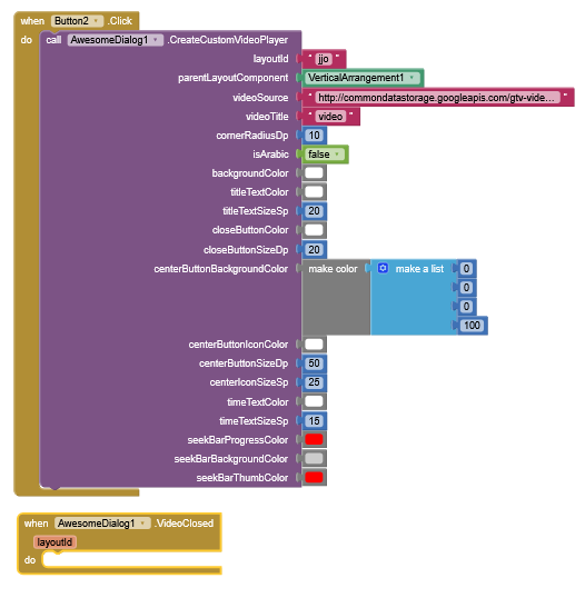
Load styled UI video to layout
Results :
Can you add video or gif support to it?
I think it would be cool
I will plan to add this feature In the next updated
1 Like
And a cool animation would be amazing and with some other settings for the dialogs(round edge, margarin, possition in the screen...)
1 Like
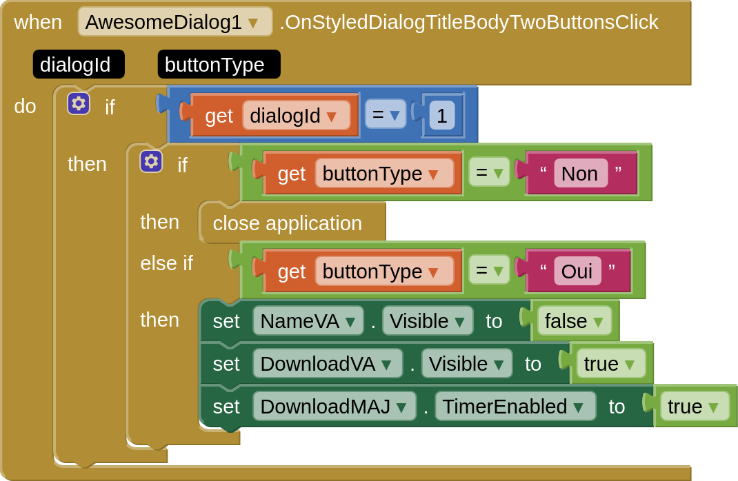
But how to use buttonType because i made this but it's doesn't works
1 Like
when i try to build the APP i face the following issues
Privacy Policy and Terms of UseAccessibility: accessibility.mit.edu
App Inventor is unable to compile this project.
The compiler error output was
[ReadBuildInfo] Starting Task
[ReadBuildInfo] Task succeeded in 0.008 seconds
[LoadComponentInfo] Starting Task
[LoadComponentInfo] INFO: Generating assets...
[LoadComponentInfo] Component assets needed, n = 0
[LoadComponentInfo] INFO: Generating activities...
[LoadComponentInfo] Component activities needed, n = 7
[LoadComponentInfo] INFO: Component "com.mrkoder.awesomedialog.dev.awesomedialog.AwesomeDialog" does not specify activityMetadata
[LoadComponentInfo] INFO: Component "com.mrkoder.dialoge.dev.alphadialog.MaterialDialog" does not specify activityMetadata
[LoadComponentInfo] INFO: Component "uk.co.metricrat.procambase64.ProCamBase64" does not specify activityMetadata
[LoadComponentInfo] INFO: Component "com.vsatish.overlapview.OverlapView" does not specify activityMetadata
[LoadComponentInfo] INFO: Component "io.shreyash.phase.Phase" does not specify activityMetadata
[LoadComponentInfo] INFO: Component "com.ruwis.decoration.Decoration" does not specify activityMetadata
[LoadComponentInfo] INFO: Component "xyz.kumaraswamy.itoo.Itoo" does not specify activityMetadata
[LoadComponentInfo] INFO: Component "com.mrkoder.styles.dev.sryles.Styles" does not specify activityMetadata
[LoadComponentInfo] INFO: Component "unk.beast.beastlottie.BeastLottie" does not specify activityMetadata
[LoadComponentInfo] INFO: Component "com.vsatish.makeviewup.MakeViewUp" does not specify activityMetadata
[LoadComponentInfo] Component activity metadata needed, n = 0
[LoadComponentInfo] INFO: Generating broadcast receivers...
[LoadComponentInfo] INFO: Component "com.mrkoder.awesomedialog.dev.awesomedialog.AwesomeDialog" does not specify broadcastReceivers
[LoadComponentInfo] INFO: Component "com.mrkoder.dialoge.dev.alphadialog.MaterialDialog" does not specify broadcastReceivers
[LoadComponentInfo] INFO: Component "uk.co.metricrat.procambase64.ProCamBase64" does not specify broadcastReceivers
[LoadComponentInfo] INFO: Component "io.shreyash.phase.Phase" does not specify broadcastReceivers
[LoadComponentInfo] INFO: Component "com.ruwis.decoration.Decoration" does not specify broadcastReceivers
[LoadComponentInfo] INFO: Component "xyz.kumaraswamy.itoo.Itoo" does not specify broadcastReceivers
[LoadComponentInfo] INFO: Component "com.mrkoder.styles.dev.sryles.Styles" does not specify broadcastReceivers
[LoadComponentInfo] INFO: Component "unk.beast.beastlottie.BeastLottie" does not specify broadcastReceivers
[LoadComponentInfo] INFO: Component "com.mrkoder.awesomedialog.dev.awesomedialog.AwesomeDialog" does not specify contentProviders
[LoadComponentInfo] INFO: Component "com.mrkoder.dialoge.dev.alphadialog.MaterialDialog" does not specify contentProviders
[LoadComponentInfo] INFO: Component "uk.co.metricrat.procambase64.ProCamBase64" does not specify contentProviders
[LoadComponentInfo] INFO: Component "com.vsatish.overlapview.OverlapView" does not specify contentProviders
[LoadComponentInfo] INFO: Component "io.shreyash.phase.Phase" does not specify contentProviders
[LoadComponentInfo] INFO: Component "com.ruwis.decoration.Decoration" does not specify contentProviders
[LoadComponentInfo] INFO: Component "xyz.kumaraswamy.itoo.Itoo" does not specify contentProviders
[LoadComponentInfo] INFO: Component "com.mrkoder.styles.dev.sryles.Styles" does not specify contentProviders
[LoadComponentInfo] INFO: Component "unk.beast.beastlottie.BeastLottie" does not specify contentProviders
[LoadComponentInfo] INFO: Component "com.vsatish.makeviewup.MakeViewUp" does not specify contentProviders
[LoadComponentInfo] INFO: Generating libraries...
[LoadComponentInfo] INFO: Component "com.mrkoder.awesomedialog.dev.awesomedialog.AwesomeDialog" does not specify libraries
[LoadComponentInfo] INFO: Component "com.mrkoder.dialoge.dev.alphadialog.MaterialDialog" does not specify libraries
[LoadComponentInfo] INFO: Component "uk.co.metricrat.procambase64.ProCamBase64" does not specify libraries
[LoadComponentInfo] INFO: Component "io.shreyash.phase.Phase" does not specify libraries
[LoadComponentInfo] INFO: Component "com.ruwis.decoration.Decoration" does not specify libraries
[LoadComponentInfo] INFO: Component "xyz.kumaraswamy.itoo.Itoo" does not specify libraries
[LoadComponentInfo] INFO: Component "com.mrkoder.styles.dev.sryles.Styles" does not specify libraries
[LoadComponentInfo] INFO: Component "unk.beast.beastlottie.BeastLottie" does not specify libraries
[LoadComponentInfo] Libraries needed, n = 3
[LoadComponentInfo] INFO: Component "com.mrkoder.awesomedialog.dev.awesomedialog.AwesomeDialog" does not specify metadata
[LoadComponentInfo] INFO: Component "com.mrkoder.dialoge.dev.alphadialog.MaterialDialog" does not specify metadata
[LoadComponentInfo] INFO: Component "uk.co.metricrat.procambase64.ProCamBase64" does not specify metadata
[LoadComponentInfo] INFO: Component "com.vsatish.overlapview.OverlapView" does not specify metadata
[LoadComponentInfo] INFO: Component "io.shreyash.phase.Phase" does not specify metadata
[LoadComponentInfo] INFO: Component "com.ruwis.decoration.Decoration" does not specify metadata
[LoadComponentInfo] INFO: Component "xyz.kumaraswamy.itoo.Itoo" does not specify metadata
[LoadComponentInfo] INFO: Component "com.mrkoder.styles.dev.sryles.Styles" does not specify metadata
[LoadComponentInfo] INFO: Component "unk.beast.beastlottie.BeastLottie" does not specify metadata
[LoadComponentInfo] INFO: Component "com.vsatish.makeviewup.MakeViewUp" does not specify metadata
[LoadComponentInfo] Component metadata needed, n = 0
[LoadComponentInfo] INFO: Generating Android minimum SDK...
[LoadComponentInfo] INFO: Generating native libraries...
[LoadComponentInfo] INFO: Component "com.mrkoder.awesomedialog.dev.awesomedialog.AwesomeDialog" does not specify native
[LoadComponentInfo] INFO: Component "com.mrkoder.dialoge.dev.alphadialog.MaterialDialog" does not specify native
[LoadComponentInfo] INFO: Component "uk.co.metricrat.procambase64.ProCamBase64" does not specify native
[LoadComponentInfo] INFO: Component "io.shreyash.phase.Phase" does not specify native
[LoadComponentInfo] INFO: Component "com.ruwis.decoration.Decoration" does not specify native
[LoadComponentInfo] INFO: Component "xyz.kumaraswamy.itoo.Itoo" does not specify native
[LoadComponentInfo] INFO: Component "com.mrkoder.styles.dev.sryles.Styles" does not specify native
[LoadComponentInfo] INFO: Component "unk.beast.beastlottie.BeastLottie" does not specify native
[LoadComponentInfo] Native Libraries needed, n = 0
[LoadComponentInfo] INFO: Generating permissions...
[LoadComponentInfo] usesLocation = False
[LoadComponentInfo] Permissions needed, n = 25
[LoadComponentInfo] INFO: Component "com.thekstudio.NetworkStatus.NetworkStatus" does not specify queries
[LoadComponentInfo] INFO: Component "com.mrkoder.awesomedialog.dev.awesomedialog.AwesomeDialog" does not specify queries
[LoadComponentInfo] INFO: Component "com.mrkoder.dialoge.dev.alphadialog.MaterialDialog" does not specify queries
[LoadComponentInfo] INFO: Component "com.gordonlu.beautify.Beautify" does not specify queries
[LoadComponentInfo] INFO: Component "com.rasitech.connectionchecker.ConnectionChecker" does not specify queries
[LoadComponentInfo] INFO: Component "com.gordonlu.componentutil.ComponentUtil" does not specify queries
[LoadComponentInfo] INFO: Component "uk.co.metricrat.procambase64.ProCamBase64" does not specify queries
[LoadComponentInfo] INFO: Component "com.vsatish.overlapview.OverlapView" does not specify queries
[LoadComponentInfo] INFO: Component "com.ruwis.decoration.Decoration" does not specify queries
[LoadComponentInfo] INFO: Component "io.techhamara.LottieView.LottieView" does not specify queries
[LoadComponentInfo] INFO: Component "xyz.kumaraswamy.itoo.Itoo" does not specify queries
[LoadComponentInfo] INFO: Component "com.mrkoder.styles.dev.sryles.Styles" does not specify queries
[LoadComponentInfo] INFO: Component "unk.beast.beastlottie.BeastLottie" does not specify queries
[LoadComponentInfo] INFO: Component "com.vsatish.makeviewup.MakeViewUp" does not specify queries
[LoadComponentInfo] INFO: Component "com.mrkoder.awesomedialog.dev.awesomedialog.AwesomeDialog" does not specify services
[LoadComponentInfo] INFO: Component "com.mrkoder.dialoge.dev.alphadialog.MaterialDialog" does not specify services
[LoadComponentInfo] INFO: Component "uk.co.metricrat.procambase64.ProCamBase64" does not specify services
[LoadComponentInfo] INFO: Component "com.vsatish.overlapview.OverlapView" does not specify services
[LoadComponentInfo] INFO: Component "io.shreyash.phase.Phase" does not specify services
[LoadComponentInfo] INFO: Component "com.ruwis.decoration.Decoration" does not specify services
[LoadComponentInfo] INFO: Component "xyz.kumaraswamy.itoo.Itoo" does not specify services
[LoadComponentInfo] INFO: Component "com.mrkoder.styles.dev.sryles.Styles" does not specify services
[LoadComponentInfo] INFO: Component "unk.beast.beastlottie.BeastLottie" does not specify services
[LoadComponentInfo] INFO: Component "com.vsatish.makeviewup.MakeViewUp" does not specify services
[LoadComponentInfo] INFO: Component "com.thekstudio.NetworkStatus.NetworkStatus" does not specify xmls
[LoadComponentInfo] INFO: Component "com.mrkoder.awesomedialog.dev.awesomedialog.AwesomeDialog" does not specify xmls
[LoadComponentInfo] INFO: Component "com.mrkoder.dialoge.dev.alphadialog.MaterialDialog" does not specify xmls
[LoadComponentInfo] INFO: Component "com.gordonlu.beautify.Beautify" does not specify xmls
[LoadComponentInfo] INFO: Component "com.rasitech.connectionchecker.ConnectionChecker" does not specify xmls
[LoadComponentInfo] INFO: Component "com.gordonlu.componentutil.ComponentUtil" does not specify xmls
[LoadComponentInfo] INFO: Component "uk.co.metricrat.procambase64.ProCamBase64" does not specify xmls
[LoadComponentInfo] INFO: Component "com.vsatish.overlapview.OverlapView" does not specify xmls
[LoadComponentInfo] INFO: Component "io.shreyash.phase.Phase" does not specify xmls
[LoadComponentInfo] INFO: Component "com.ruwis.decoration.Decoration" does not specify xmls
[LoadComponentInfo] INFO: Component "io.techhamara.LottieView.LottieView" does not specify xmls
[LoadComponentInfo] INFO: Component "xyz.kumaraswamy.itoo.Itoo" does not specify xmls
[LoadComponentInfo] INFO: Component "com.mrkoder.styles.dev.sryles.Styles" does not specify xmls
[LoadComponentInfo] INFO: Component "space.themelon.melonnotification.MelonNotification" does not specify xmls
[LoadComponentInfo] INFO: Component "unk.beast.beastlottie.BeastLottie" does not specify xmls
[LoadComponentInfo] INFO: Component "com.vsatish.makeviewup.MakeViewUp" does not specify xmls
[LoadComponentInfo] Component xmls needed, n = 0
[LoadComponentInfo] INFO: Generating component broadcast receivers...
[LoadComponentInfo] INFO: Component "com.mrkoder.awesomedialog.dev.awesomedialog.AwesomeDialog" does not specify broadcastReceiver
[LoadComponentInfo] INFO: Component "com.mrkoder.dialoge.dev.alphadialog.MaterialDialog" does not specify broadcastReceiver
[LoadComponentInfo] INFO: Component "uk.co.metricrat.procambase64.ProCamBase64" does not specify broadcastReceiver
[LoadComponentInfo] INFO: Component "io.shreyash.phase.Phase" does not specify broadcastReceiver
[LoadComponentInfo] INFO: Component "com.ruwis.decoration.Decoration" does not specify broadcastReceiver
[LoadComponentInfo] INFO: Component "xyz.kumaraswamy.itoo.Itoo" does not specify broadcastReceiver
[LoadComponentInfo] INFO: Component "com.mrkoder.styles.dev.sryles.Styles" does not specify broadcastReceiver
[LoadComponentInfo] INFO: Component "unk.beast.beastlottie.BeastLottie" does not specify broadcastReceiver
[LoadComponentInfo] Task succeeded in 0.006 seconds
[PrepareAppIcon] Starting Task
[PrepareAppIcon] INFO: Creating mipmap dirs...
[PrepareAppIcon] INFO: Generating icons...
[PrepareAppIcon] Generating icons for mipmap-mdpi
[PrepareAppIcon] Generating icons for mipmap-hdpi
[PrepareAppIcon] Generating icons for mipmap-xhdpi
[PrepareAppIcon] Generating icons for mipmap-xxhdpi
[PrepareAppIcon] Generating icons for mipmap-xxxhdpi
[PrepareAppIcon] Task succeeded in 3.39 seconds
[XmlConfig] Starting Task
[XmlConfig] INFO: Creating animation xml
[XmlConfig] Creating zoom_enter.xml
[XmlConfig] Creating fadeout.xml
[XmlConfig] Creating slide_v_exit.xml
[XmlConfig] Creating fadein.xml
[XmlConfig] Creating zoom_exit.xml
[XmlConfig] Creating slide_v_enter.xml
[XmlConfig] Creating zoom_exit_reverse.xml
[XmlConfig] Creating slide_v_enter_reverse.xml
[XmlConfig] Creating zoom_enter_reverse.xml
[XmlConfig] Creating slide_enter_reverse.xml
[XmlConfig] Creating slide_exit.xml
[XmlConfig] Creating hold.xml
[XmlConfig] Creating slide_enter.xml
[XmlConfig] Creating slide_v_exit_reverse.xml
[XmlConfig] Creating slide_exit_reverse.xml
[XmlConfig] INFO: Creating style xml
[XmlConfig] INFO: Creating provider_path xml
[XmlConfig] INFO: Creating network_security_config xml
[XmlConfig] INFO: Generating adaptive icon file
[XmlConfig] INFO: Generating round adaptive icon file
[XmlConfig] INFO: Generating adaptive icon background file
[XmlConfig] Task succeeded in 0.003 seconds
[CreateManifest] Starting Task
[CreateManifest] INFO: Reading project specs...
[CreateManifest] VCode: 1
[CreateManifest] VName: 1.0
[CreateManifest] Min SDK 14
[CreateManifest] INFO: Writing screen 'appinventor.ai_telalamareia.OrderVision.Screen1'
[CreateManifest] Task succeeded in 0.001 seconds
[AttachNativeLibs] Starting Task
[AttachNativeLibs] Task succeeded in 0.001 seconds
[AttachAarLibs] Starting Task
[AttachAarLibs] Task succeeded in 0.15 seconds
[AttachCompAssets] Starting Task
[AttachCompAssets] Task succeeded in 0.038 seconds
[MergeResources] Starting Task
[MergeResources] Task succeeded in 0.198 seconds
[SetupLibs] Starting Task
[SetupLibs] Task succeeded in 0.0 seconds
[RunAapt] Starting Task
[RunAapt] Task succeeded in 1.038 seconds
[GenerateClasses] Starting Task
[GenerateClasses] INFO: Source File: appinventor/ai_telalamareia/OrderVision/Screen1.yail
[GenerateClasses] INFO: Libraries Classpath = /tmp/kawa15775156836996136400.jar:/tmp/acra-4.4.05357440367202822475.jar:/tmp/AndroidRuntime55833078351403930.jar:/tmp/annotation7505936000275552527.jar:/tmp/annotation-experimental15993042388699641622.jar:/tmp/appcompat12681691226833028054.jar:/tmp/asynclayoutinflater15073715155607383709.jar:/tmp/collection13318685286328584255.jar:/tmp/constraintlayout6129719570947864515.jar:/tmp/constraintlayout-solver7521525001892731895.jar:/tmp/coordinatorlayout9217869178039849029.jar:/tmp/core17820792360071456377.jar:/tmp/core-common15647235065738089975.jar:/tmp/core-runtime4796208841016430500.jar:/tmp/cursoradapter14482918972695159860.jar:/tmp/customview12524304077119719135.jar:/tmp/documentfile6053765758309040114.jar:/tmp/drawerlayout6127282371255579986.jar:/tmp/fragment10728818286159938353.jar:/tmp/interpolator13236477602627757675.jar:/tmp/legacy-support-core-ui8895020174698203354.jar:/tmp/legacy-support-core-utils6710154950626579704.jar:/tmp/lifecycle-common3535000325985761047.jar:/tmp/lifecycle-livedata6517879361327132557.jar:/tmp/lifecycle-livedata-core10402846067685351182.jar:/tmp/lifecycle-runtime3266897427463275171.jar:/tmp/lifecycle-viewmodel16275130955578839153.jar:/tmp/loader16326483592803773934.jar:/tmp/localbroadcastmanager6791224494381662336.jar:/tmp/print10812684614321152387.jar:/tmp/slidingpanelayout11993671309097943777.jar:/tmp/swiperefreshlayout11625737112097824664.jar:/tmp/vectordrawable7713074929191894945.jar:/tmp/vectordrawable-animated14462544612052195353.jar:/tmp/versionedparcelable9864012831541939663.jar:/tmp/viewpager900393331019874686.jar:/tmp/1753549484500_3822904526716822528-0/youngandroidproject/../assets/external_comps/com.thekstudio.NetworkStatus/files/AndroidRuntime.jar:/tmp/1753549484500_3822904526716822528-0/youngandroidproject/../assets/external_comps/com.mrkoder.awesomedialog.dev.awesomedialog/files/AndroidRuntime.jar:/tmp/1753549484500_3822904526716822528-0/youngandroidproject/../assets/external_comps/com.mrkoder.dialoge.dev.alphadialog/files/AndroidRuntime.jar:/tmp/1753549484500_3822904526716822528-0/youngandroidproject/../assets/external_comps/com.gordonlu.beautify/files/AndroidRuntime.jar:/tmp/1753549484500_3822904526716822528-0/youngandroidproject/../assets/external_comps/com.rasitech.connectionchecker/files/AndroidRuntime.jar:/tmp/1753549484500_3822904526716822528-0/youngandroidproject/../assets/external_comps/com.gordonlu.componentutil/files/AndroidRuntime.jar:/tmp/1753549484500_3822904526716822528-0/youngandroidproject/../assets/external_comps/uk.co.metricrat.procambase64/files/AndroidRuntime.jar:/tmp/1753549484500_3822904526716822528-0/youngandroidproject/../assets/external_comps/com.vsatish.overlapview/files/AndroidRuntime.jar:/tmp/1753549484500_3822904526716822528-0/youngandroidproject/../assets/external_comps/io.shreyash.phase/files/AndroidRuntime.jar:/tmp/1753549484500_3822904526716822528-0/youngandroidproject/../assets/external_comps/com.ruwis.decoration/files/AndroidRuntime.jar:/tmp/1753549484500_3822904526716822528-0/youngandroidproject/../assets/external_comps/io.techhamara.LottieView/files/AndroidRuntime.jar:/tmp/1753549484500_3822904526716822528-0/youngandroidproject/../assets/external_comps/xyz.kumaraswamy.itoo/files/AndroidRuntime.jar:/tmp/1753549484500_3822904526716822528-0/youngandroidproject/../assets/external_comps/com.mrkoder.styles.dev.sryles/files/AndroidRuntime.jar:/tmp/1753549484500_3822904526716822528-0/youngandroidproject/../assets/external_comps/space.themelon.melonnotification/files/AndroidRuntime.jar:/tmp/1753549484500_3822904526716822528-0/youngandroidproject/../assets/external_comps/unk.beast.beastlottie/files/AndroidRuntime.jar:/tmp/1753549484500_3822904526716822528-0/youngandroidproject/../assets/external_comps/com.vsatish.makeviewup/files/AndroidRuntime.jar:/tmp/Barcode10584569661698249165.jar:/tmp/QRGenerator16486197033570910882.jar:/tmp/json15930011326456516953.jar:/tmp/1753549484500_3822904526716822528-0/youngandroidproject/../build/classes:/tmp/android5771997599947455532.jar
(compiling appinventor/ai_telalamareia/OrderVision/Screen1.yail to appinventor.ai_telalamareia.OrderVision.Screen1)
(compiling /tmp/runtime7859275772359844434.scm to com.google.youngandroid.runtime)
[GenerateClasses] Task succeeded in 2.789 seconds
[RunD8] Starting Task
[RunD8] INFO: Using pre-dexed dex-cached-7076f10a8011904f6fc06d9590b95179.dex <- /tmp/AndroidRuntime55833078351403930.jar
[RunD8] INFO: Using pre-dexed dex-cached-4afd1465d334dee94ac700edb0374a45.dex <- /tmp/kawa15775156836996136400.jar
[RunD8] INFO: Using pre-dexed dex-cached-558104d32e109ad96655ecbe9fe4e39f.dex <- /tmp/annotation7505936000275552527.jar
[RunD8] INFO: Using pre-dexed dex-cached-ef239d31d31d166f7410d71e14db1a68.dex <- /tmp/swiperefreshlayout11625737112097824664.jar
[RunD8] INFO: Using pre-dexed dex-cached-de87276390f7a8c71064f3e7908c143b.dex <- /tmp/core-common15647235065738089975.jar
[RunD8] INFO: Using pre-dexed dex-cached-c950a9845cca4523f19bc2fc922b41bf.dex <- /tmp/legacy-support-core-utils6710154950626579704.jar
[RunD8] INFO: Using pre-dexed dex-cached-35076b6f638faca00c217e98a0385344.dex <- /tmp/interpolator13236477602627757675.jar
[RunD8] INFO: Using pre-dexed dex-cached-bee920fd1e059913bf2d820dbb234720.dex <- /tmp/lifecycle-common3535000325985761047.jar
[RunD8] INFO: Using pre-dexed dex-cached-1e4d689047e2ee2cc76b7203626e9c33.dex <- /tmp/customview12524304077119719135.jar
[RunD8] INFO: Using pre-dexed dex-cached-74360288e1016af9d6afdd39a2caa1b8.dex <- /tmp/asynclayoutinflater15073715155607383709.jar
[RunD8] INFO: Using pre-dexed dex-cached-d53c4c8eedbf41663110b03a33fe9914.dex <- /tmp/lifecycle-runtime3266897427463275171.jar
[RunD8] INFO: Using pre-dexed dex-cached-032c68a2c5e93c1baac1524e105bbe88.dex <- /tmp/collection13318685286328584255.jar
[RunD8] INFO: Using pre-dexed dex-cached-91b7d1f3cb5fd0fd2f3a4c939316139b.dex <- /tmp/versionedparcelable9864012831541939663.jar
[RunD8] INFO: Using pre-dexed dex-cached-16ea1fc3b7e49139559eafccec2708ab.dex <- /tmp/lifecycle-viewmodel16275130955578839153.jar
[RunD8] INFO: Using pre-dexed dex-cached-84637f838557e65ad5856467fd22316c.dex <- /tmp/print10812684614321152387.jar
[RunD8] INFO: Using pre-dexed dex-cached-a9e803bf51318b35fcaf603f59f25f7c.dex <- /tmp/vectordrawable7713074929191894945.jar
[RunD8] INFO: Using pre-dexed dex-cached-b73957ec00af79319f56aedf27dff3fc.dex <- /tmp/core-runtime4796208841016430500.jar
[RunD8] INFO: Using pre-dexed dex-cached-4e788f5c66d33a47036ae77a849ffa1b.dex <- /tmp/core17820792360071456377.jar
[RunD8] INFO: Using pre-dexed dex-cached-e890ce7827a13b8714afbb241f7e89b2.dex <- /tmp/lifecycle-livedata-core10402846067685351182.jar
[RunD8] INFO: Using pre-dexed dex-cached-9e7da29c234333f4d245d8baa48e1746.dex <- /tmp/annotation-experimental15993042388699641622.jar
[RunD8] INFO: Using pre-dexed dex-cached-81757b9148a3984b5874ef1fd300acdb.dex <- /tmp/documentfile6053765758309040114.jar
[RunD8] INFO: Using pre-dexed dex-cached-b83403f2b639cc6e7a6f9c0681d69367.dex <- /tmp/viewpager900393331019874686.jar
[RunD8] INFO: Using pre-dexed dex-cached-c2a16bb02f51a6fcd1ff46dd1a78d0bf.dex <- /tmp/slidingpanelayout11993671309097943777.jar
[RunD8] INFO: Using pre-dexed dex-cached-2eabb48fdf784357d984acbda18ea6a3.dex <- /tmp/appcompat12681691226833028054.jar
[RunD8] INFO: Using pre-dexed dex-cached-7a5a85c38b934be86a121ca9b5e7477b.dex <- /tmp/vectordrawable-animated14462544612052195353.jar
[RunD8] INFO: Using pre-dexed dex-cached-a3a712d1d179d231b40a977ed5593202.dex <- /tmp/lifecycle-livedata6517879361327132557.jar
[RunD8] INFO: Using pre-dexed dex-cached-9b1768a7734de4eaf5a635a007ad4b25.dex <- /tmp/coordinatorlayout9217869178039849029.jar
[RunD8] INFO: Using pre-dexed dex-cached-d3d338969c3cd4ad53a888753da3b580.dex <- /tmp/cursoradapter14482918972695159860.jar
[RunD8] INFO: Using pre-dexed dex-cached-a116e0a41475b6522ae295f7cc4ff4b3.dex <- /tmp/legacy-support-core-ui8895020174698203354.jar
[RunD8] INFO: Using pre-dexed dex-cached-a07a23b88daaae0b48cdd25378e03b03.dex <- /tmp/localbroadcastmanager6791224494381662336.jar
[RunD8] INFO: Using pre-dexed dex-cached-bb8901219e7be6c576cc65e75503d7fa.dex <- /tmp/fragment10728818286159938353.jar
[RunD8] INFO: Using pre-dexed dex-cached-fca718e99e97cb52f4c8c0ada2c74e72.dex <- /tmp/drawerlayout6127282371255579986.jar
[RunD8] INFO: Using pre-dexed dex-cached-ccb6f0c5e0adc11059c3d609a2fd15d6.dex <- /tmp/loader16326483592803773934.jar
[RunD8] INFO: Using pre-dexed dex-cached-c0e4dda29672c028ea3ce0e3785040de.dex <- /tmp/constraintlayout6129719570947864515.jar
[RunD8] INFO: Using pre-dexed dex-cached-85f46a2fd295a23f59a391cccd7a11c8.dex <- /tmp/constraintlayout-solver7521525001892731895.jar
[RunD8] INFO: Using pre-dexed dex-cached-c70c540af2568ca4e4b168a72f71b49e.dex <- /tmp/Barcode10584569661698249165.jar
[RunD8] INFO: Using pre-dexed dex-cached-5e8957d43c18b768aa7d081353a3dd55.dex <- /tmp/json15930011326456516953.jar
[RunD8] INFO: Using pre-dexed dex-cached-34183dd13eefd80bd93dbefb2cca2c89.dex <- /tmp/QRGenerator16486197033570910882.jar
[RunD8] ERROR: d8 failed.
[RunD8] Task errored in 2.709 seconds
Could you list for me all extensions used inside your project, this error could resulted by the conflict of two extensions
So how do I use buttonType in OnStyledDialogTileBodyTwoButtonsClick