Hello everyone,
I’m reaching out again to request your feedback, this time focusing specifically on the layout mockups for my responsive mobile UI design for App Inventor.
After receiving some great reactions and helpful suggestions from my previous post on the community forum, I’ve been working on refining the design. Following my mentor’s advice, I’d now like to narrow the focus to just the layout aspects of the mockups to ensure they provide an optimal user experience on mobile devices.your insights mean a lot to me and are helping me improve every step of the way.
You can check out the updated layout mockups here:
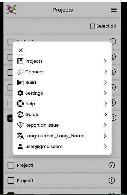
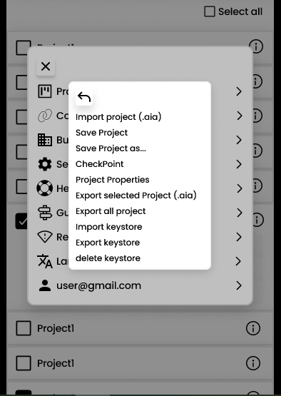
Below is the interactive prototype for the Project List screen,please click on the hamburger menu and then select the "Project" option.
For the project list screen, my idea is that when a user taps the hamburger menu, a single popup should appear with all the available navigation options—options like “Project,” “Connect,” etc. In the current design, if the user selects an option such as “Project,” it triggers another popup over the first one, creating a cascade of popups. This “popup over popup” model can be inefficient and confusing. Instead, we can streamline the interface by using just one popup. Within this popup, a dropdown menu can be implemented so that when the user taps a category (e.g., “Project”), all the related sub-options are displayed directly in that same window with sliding bar. This approach simplifies the user experience and keeps the navigation neat and efficient, which is more in line with best practices in MIT App Inventor designs.
For this round of feedback, I’d really value your thoughts on the following:
-
The overall structure and organization of the UI components
-
The navigation flow and how intuitive it feels to move through the app
-
The responsiveness and adaptability of the layout across different screen sizes
-
Any suggestions for improving the layout to enhance usability
-
If anyone have any suggestions or an alternative design idea, please share your thoughts. Your input is highly valued and will be very helpful.
While I’m grateful for feedback on all parts of the design, this post is primarily about the layout. I’ll be tackling other elements like colors and specific UI components in future updates, so feel free to hold off on those for now unless they tie directly into the layout.
Thank you so much for taking the time to review my work and share your feedback. Your input has already been a huge help, and I’m excited to keep refining this design with your suggestions!
Looking forward to hearing your thoughts,
Divyanshu Nayak ![]()