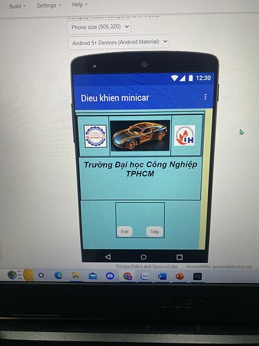
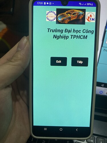
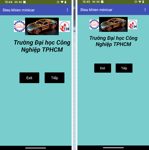
Hello, I set the size to be the phone interface, but when exporting to the apk, the interface is different from the simulation on the web. Why so? Help me, please
Hello,
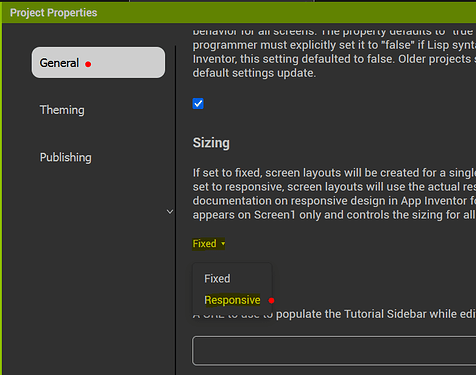
The Designer is just a representation of the finished GUI. Allows you to place the components. It represents the GUI quite well. When run on you device then it depends on your device (pixel density, screen size, fonts...) and whether you have set the sizing as fixed or responsive:
Responsive Design in App Inventor (mit.edu)
The appearance of the components may also vary with the Theme of your application.
Hi, thanks. I have set the both but It still not work.
What exactly is not working?
You don't tell the Screen its size.
The Screen tells you.
As you can see I have set the interface to match the simulation size on the web and adjusted the size in the sizing function but when I export the apk the interface is still wrong. Is there any way to fix it?
It seems displaced to the right...Do you have the horizontal alignment to Center? Is there any element on the left that is forcing that shift to the right? Maybe you can share the aia.
i have bound it in the center but it is still lopsided. I do not understand why? and what is aia?
(Canned Reply: ABG- Export & Upload .aia)
Export your .aia file and upload it here.
help me!!! I have a deadline
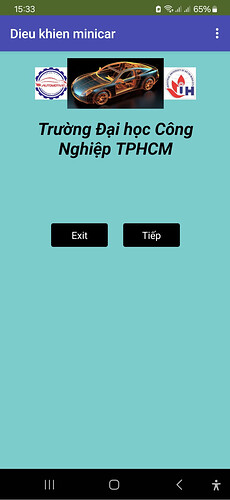
As you can see it is completely different from my web simulation
I want it to keep the same interface layout with every other phone device. is it possible?
I adjusted but still the same
Left: Fixed ....................... right: Responsive
Android 13, Companion.
Since your screenshot doesn't show a title, I'm assuming that you tested it firstly with the APK and secondly with the "Device Default" Theme. Correct?
That's right. What do you think I should do now?
Android version & name of your test device?
Check again whether “Responsive” is actually set under Sizing. If necessary, reload the browser and test it with Companion and the APK. Post screenshots from Companion as well.

