Hi,
probably is a very simple question but I 'm not able to get X and Y value from my Sheet.
In the new chart component I want to read data from a csv file ( an excel sheet saved as csv ).
If I save one column in the file , it's ok but one axis is from the file and the other go automatic (0,1,2,3,4, etc ). Also the name of column is right but if I try add another column I get error.
I want to get both data from csv , X and Y. How to manage and save the csv file? I get always error 4101 invalid values.
Thanks for reply.
Very easy
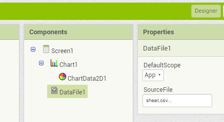
I added chart component , then dataFile and set as source the csv file uploaded as assets, then dragged datafile in the chart to create and connect chartData2d .
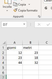
You are showing a screenshot of the spreadsheet, but not from the csv file itself... csv means comma separated value...
Just open your csv file and check if it looks like this
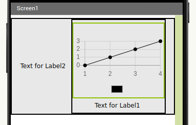
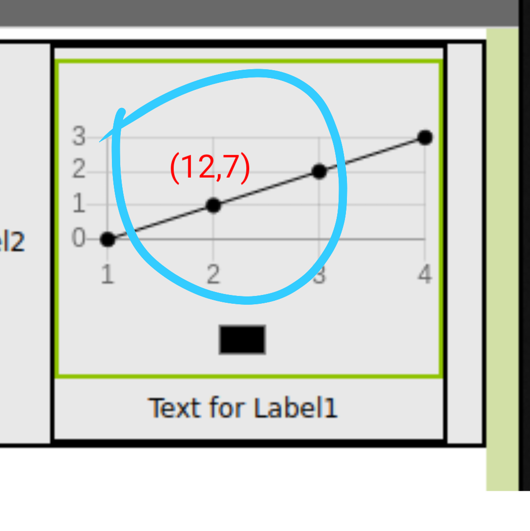
Google sheet saved in the right way . You know if is possible to show both values in the chart near the point ? Now I see only Y value and I use a notifier to show them on click
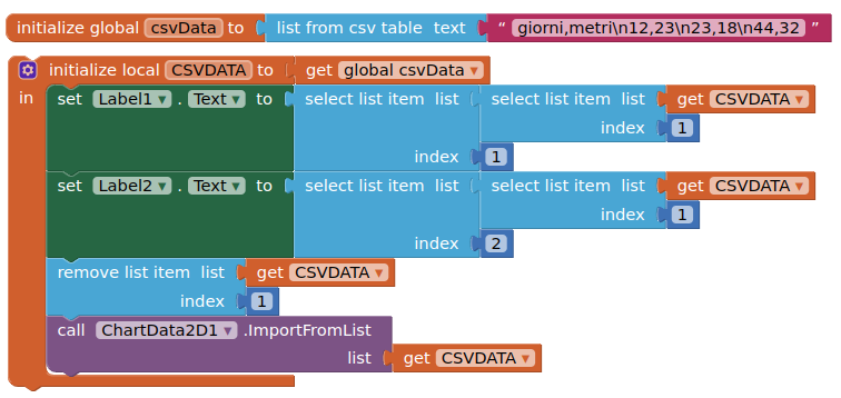
The chart component does not appear to provide for the setting of X/Y axis titles. To do this you will need to put the chart inside a vertical arrangement, then add a label below the chart. Then put the vertical arrangement inside a horizontal arrangement, and put a label to the left. Set the two labels with the values in the first row of your data, then remove the row from the list, then supply the data to the chart
Yes I know about the title.
Something like this in the image , now chart shows only 1 values above the point.
I don't need a special chart I'm only testing the new component