Good day.
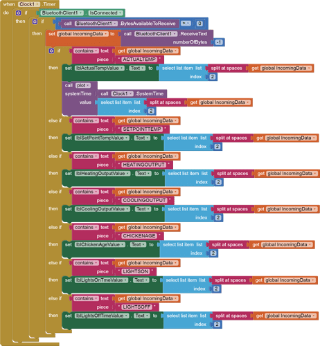
I am receiving Temperature information from a microcontroller and the displaying it in a label. This part of the project is working correctly. However I would like to create a line graph showing Temp vs Time that has passed. The range that I am going for is to display the temperature values of the last hour. I have seen that there is an option to add charts to an app, I even read the help pages but I still cant figure out how to do it. Could you please help me do this. The label that I want to plot is lblActualTempValue. I will attach my project.
Capstone_Project (1).aia (5.7 KB)
Is this sample accessible to you?
https://community.appinventor.mit.edu/t/testing-the-chart-component/58847/5?u=abg
a simple graph was is discussed here Adding labels on the axes in a canvas of App Inventor - #2 by TIMAI2
Here is a rough draft, which may need adjustment of the scale of the x values to make them readable and scaled down to negative minutes from now.
Capstone_Project_Edmar.aia (7.1 KB)
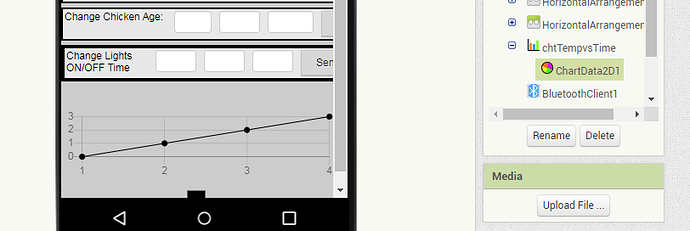
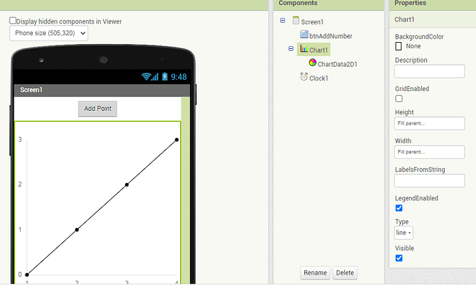
I had to make Screen1 scrollable to fit the graph, and to be able to reach it in the Designer.
In the Designer I had to insert a ChartData into the Chart.
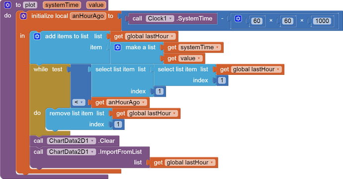
I used SystemTime as my x axis, and trimmed off (time,value) entries older than an hour.
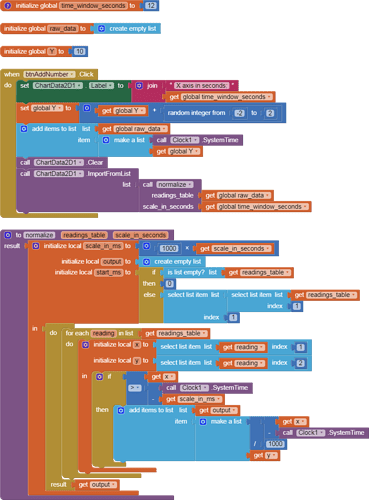
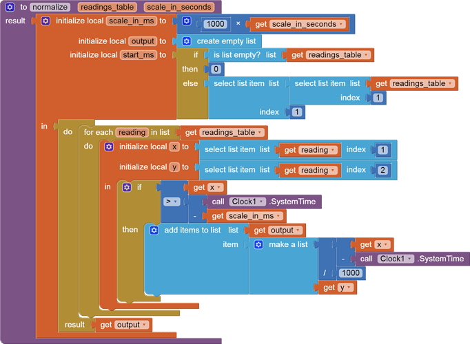
You might want to build a new table from the current table for plotting, subtracting the current Clock1.SystemTime from each x value and dividing the resulting negative ms offset by 60*1000 to get minutes ago. (assuming the charts component can handle negative x values.)
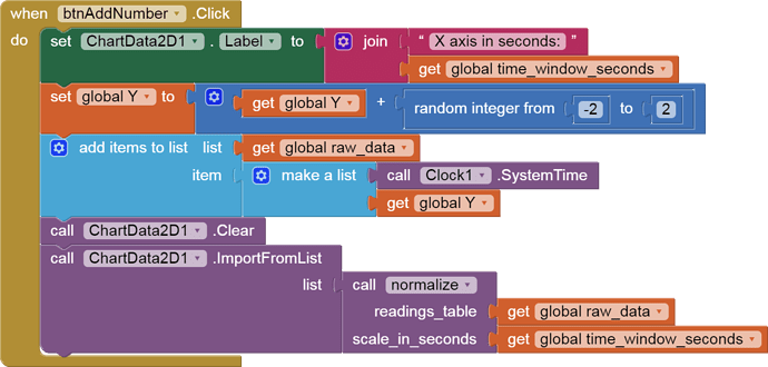
To show how to normalize time based readings to a particular scale, here is an example of the Drunkard's Walk, for the last 12 seconds:
charts_last_hour.aia (3.8 KB)

