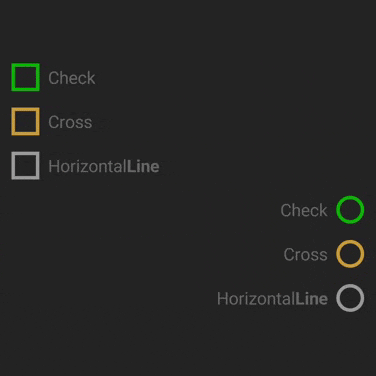
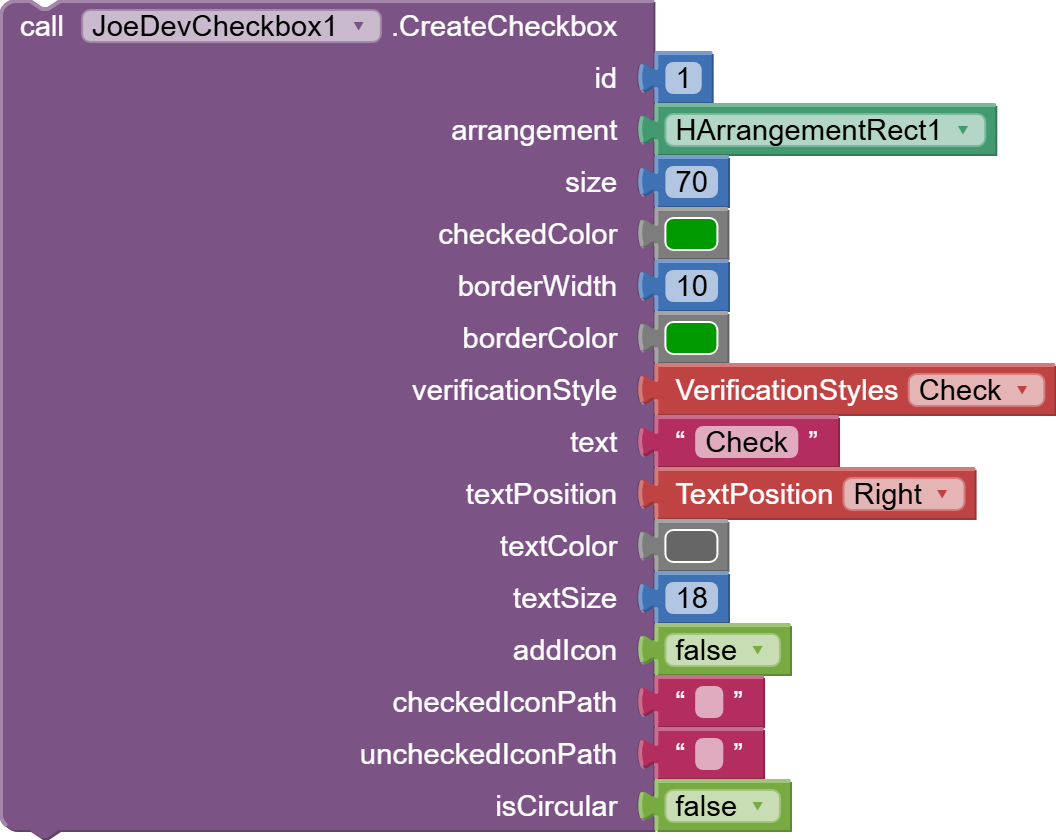
To display icons instead of the default verification icons: Check, Cross, and HorizontalLine.
Upload the .png icons to assets and set verificationStyle = Icon and addIcon = true.
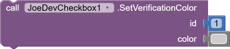
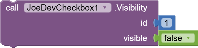
SetVerificationColor
Changes the color of the check mark in the CheckBox.
I've changed a lot of things, corrected them, and added others. The CheckboxU extension won't be updated, I've changed its name, but the checkbox functionality is still there in this new version.
Changes were made to function and parameter names.
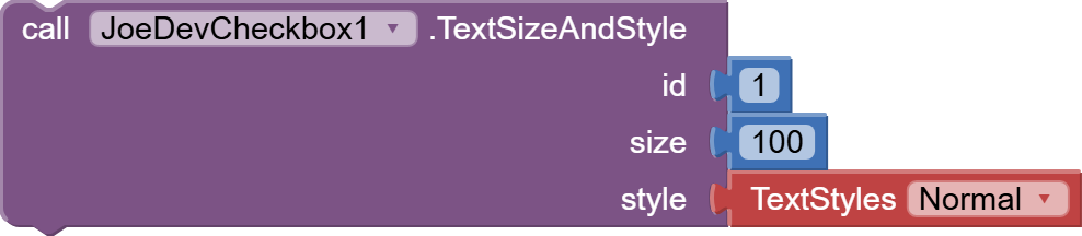
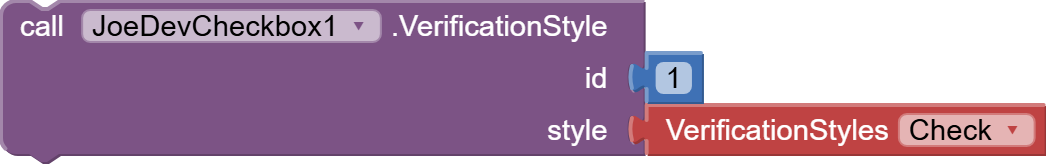
Helper blocks were added: VerificationStyles, TextStyles, and TextPosition.
Previously, only hexadecimal colors were used; now colors from built-in AI2 blocks can also be used.
A function was added to change the color of the Checkbox.
A function was added to add an icon from assets as a verification.
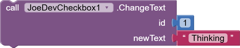
Text input now accepts HTML and text positions: right, left, top, bottom.
Circular checkboxes can now be created with the isCircular = true parameter.
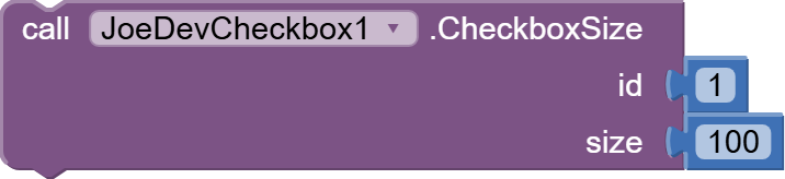
Checkboxes can be aligned based on the Arrangement alignment.
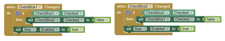
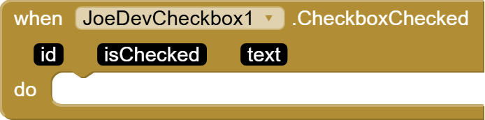
The event now also receives the checkbox text.
Removed these unnecessary check styles: Circle, Triangle, Rounded, Rectangle, and Star.
Hi, I am new to App Inventor and I think I don't understand yet how to use this extension. I've installed it, but I don't get the call block above, but a slightly different one (no drop down list for CheckboxU1, just call CheckboxUCreateCheckBox, and an extra notch for Component which I don't know what block to fill with). And where should this call block go? Thank you!
EDIT: OK, I figured it out, Component should be filled with CheckboxU1, now to figure out the second part of the question, where does the entire call block go to create a custom checkbox.
Hi and thank you for the quick reply! I restarted and I got the call block to look exactly as above, but I still haven't managed to use it properly, sorry. I will send you a message with the .aia now, thank you again!
Yes, but imagine expand it to dynamics forms creation, social or product or customer surveys, etc.
Because sometimes you need information about feelings and how it made you feel because 0 to 100%, 0 to 10, True or False, etc. It does not return the necessary information.
That's why there's a lot of difference in how something or someone makes you feel, sense, and what you think and thought about it, etc.
Many times the reactions to something or someone are varied, including "weird".
all that emotions, feelings, thoughts, and reactions can be measured by True, False, even the Null ones gives you information about.
Memerize information:
= it's ok = Whaaaaaaat....!!! = i like it = Dont like it = I'm not interested, it's even worth my time, try something else. = WaTaFuuuuu!!!!!????... = Angry = Rage = Insult = Ooooohhh... wooooo!!!! Blow my mind!!!! = Astonished, I dont want it... i need it!!!! = Amazing! i want more = Amazing.
And now... What if?? every reaction it's stored (True, False, even Nulls) and take it by an a LLM like GPT, and resume reactions from 0<X.xx <100 about your actual/next product.
And balance Decisions, projects, etc. on that resumes?
 = it's ok
 = Whaaaaaaat....!!!
 = i like it
 = Dont like it
 = I'm not interested, it's even worth my time, try something else.
 = WaTaFuuuuu!!!!!????...
 = Angry
 = Rage
 = Insult
 = Ooooohhh... wooooo!!!! Blow my mind!!!!
 = Astonished, I dont want it... i need it!!!!
 = Amazing! i want more
 = Amazing.