Custom: Icon, Radius, Border, Color, Gradient, HTML Text, Text Alignment.

CornerRadius
Set corner radius for multiple buttons.

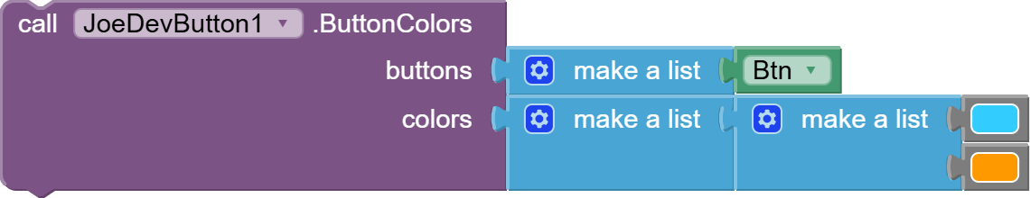
ButtonColors
Changes button colors dynamically.
Remember that you can put transparent buttons.
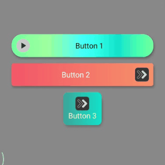
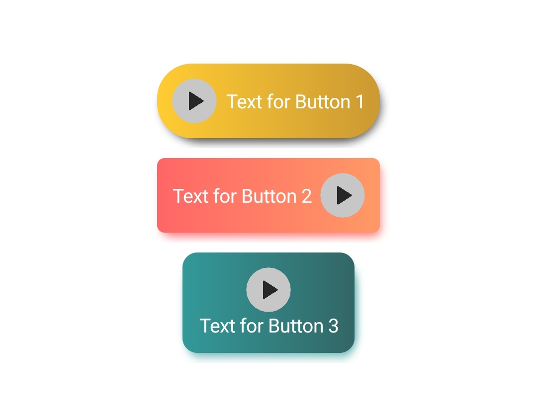
Image
Set image for multiple buttons with position and size.
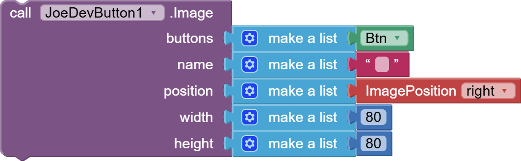
In the name parameter you can put an empty text block and the button will not have an image.

Or you can add the image from assets.

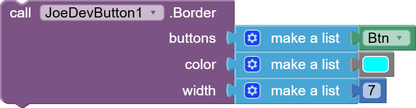
Border
Set border for multiple buttons with color and width.
SetButtonShadow
Sets shadow behind the button.
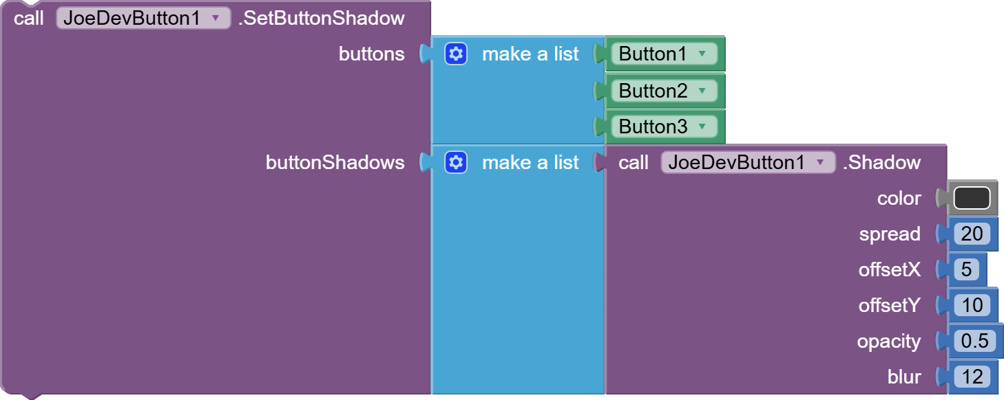
Sets a list of lists with the values for the shadow.
- I made the Shadow function to show in which position the values go and for greater convenience.
- But you can also pass just a list instead of the Shadow function.
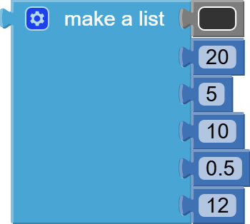
Example of List
Shadow
Adds shadow to buttons.
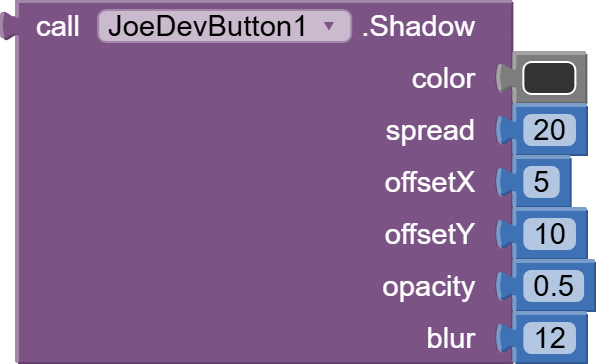
Details
color: Shadow color, in RGB, Hexadecimal or AI2 color blocks.spread: Shadow distance.offsetX: Horizontal offset of the shadow.offsetY: Vertical offset of the shadow.opacity: Opacity of the shadow, starting from 0.1.blur: It's recommended to set the value to 12.
It's recommended to set minimum values so that the shadow is not too large, since it will make the button reduce its size taking its place.
RemoveButtonShadow
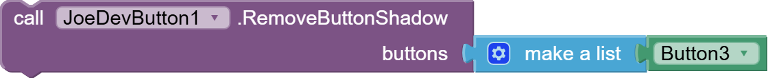
Removing the shadow increases the size of the button. Recommendation: If you add a shadow, don't remove it unless you configure the button correctly.
I have it in mind to fix it, but I don't know when yet.
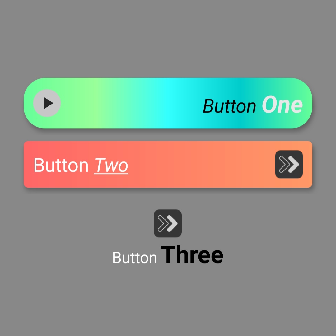
SetHtmlTextWithAlignments
Add text in html and alignment.
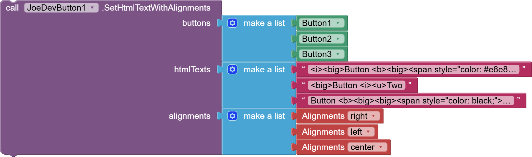
Alignment options:
center, left, right, top, bottom.
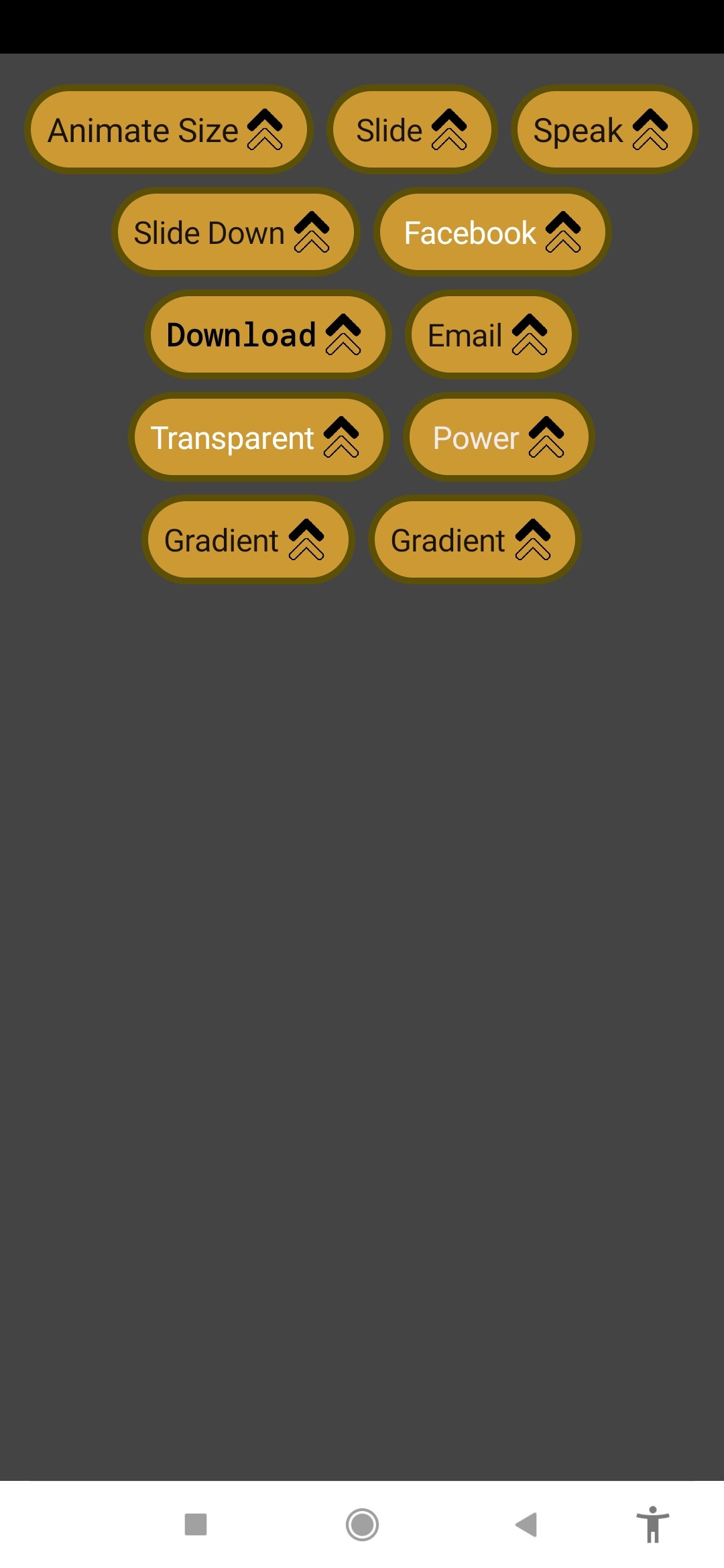
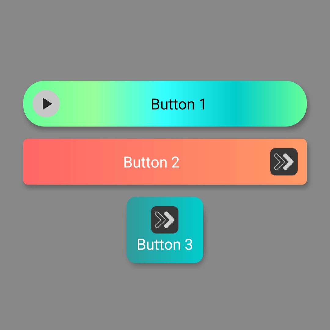
- Screenshots with examples of buttons with and without HTML and alignment.
And the button below with transparency.
Padding
Set padding for multiple buttons.
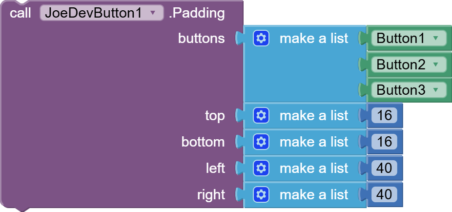
Default values:
- top:
16, bottom:16, left:40, right:40.
Like all other parameters, if you set a single value, that value will apply to all buttons, or add a different value for each button in the list.
v1.0.3
Update v1.0.3
Mar 22, 2025.
-
The buttonShadows parameter has been separated from the SetButton function.
-
Helper blocks have been added for the
imagePositionparameter of theSetButtonfunction and thealignmentsparameter of theSetHtmlTextWithAlignmentsfunction. -
Previously, the button only accepted two input colors; you couldn't enter more or less colors without getting an error.
- Now, the button can accept one color or more than two colors for a gradient.
-
A function has been added to dynamically change the button's color.
-
A function has been added to remove the shadow. (Removing the shadow increases the button's size.) Recommendation: If you add a shadow, don't remove it unless you configure the button correctly.
-
A function has been added to add HTML text and alignment.
v1.0.4
v1.0.4 Ago 11, 2025.
- Functions separate from the SetButton function have been added, so the SetButton function will be removed.
- Now, when you put an empty text block in the imageName parameter, the button won't have an image added.
v1.0.5 Ago 12, 2025.
-
The ButtonColors function had to come after any of the other functions to be applied correctly.
- Now, calling the ButtonColors function first will apply it correctly.
-
Added padding to center the text when the button is smaller, and added the function to control it.
v1.0.6 Ago 17, 2025.
- Fixed an error that does not allow joining strings in the
htmlTextsparameter of theSetHtmlTextWithAlignmentsfunction.
aia project:
Button.aia (29.8 KB)
Extensión: v1.0.4
If you're already using the SetButton function in your app, use this extension to manually migrate to the new blocks without crashing everything. You can then use the other extension below to update it, as it's lighter without the SetButton function.
joejsanz.joedevbutton.aix (16.0 KB)
If you are not using the SetButton function, you can use this extension directly without any problem.
v1.0.6
joejsanz.joedevbutton.aix (14.6 KB)
Note:
- You don't need to use the Image function if you're not adding an image to a button.
- The same goes for any other function.
JDK: 11
Minimum API Level: 21
Updated On: 2025-08-17T07:00:00Z
Built using: FAST-CLI v4.1.1-premium
Thanks
