Hi all,
I am planning a big series of tutorials on App Inventor this year (second half) and I was wondering if the App Inventor UI will change in the near future. I am asking because I read somewhere that the team thinks the UI is a bit dated and it should get a more modern feel. I fully agree, but also I am worried about putting lots of work in a tutorial series that will look dated soon.
My question is, do redesign plans exist? And if so, when is it planed to be release?
You can check open PRs here.
https://github.com/mit-cml/appinventor-sources/pulls
UI definitely needs an upgrade but that's going to take more than a year.
iOS support is hot-topic at this time.
Thanks for answering!
You can also try it out at https://ai2-test.appinventor.mit.edu. There is a new User Interface item on the Settings menu to switch to the new interface.
1 Like
That is not too shabby at all ![]()
Is dark mode far away ?
Dark mode is on hold until we finish the Blockly update, which enables applying themes (e.g., dark mode) to the block workspace. The remainder of the work on the UI has been done to support it but the white background of the current workspace is a bit garish against the darker theme elements so it's disabled in the short term.
1 Like
I took another peek at ai2-test for the new UI.
Project Properties is missing, along with its subtree (icon, etc.)
this is looking good! I'll keep an eye on it.
Maybe it is worth adding that setting sooner and just leave it off by default? That way we could start recording tutorials using the new UI.
Nope, it is at the top of the components list, on the right
Ah, I see it now. Maybe it needs background color like a bona fide button?
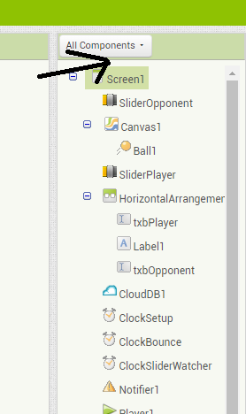
I was only expecting a hierarchy of components there.
This topic was automatically closed 7 days after the last reply. New replies are no longer allowed.
This thread is now reopened. We're updating ai2-test soon.
I have heard the confusion around the Project Settings button on the new UI. My reasoning was that we already set properties for individual components by clicking them in the component tree. This connection doesn't seem to have worked as well for users in general.
Current proposal is to change the button to a gear icon and put it back on the project toolbar beside the project name. That probably won't be done for this week's update.
I would have put the Project name here in the component hierarchy of the Designer, so selecting it would expose its Properties the same way selecting a Component exposes its Attributes.
2 Likes
Annnnd you just brought to my attention that the component display drop-down, which is a port from Kodular, did not make it into the new ui.
I'm off to go fix that.
As to the meat of your suggestion, my original draft was approximately what you suggested, only using "Project" instead of the actual project name. Testers found that confusing too.
There's probably some A/B testing that would be useful here if we had the resources to do it.