Description:
My new unique extension. The uniqueness is that its usage is different from other extensions. This extension is sort of a visible component, it replaces the original TextBox component, adding many new properties and methods to it. All you have to do is import this extension. If there are any TextBoxes in your project, they will all get new properties that you can modify in the designer screen. Note, removing the extension from the project will remove all TextBoxes from it. In order not to accidentally remove the extension, it is located in the UserInterface category replacing the original TextBox.
Blocks:
Below I present all additional blocks that are new. The description does not include the original blocks from the TextBox component.
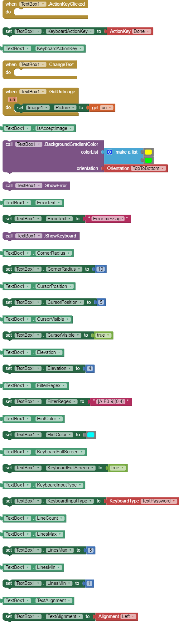
Description of blocks:
ActionKeyClicked- An event that occurs when click action button on keyboard.
KeyboardActionKey- Set/get the type of the action key on the soft keyboard. Possible values: Done, Go, Next, Previous, Search and Send. Designer and Blocks Editor.
ChangeText- An event that occurs when text in TextBox change.
GotUriImage- An event that occurs when the TextBox receives an image from the keyboard. The event returns a uri that we can use with the Image component to display the image.
IsAcceptImage- Returns whether the TextBox is set to accept images from keyboard. Accepting images is set in the designer, the AcceptImage option.
BackgroundGradientColor- A method that sets the background to a color gradient from colorList. The gradient is arranged according to the orientation parameter.
ShowError- This function displays an error in a TextBox, with the description specified in the ErrorText property.
ErrorText- Set/get the message that will be displayed in the text field balloon after the ShowError method is called. Designer and Blocks Editor.
ShowKeyboard- This function allows you to programmatically open the keyboard.
CornerRadius- Set/get the value of the corner radius with which the TextBox is to be trimmed, creating a view with rounded corners. Designer and Blocks Editor.
CursorPosition- Set/get position of the cursor in TextBox.
CursorVisible- Sets/get whether the cursor in the TextBox is visible.
Elevation- Set/get the value by which the TextBox component is lifted with a shadow underneath it. Designer and Blocks Editor.
FilterRegex- Set/get regular expression (regex) that will filter keyboard input. To disable filtering, set the value to an empty string. Example: [1]{0,4}& -this expression will allow you to enter 4 digits from 0 to 5. Designer and Blocks Editor.
HintColor- Set/get the color for the hint text. You can choose a color by name in the Designer or in the Blocks Editor.
KeyboardFullScreen- Podczas wprowadzania tekstu w orientacji poziomej klawiatura jest wyświetlana na pełnym ekranie i zasłania widok aplikacji. Ta właściwość włącza/wyłącza tryb pełnoekranowy i możemy zobaczyć ekran aplikacji nad klawiaturą. Designer and Blocks Editor.
KeyboardInputType- Set/get the type of soft keyboard and type of text inputted. Possible values: NormalText - full keyboard letters and numbers, CapChars - all uppercase letters,CapWords - every word starts with a capital letter, CapSentences - every sentence starts with a capital letter, TextPassword - letters and numbers hidden, DecimalSigned - floating point numbers, Decimal - positive floating point numbers, Integer - positive integers, NumberPhone - digits and characters useful when entering a telephone number, NumberPassword - hidden digits. Designer and Blocks Editor.
LineCount- get number of lines in the TextBox.
LinesMax- Set/get the maximum number of lines the TextBox can expand to when typing text. Other lines will be invisible but scrollable.
LinesMin- Set/get the minimum number of lines the TextBox will collapse to when deleting text.
TextAlignment- Set/get whether the text should be left justified, centered, or right justified. This is the original function from TextBox, but now also available in the Block Editor.
0-5 ↩︎