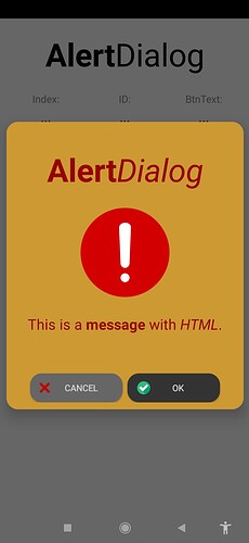
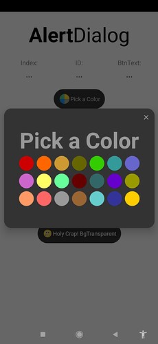
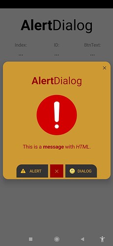
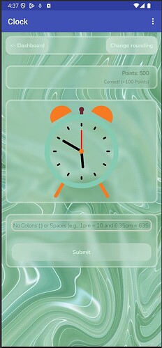
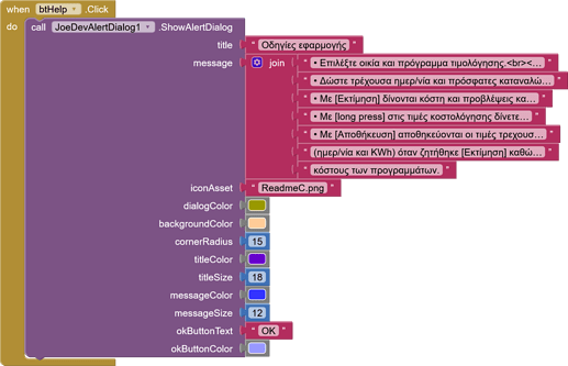
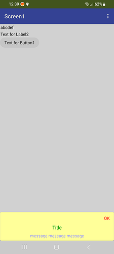
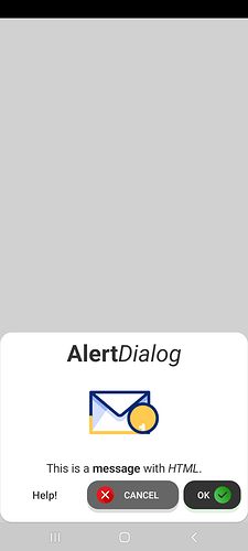
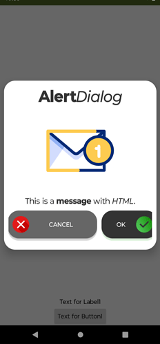
Includes: title, message, icon (Static or Animated), customizable buttons, background colors, text, border, corner radius.
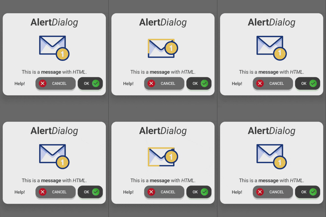
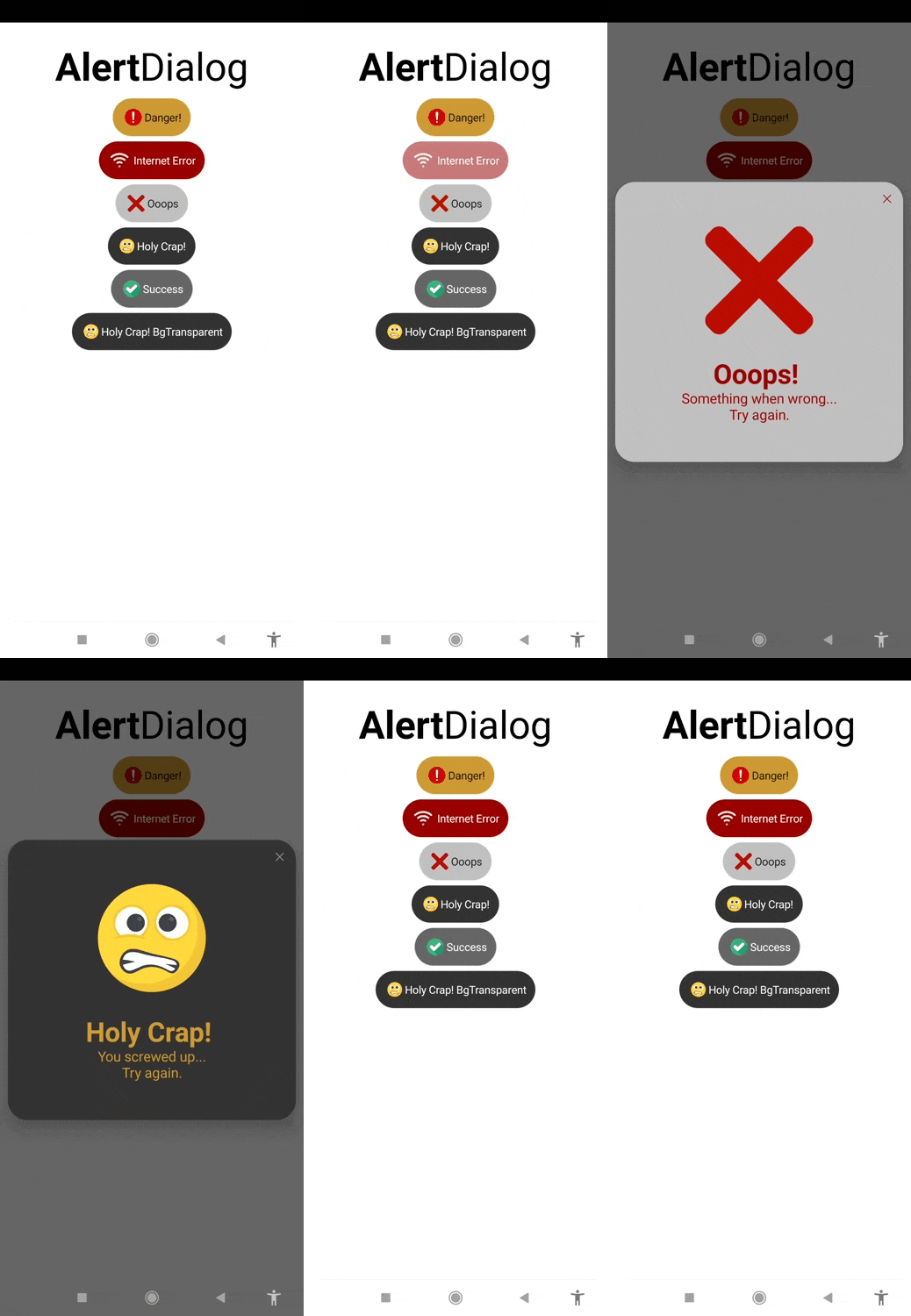
Update v1.1 June 14, 2025.
- Icons can now be added from assets or URLs from the web: .jpg, .png, .gif
- A helper block has been added for imagePositions.
- The backgroundColor parameter has been removed from the ShowAlertDialog function; the block will update.
- The IconSize function has been added.
- A click effect and shadow have been added to buttons.
(When the effect ends, the dialog closes, triggering the event.) - Three new parameters have been added to the AddButtons function.
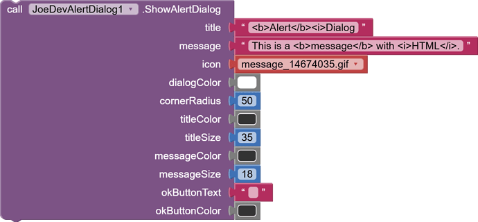
ShowAlertDialog
Shows an AlertDialog with an icon or animated gif
The backgroundColor parameter has been removed as it was no longer needed. (The block will be updated).
You can add image from assets or url.
Formats: .jpg, .png y .gif.
IconSize
Changes the size of the icon.
The size is 400 x 400 by default.
- You can enter any value to resize the icon within the dialog.
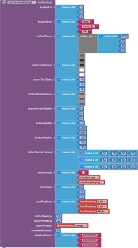
AddButtons
Adds multiple buttons below the message with customizable options.
3 more parameters have been added, the block will be updated.
Parameters: buttonGravity , shadowElevation , shadowColors .
Customizable Options:
-
Change the color.
-
Separate corner radius.
-
Height and width.
-
Add icons.
-
Position icons between left, right, top, and bottom.
-
Shadow under the button and change its color.
-
buttonGravity: Positions buttons to the right, center, or left. -
shadowElevation: The distance of the shadow under the button. (The shadow has no feathering.) -
shadowColors: The shadow color. It is recommended that colors with transparency be used. Enter a hexadecimal value, for example: #22000000 (22 indicates transparency). -
In
buttonWidthsif you pass -1 as the value, the button will expand to cover the available space.
Dismiss
Closes the AlertDialog.

ButtonClicked
Triggered when a button is clicked.
It will fire after the button completes the click animation.
v1.1 June 14, 2025.
AlertDialog.aia (532.3 KB)
joejsanz.joedevalertdialog.aix (19.7 KB)
JDK: 11
Minimum API Level: 21
Updated On: 2025-06-14T07:00:00Z
Built using: FAST-CLI v3.6.1
Thanks.
