ㅤToggle Switchㅤ
Custom slide switches with images or solid colors for background and thumbs. Rounded corners can be adjusted.

ㅤFunctions:ㅤ
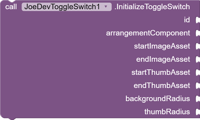
InitializeToggleSwitch
Initializes the switch with images for background and thumb, and adjusts rounded corners.
id(int): Switch identifier.arrangementComponentArrangement.startImageAsset(String): Background start image filename (from assets).endImageAsset(String): Background end image filename (from assets).startThumbAsset(String): Start thumb image filename (from assets).endThumbAsset(String): End thumb image filename (from assets).backgroundRadius(int): Background corner radius.thumbRadius(int): Corner radius of the thumb.
SetSwitchBackgroundColors
Sets solid colors for the switch background instead of images.
id(int): Switch identifier.startColor(int): Background color at start (in ARGB format).endColor(int): Background color at end (in ARGB format).
GetIsChecked
Returns the current state of the switch (true if on, false if off).
id(int): Switch identifier.
SetChecked
Sets the state of the switch, moving the thumb to the corresponding position.
id(int): Switch identifier.checked(boolean): Switch state (true for on, false for off).
ㅤEvent ㅤ
OnSwitchChanged
Event that is triggered when the switch changes state (is turned on or off).
id(int): Switch identifier.isChecked(boolean): Updated state of the switch (true if it is on, false if it is off).
ㅤExtension:ㅤ
joejsanz.joedevtoggleswitch.aix (12.8 KB)
Thanks.


