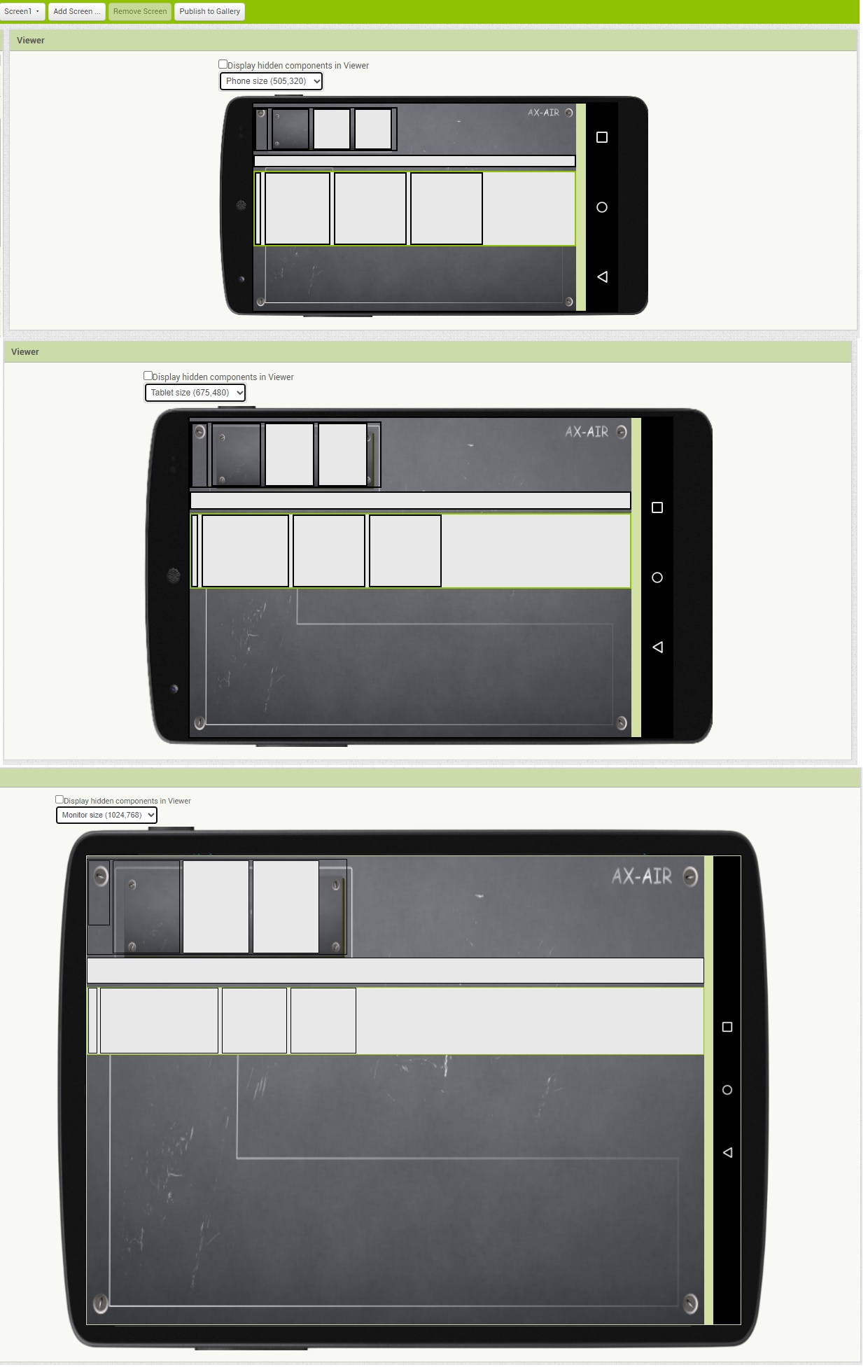
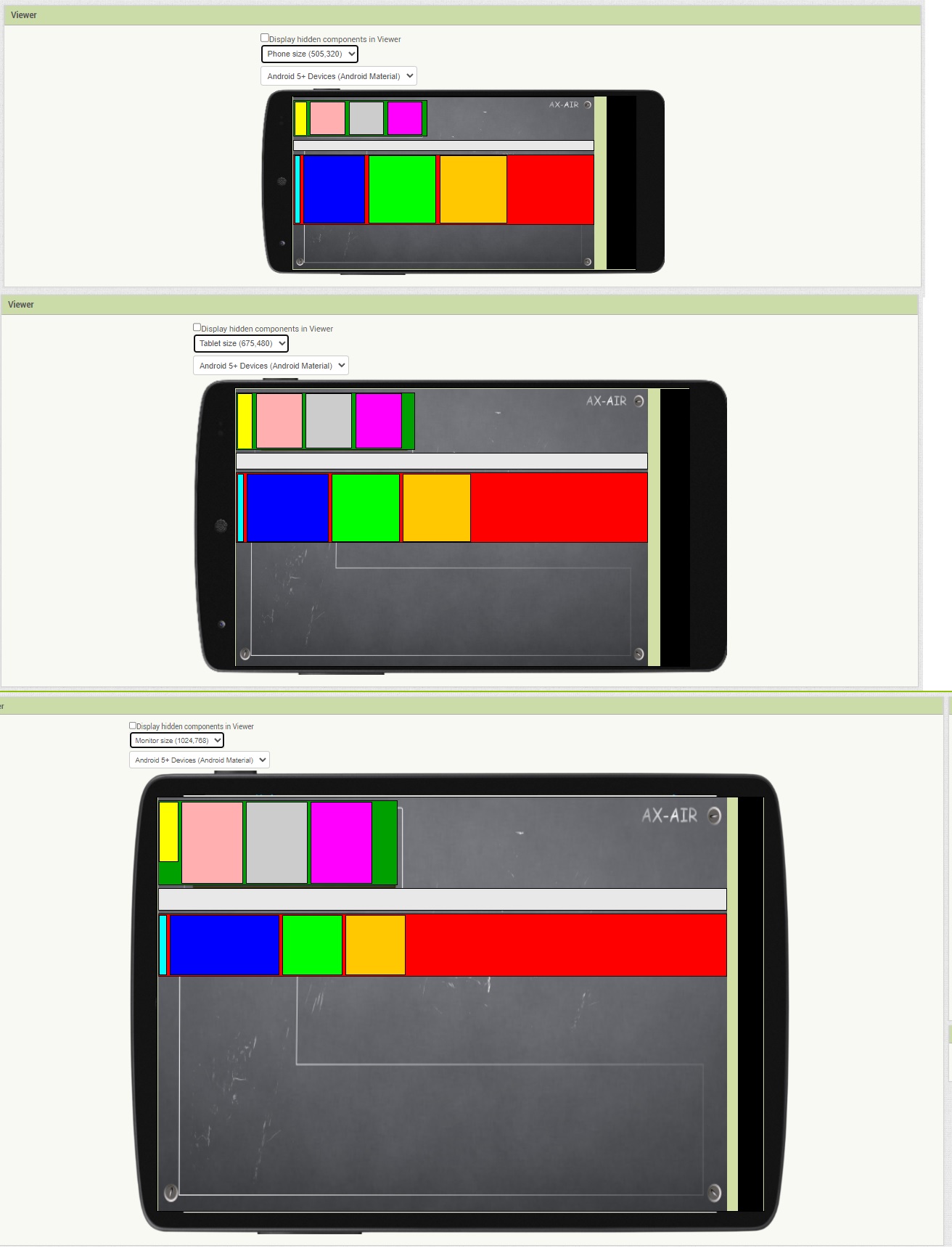
Forgive me, I am a beginner at this but fighting an issue before I can go ahead with building apps. It has also probably been explained before but I couldn't find the answer. I followed the basic rules of designing in percentages and not in Pixels. The screen sizing is set to responsive. (and also set the screen orientation Landscape).
When I cycle through the view options I see completely different placements of the layout arrangements and the percentages do not match. Also after uploading an example like this to a phone or tablet the placements are very far off. Randomly and different on every device.
You can see the background screen image where my components need to be scaled and line up with every screen size device.
I feel I miss something really basic. Anyone who can help me to get this basic layout done the correct way so it scales and sizes?
My problem is that I cannot have a correct layout on a background image in general. I can get it done on purely 1 device but the arrangement will be completely distorted on another.
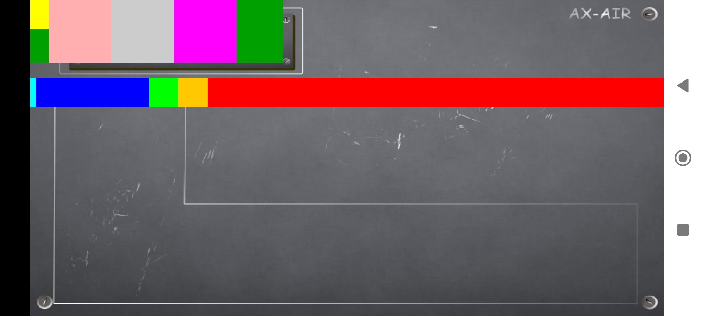
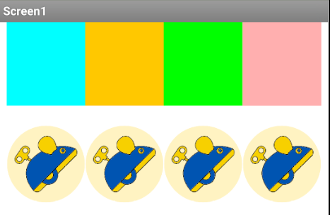
If I would have a horizontal arrangement of 4 blocks, each 25% in width and height, and add an image to each of those blocks. I scale the images as fit to parent in both height and width. Then scale the picture to fit. I would expect now to see 4 blocks filled with the images and aligned from left to full right. 4x25% is 100% of the screen width so why do I see 3 blocks being to the same scale and the last block just filling the screen. So not all 4 arrangements are responsive but only the last filling the space. 25% is not 25% when I load the app on a tablet, It suddenly became 10% or so
I think I might know the problem. The scaling is always to the full-screen size which I indeed read in a tutorial. If I have an arrangement in an arrangement I can only guess the scaling by trying and looking at the screen. Even if I get that done and upload the app to a phone the scaling is suddenly done to the parent arrangement instead of the full screen. Very confusing as what you see is completely different from what you get.
I am sure I do something very wrong because this way it will be a trial and error exercise.
Is the trick not to use the phone representation on the PC but only the companion screen?
That is an exceptional requirement where you would have to define everything in pixels. Anke has created an extension that can verify the phones's screen size, so you should be able to work with that.
You might have to draw the background at run time. Draw it on a Canvas and export to a file, then hide the Canvas and import the image as the Screen Background.
I can't see what your explanations have to do with your aia.
Post a test aia that actually shows your problem exactly (as you described, with images etc).