Although a guide does exist, I though of making a guide for making and designing tabs just like it is on android (the native UI).
Ok, so let's get started!!
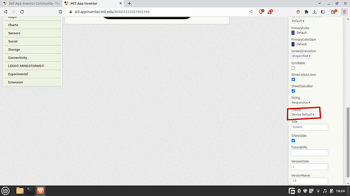
First create a project, with the theme device default, important to make the app look professional
pls tell me how many times i said professional
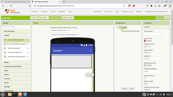
Anyways, as I was saying, add a horizontal arrangement just below the title bar and make the component to width == "fill parent"
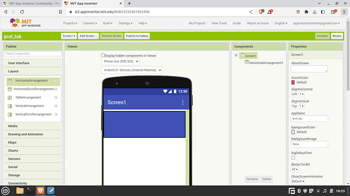
Now make its background color the same as the the title bar color (screen1's or any screen's primary color). By default screen primary color is #3f51b5ff.
Add a vertical arrangement inside the horizontal arrangement and set its width to fill parent!
set its background color to none (transparent)
add a label inside the vertical arrangement and set it's color to white or to your desire...
text align should be center and width to fill parent
add a horizontal arrangement below the label inside of that vertical arrangement and set the color same as label text color
width should be fill parent.
now we must adjust the height
i will show you my way of doing it.
add a label inside of the arrangement that's below the other label
text should be just a space and font size is 2.
Change the Text For Label1 text to tab text
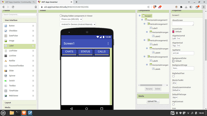
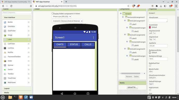
overall the components of the app should be looking like this
paste the vertical arrangement that contains the tab text inside the first horizontal arrangement into many tabs
it should be looking like this
now decide which tab should open by default on initialize.
keep that tab setting intact an change the other tabs horizontal arrangement color to none
download labelplus extension by searching the community!!
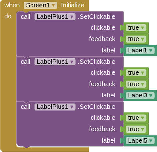
Add this script when screen initialize
It just enables the tab labels to be clickable with a sound effect!
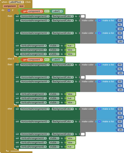
Then add this script
This allows the user to switch tabs and the pages by clicking the tab texts and the arrangements are highlited.
There you go! It should work!
Now if you want to make it even more realistic, you can use Corner Radius extension by searching the community and making the top left and top right radius 50px.
I won't be covering that extension here. Thank you!
Note: Please rename your labels to something else so it will be easier to follow for you. Since I don't have this habit I didn't rename them, but will from the future 
If it doesn't work pls tell me, and I will improve the tutorial accordingly..
