Sounds like you have figured out what I’ve been seeing, too. If it helps I’m seeing this on a Pixel 4 XL.
1 Like
I'm having the same problem with my Pixel 4 XL running Android 10. When the icon is slid around, you can tell that the image is a square within the circular icon mask. It slides to reveal the default white underneath, and the edges of the square show as you move the icon. It may be better to include background color control in AI and layer on a PNG icon with alpha channel to avoid the background color and edges issues.
Did that solution work for you? How would I go about doing this with App Inventor? I didn't know there was another way to customize the icon besides by uploading an image file. Thanks!
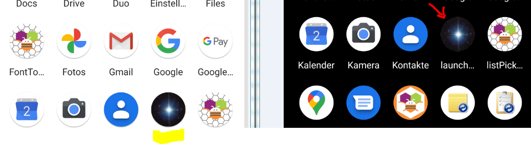
I am having the same issues as in the original post. I am using a Google Pixel 3a and I see very small white spots on the right and bottom. My icons are completely circular and I am using a square image file.
I built this aia launcherIcon.aia (43.2 KB) and checked it on a Pixel 2XL (Android 11 - Beta):
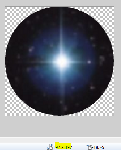
launcher_icon.png (192x192px)
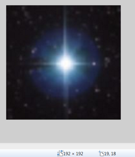
launcher_icon.jpg (192x192px)
Similar results on a Galaxy Note8, Xiaomi Redmi Note 5 (both Android 9).
So check this aia on your test devices and post the results.
Unfortunately I'm still having the same issue. Screenshot attached. Also if you zoom in on your screenshot you can see that there are white spaces on all 4 sides, screenshot of that also attached. The white space on yours is smaller than on mine, but it's still noticeable. I increased the contrast to make it easier to see.
my phone:
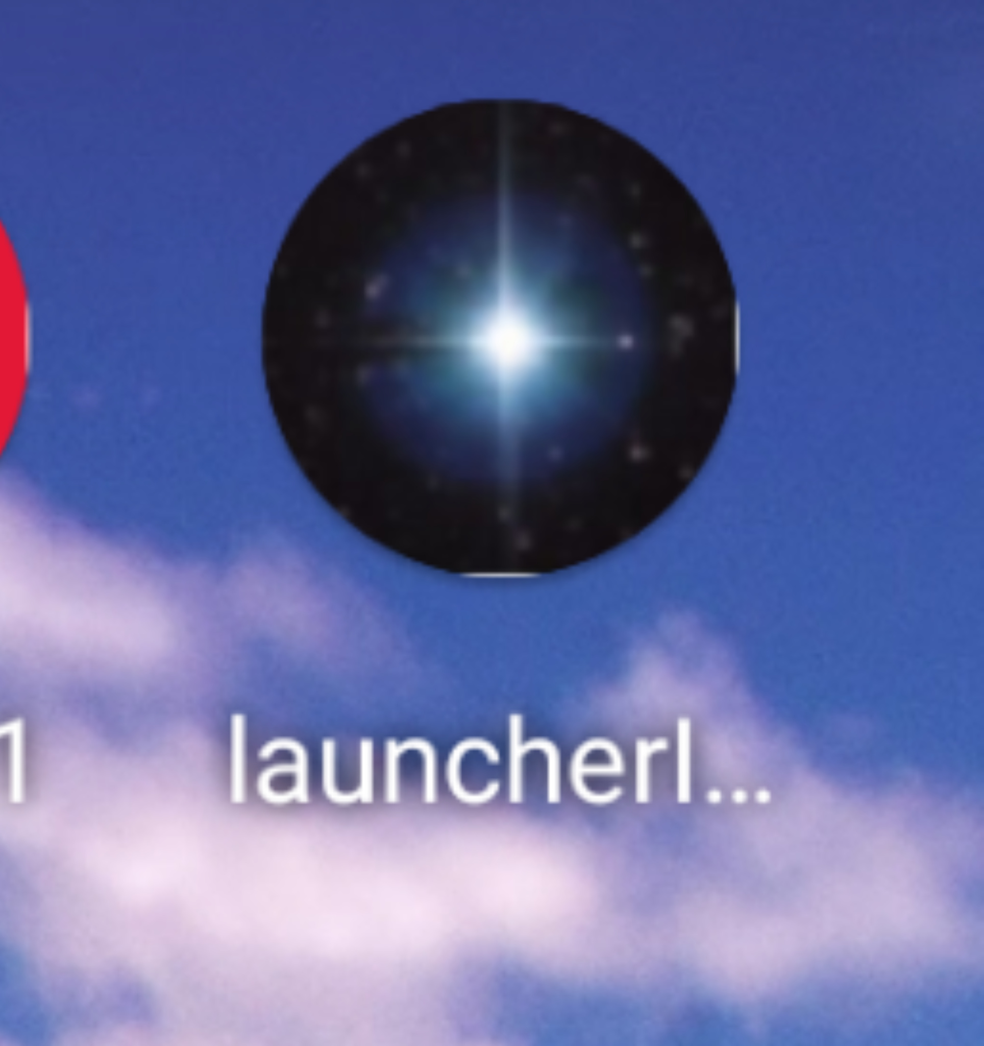
zoomed in screenshot from @Anke
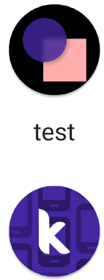
You are using a simple rectangular icon and your device OEM specification renders it as a round icon.
The white slivers at the top, bottom, left, right are the remnants of clipping your rectangular image. I suspect this is either an issue with how MIT introduced adaptive icons into App Inventor or an issue that arises when a developer creates a rectangular icon and expects it to perform / adapt into a circle perfectly on devices that can handle adaptive icons. Perhaps a solution is to design a circular icon using the Android Studio tool that is used to create 'circular' icons.
Google has some guidelines
- Understanding Android adaptive icons
- Designing adaptive icons
- Implementing adaptive icons
- Discover the latest Google Play icon design specifications
(above from https://developer.android.com/guide/practices/ui_guidelines/icon_design_adaptive )
Ahh, I see. (Does anyone really notice this? Not me.)
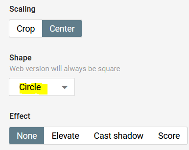
I tried to create the launcher icon with:
https://romannurik.github.io/AndroidAssetStudio/icons-launcher.html
but the result is almost the same (even with a circle)
 .
.
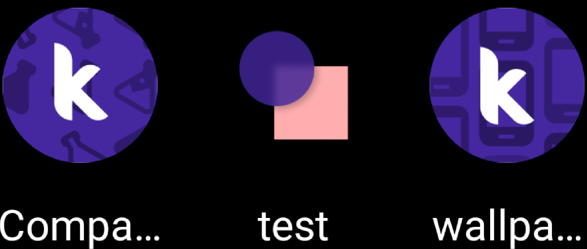
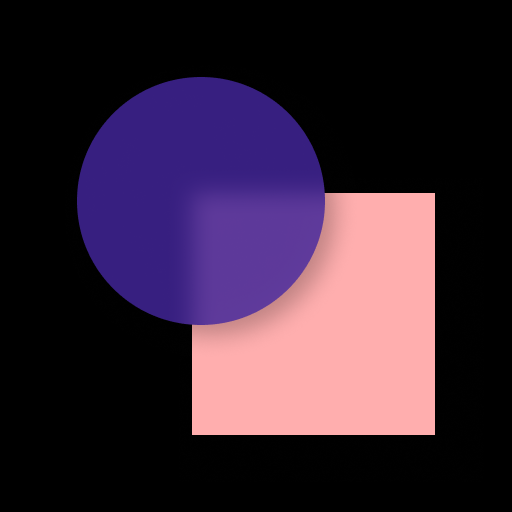
Btw, also the same result with Kodular.
Left: circle (192x192px), right square (192x192px):

Background transparent:
1 Like

It's not just the white edges though - adaptive icons in later versions of Android use varying shape masks and when the icon is dragged around the screen, it slides within the mask, revealing that the AI apk is only using a square image instead of a solid background color with a floating centered icon like all other apps do.
I'm not sure what you're asking?
And I'm not sure what exactly your statement means.
Hello all
Can you please test if the artefacts persist with this APK?
Thanks
1 Like
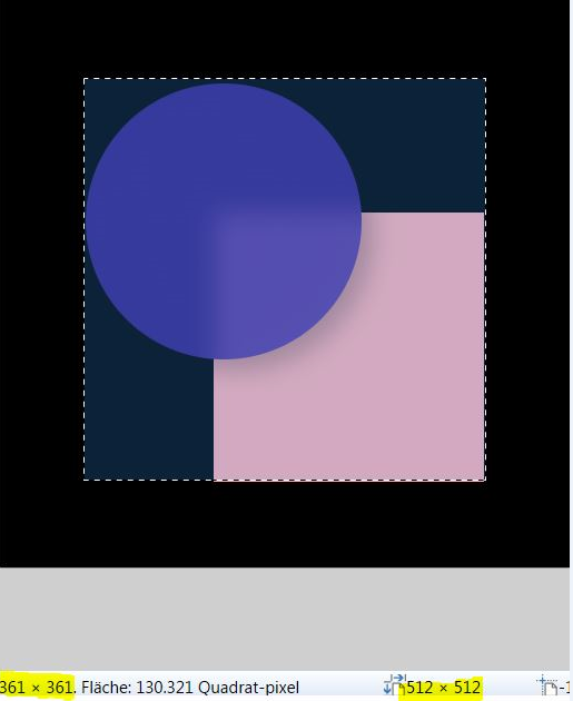
Ok, the launcher icon is 512x512px and has a black background. The actual picture is only 360x360px and is exactly in the middle.
Awesome!
Based on my experiments with the system, I see three plausible solutions to the problem
-
Use the solution I've shared above. The user's app icon is set as the adaptive icon's background layer.
Pros: No white patches along the edges
Cons: The wiggle/parallax/spring motion that comes with adaptive icons is lost; the icon is stationary. -
Set the background layer of the icon from #FFFFFF (white) to #00FFFFFF (transparent). This will get rid of the artefacts while retaining the parallax motion.
Pros: Motion is retained
Cons: Motion is applied to the entire icon (this is not an issue introduced by this solution, rather a limitation of the system currently implemented in App Inventor). It is not possible to have, say in the other two icons @Anke shared above , the "k" ligature maintain motion while the background art stay stationary. -
Add a new property called
AppIconBackground. This will let the user set a special background for their app's icon that will remain stationary. TheAppIconproperty will retain its parallax. If theAppIconBackgroundimage property is not set, the system can default to a solid background colour (either white, transparent, or the app's primary colour property; I'm unsure which one is best suited here)
Pros: Provides granular control over what part of the icon should move and what shouldn't.
Cons: The user will have to take care to make theAppIconimage transparent. For example, theAppIconandAppIconBackgroundproperties will have to be

Note that they are of the same dimensions.
It's a single image of size 512x512
1 Like
Lots of effort for a few tiny artifacts. 
1 Like