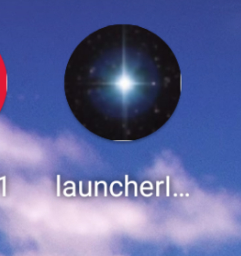
I’m not seeing the issue on my Samsung Galaxy S8 Running Android OS v9.0:
It’s strange that it’s working for you and thank you for testing it for me!
Yes, I think it’s an issue with the device’s DPI. All of the DPI values are powers of two except HDPI and XXHDPI, which are 1.5 and 3, respectively. I think your 1-pixel of white is due to an off-by-one error resulting from a division by an odd number (if it were an even number it would scale accordingly and you wouldn’t get the 1 pixel of white).
Thanks for the explanation. Can you think of anything I can do to fix this?
To fix? No, to ameliorate the halo, you could Invert the image

Not quite the same effect but an might eliminate your white halo as obvious and provide a similar. hopefully pleasing, effect.
I think this is something that we need to correct on our end. My original hypothesis was that using a 576x576 icon would work best as its the least common multiple of all the possible icon sizes (for Android), but because of how the integer math works it ends up still rounding down by a pixel. Using your phone’s specifications the plan is to try and reproduce the issue with the emulator and see if we can fix it.
what about resizing it to 543x543px maybe that would be better 
I’ll give it a shot when I have time!
I’m curious what your reasoning is behind the effectiveness of 543x543px?
Sounds like you have figured out what I’ve been seeing, too. If it helps I’m seeing this on a Pixel 4 XL.
I'm having the same problem with my Pixel 4 XL running Android 10. When the icon is slid around, you can tell that the image is a square within the circular icon mask. It slides to reveal the default white underneath, and the edges of the square show as you move the icon. It may be better to include background color control in AI and layer on a PNG icon with alpha channel to avoid the background color and edges issues.
Did that solution work for you? How would I go about doing this with App Inventor? I didn't know there was another way to customize the icon besides by uploading an image file. Thanks!
I am having the same issues as in the original post. I am using a Google Pixel 3a and I see very small white spots on the right and bottom. My icons are completely circular and I am using a square image file.
I built this aia launcherIcon.aia (43.2 KB) and checked it on a Pixel 2XL (Android 11 - Beta):
launcher_icon.png (192x192px)
launcher_icon.jpg (192x192px)
Similar results on a Galaxy Note8, Xiaomi Redmi Note 5 (both Android 9).
So check this aia on your test devices and post the results.
Unfortunately I'm still having the same issue. Screenshot attached. Also if you zoom in on your screenshot you can see that there are white spaces on all 4 sides, screenshot of that also attached. The white space on yours is smaller than on mine, but it's still noticeable. I increased the contrast to make it easier to see.
my phone:
zoomed in screenshot from @Anke
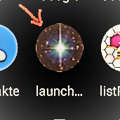
You are using a simple rectangular icon and your device OEM specification renders it as a round icon.
The white slivers at the top, bottom, left, right are the remnants of clipping your rectangular image. I suspect this is either an issue with how MIT introduced adaptive icons into App Inventor or an issue that arises when a developer creates a rectangular icon and expects it to perform / adapt into a circle perfectly on devices that can handle adaptive icons. Perhaps a solution is to design a circular icon using the Android Studio tool that is used to create 'circular' icons.
Google has some guidelines
- Understanding Android adaptive icons
- Designing adaptive icons
- Implementing adaptive icons
- Discover the latest Google Play icon design specifications
(above from https://developer.android.com/guide/practices/ui_guidelines/icon_design_adaptive )
Ahh, I see. (Does anyone really notice this? Not me.)
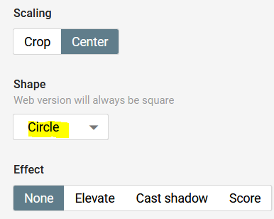
I tried to create the launcher icon with:
https://romannurik.github.io/AndroidAssetStudio/icons-launcher.html
but the result is almost the same (even with a circle)
 .
.
Btw, also the same result with Kodular.
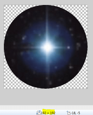
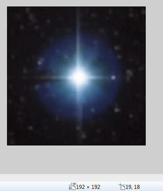
Left: circle (192x192px), right square (192x192px):

Background transparent:
It's not just the white edges though - adaptive icons in later versions of Android use varying shape masks and when the icon is dragged around the screen, it slides within the mask, revealing that the AI apk is only using a square image instead of a solid background color with a floating centered icon like all other apps do.
