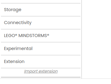
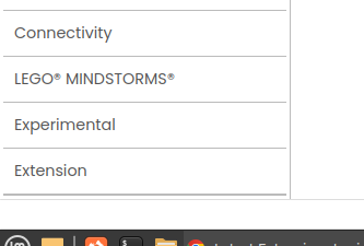
Then click on Extensions?
Dude ! Take me a week find this, you a a genius. Thanks a lot.


Have to click and scroll a bit. ![]()
If you close other parts of the palette more space appears at the bottom

This bar cover the screen on my low resolution laptop.
A post was merged into an existing topic: Issue with AI companion 2.72 and Tom Bennedum's sqlite extension
Some features in UI:
-
i like to have a note field in the project property for write in some feature of the app or in case of new release the difference from the other release.
this could be not visible but only for archive information during developing. -
in the list projet page could be showed also the column versioncode and versionname. It would be useful to see the release without entering the project.
And a pop up with the note field explained above (for example a ? button like in the extension)
This is a known issue I'm working on. It's been troublesome.
I found bugs on https://code.appinventor.mit.edu
- Not able to remove extensions , it click on extension only
- Not able to delete or move project to trash

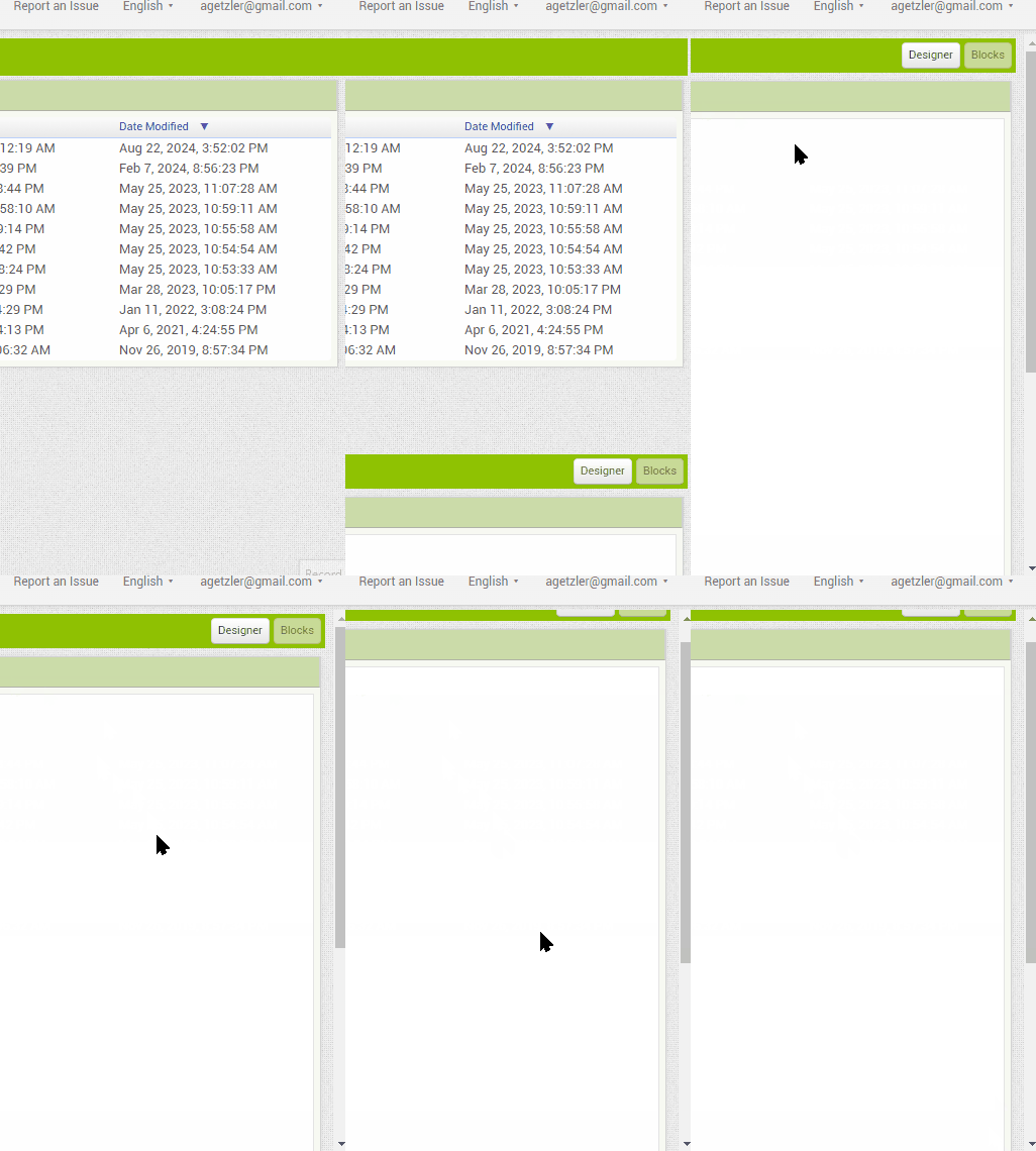
I'm also working on an excess of scrollbars in Windows. I appreciate that it's an issue, but it came to light late in the development process because our dev computers are Macs.
OK I now have and update on the test server with an overhaul of the css affecting the accessibility footer on Neo. It still has the refactored help popups:
https://ui-refactor-dot-srlane-test.uc.r.appspot.com
Testing welcome. My next priority is taking another pass at the scrollbars on Windows.
While you're doing Windows scroll bars, take a look at this continuing annoyance.
The first click in the Blocks Workspace nudges the outer scroll bar enough to obscure half of the bar that has the Designer/Blocks Editor buttons.

(I checked the Privacy Policy bar on my laptop. It's down to a quarter inch high, less intrusive on my desktop PC monitor.)
Huh. I think I understand what's happening on your video, but I don't reproduce it on Edge on my VMWare Windows 11 virtual machine. This will take some digging.
I'm using Brave on Windows 10.
It also happens on Chrome,
but not on Firefox.
It happens on Edge.
I can't scroll the blocks when a project is reopened in block view after switching from another project. Neither by the mouse nor by the scroll bars (scroll bar remains hidden).
I switch to Designer view and back to the Blocks view, then scrolling is enabled. I tried this several times.
Best regards,
Osmany
Hey MIT! This Is Team Anissa Project Here.
I want to discuss a few issues with the palette scheme of the app builder.
Issues:
-
It is a bit too bright, and users are unable to properly view the sections, due to everything being white.
-
Basically, Just The Ribbon can Be The Signature Green MIT App Inventor Colour.
-
Also, many MIT App Inventor Users have told me that the icons for the components are mostly indistinguishable.
-
It just doesn't feel that organised, and all too confusing due to everything being white.
Hope this Helps. Thank You for your Time.
Regards,
Team Anissa Project.
Then it's a Chromium issue I believe. Brave, Chrome, and Edge are all based on Chromium, but not Firefox.
Oh, Okay.
I’ve been mentioning for a while now that the internal scroll in the blocks section, both in all Firefox forks and in Firefox itself, skips and doesn’t provide smooth scrolling, which is frustrating. This forces users to rely only on browsers with Chromium engine or use a Chromium User Agent on Gecko engines. Since a new UI is still being implemented, I thought it might be worth checking if this is an issue with the builder or with the Gecko engines.
Sample video
