Customize: color, size, corner radius, position within the Arrangement, add asset icons, and generate multiple action buttons related to the main one.


- Added helper blocks for corner and direction.
- Buttons can now have text instead of icons.
- Added an additional parameter to accept a list of colors to change the text color. Text colors will be ignored if the button has text. (The block will update.)
- Clicking any button will animate it with a scaling effect.
CreateFloatingActionButton
Create a floating button with color, size and corner radius.

corner: Specify in which corner of the arrangement it will be positioned
SetFabIconFromAssets
Set an icon from Assets for the floating button.

It should be placed below the function CreateFloatingActionButton.
RemoveFloatingActionButton
Remove the floating button from the Arrangement.
GenerateFloatingActionButtons
Generates a specified number of floating buttons with spacing, colors, icons, or text.

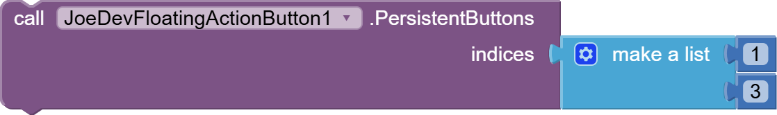
PersistentButtons
Sets a list of button indexes that should not close the popup when clicked
UpdateGeneratedButtonIcon
Updates the icon or text of a generated button based on its index.

TextColor
Changes the text color of a generated button that displays text, based on its index.

GeneratedButtonColor
Changes the background color of a generated button by its index.

TemporarilyHideFAB
Hides the main floating button with a fade-out effect, after the set delay in milliseconds, shows it again with a fade-in effect.

FloatingActionButtonHidden
Triggered after the FloatingActionButton becomes invisible due to TemporarilyHideFAB

FloatingActionButtonClicked
Triggered when the FloatingActionButton is clicked.

GeneratedButtonClicked
Triggered when a generated button is clicked, returning the button index and icon path.

v1.1 June 15, 2025.
FloatingActionButton.aia (30.1 KB)
joejsanz.joedevfloatingactionbutton.aix (21.8 KB)
JDK: 11
Minimum API Level: 21
Updated On: 2025-06-15T07:00:00Z
Built using: FAST-CLI v3.6.1
Thanks.