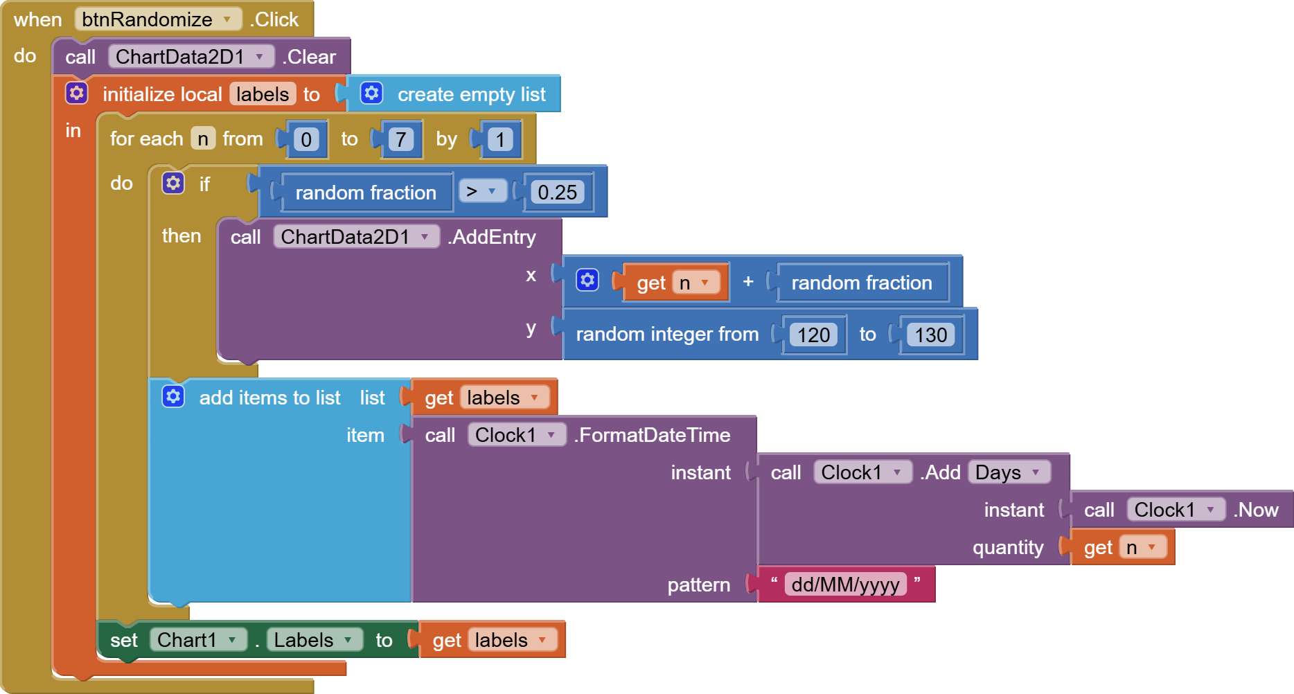
Here's a snippet showing sporadically collected data over a week:
week_chart_sporadic.aia (2.6 KB)
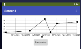
Note how the Labels list is spread out evenly over the range of the x values.
The y values are blood pressure readings, and the x values are fractional days from the start of the week when the readings were taken.